Hazel & Terry
|
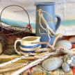
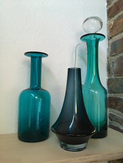
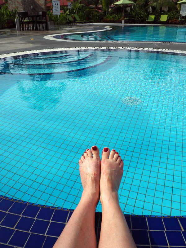
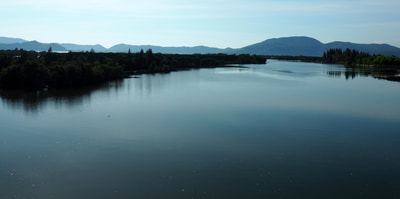
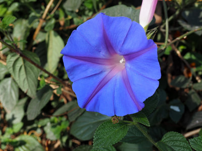
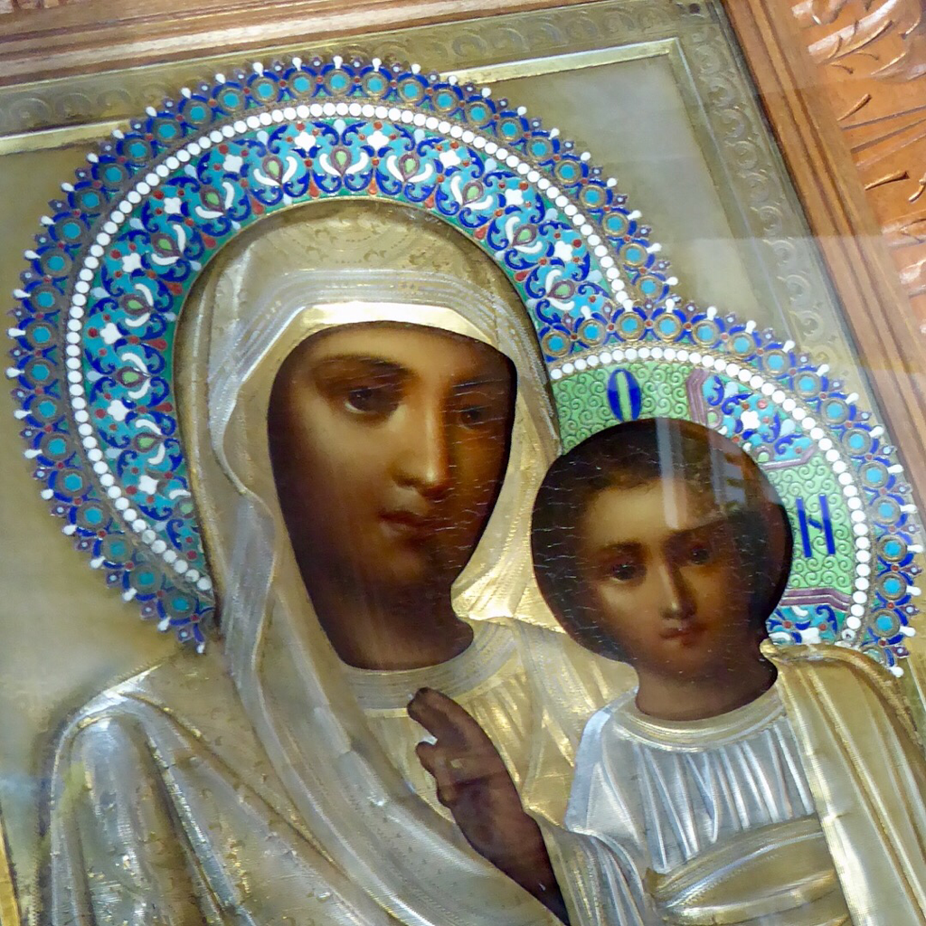
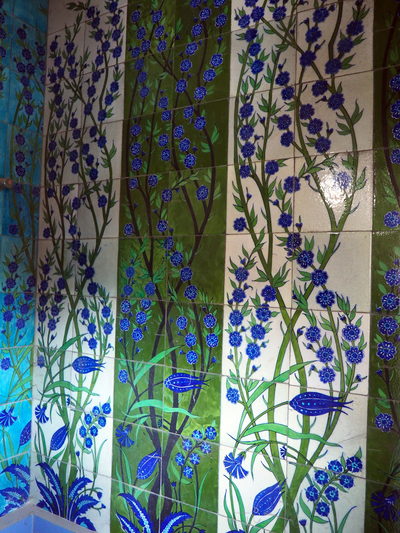
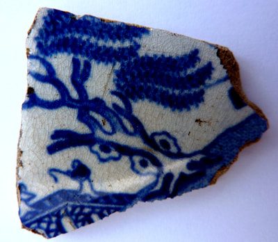
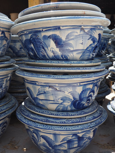
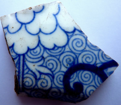
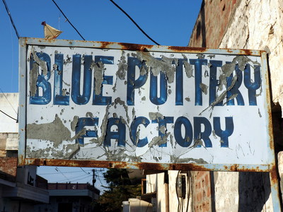
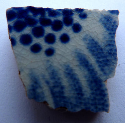
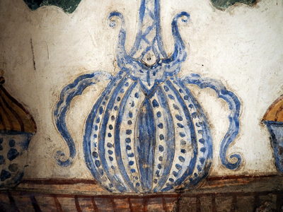
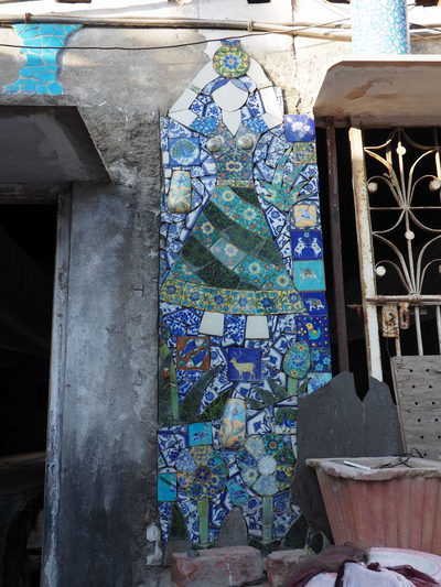
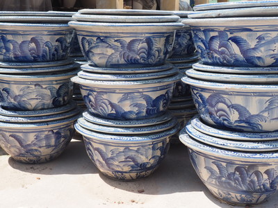
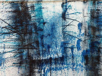
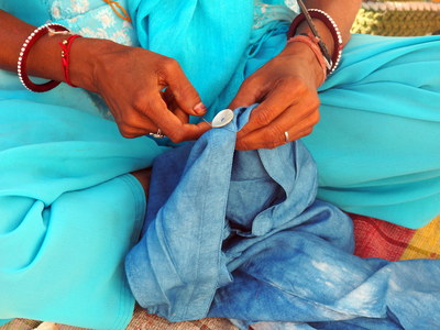
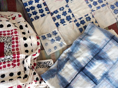
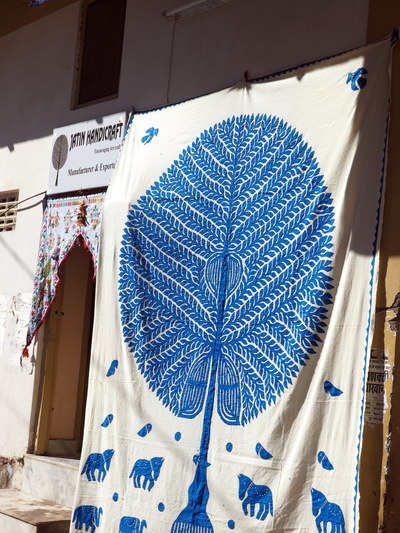
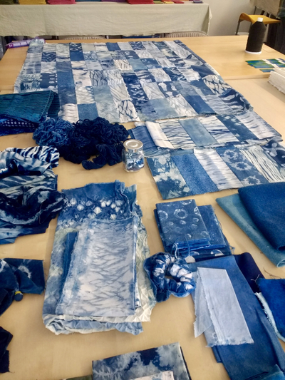
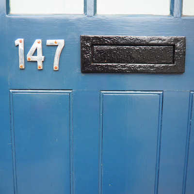
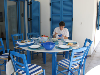
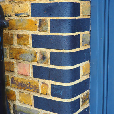
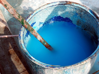
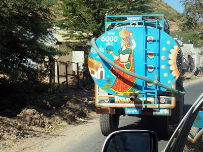
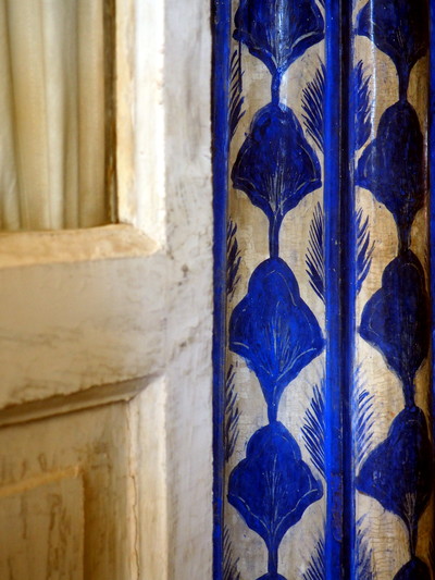
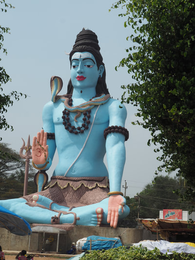
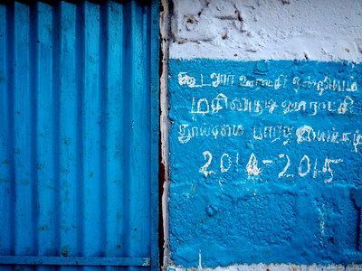
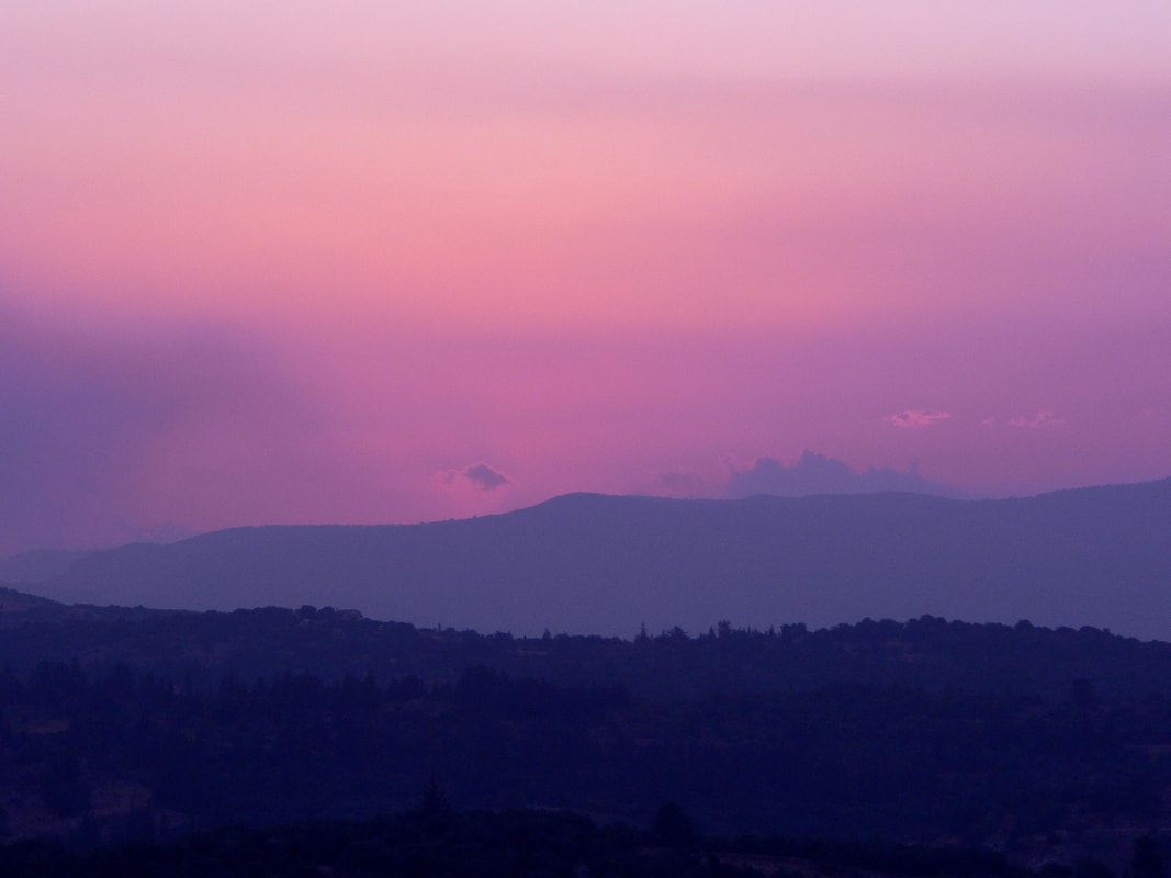
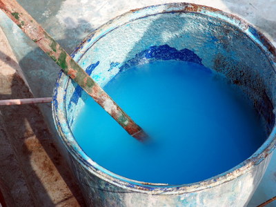
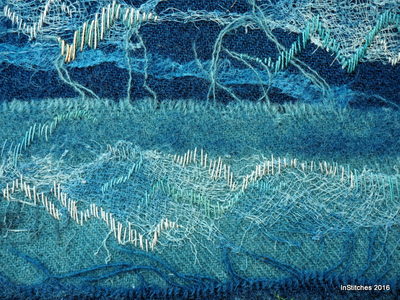
Feeling blue, blue Monday, dolly blue, blue suede shoes, Mediterranean blue, once upon a blue moon, Rhapsody in blue, Blue Valentine, blue yonder, listening to the blues, blue cheese, blue blood, sporting blue, Bluetooth, Picassos' blue period, blue light, blue airmail, blue beard, Blue Planet ... Blue is the colour of the oceans, the sky and many a swimming pool. An essential colour of nature, blue is probably the world's favourite colour. Cooling and calming, who doesn't feel that little more relaxed at the sight of a clear blue sky and a view of the sea? But it's not been an easy history for the colour blue - often undervalued and passed over for greatness, the ancient Greeks and Romans preferring black, white and red and often associated with barbarism - think of the early Celts smearing their faces and body with woad before going into battle. Only the Egyptians seemed to value the colour blue, where it was thought to dispel evil and bring prosperity. In the 12th Century, due to the influence of the church, many colours, including blue became to be seen as divine. It was around this time that the Virgin Mary was first depicted wearing blue robes and the colour began to be seen as a symbol of beauty, purity and wisdom and seen as a very feminine colour. The Chinese used to depend on Persia for the blue for their Ming porcelain and I always regard it a lucky day when I dig up a blue and white china fragment on my allotment! Blue is an easy colour to wear, the work-a-day blue jeans developed by Levi for the manual labourer are today's default 'off-duty' wear. All shades of blue are often used for uniforms from schools to the military, not forgetting 'the boys in blue'. It was synthesising indigo dye in 1860s that helped German chemist, Adolf von Baeyer win the Nobel Prize for Chemistry in 1905. A direct consequence of this was the catastrophic effect on the Indian economy and a decline in the demand for natural indigo, whilst the German chemical dye industry expanded and the profits undoubtedly help fund the German war effort. There's a lot of blue out there in the world and when you tilt your head and look at the night sky it's ever deepening shades of blue that you see but I'm left wondering, could this actually be sky blue pink, shot with a carrot?
Hazel & Terry
1 Comment
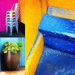
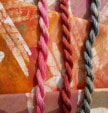
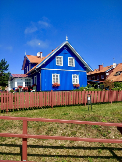
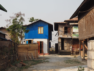
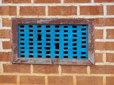
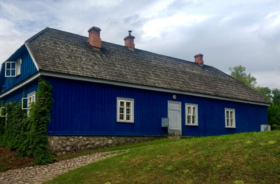
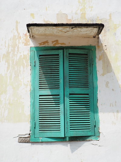
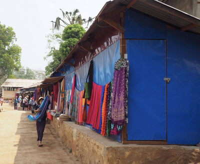
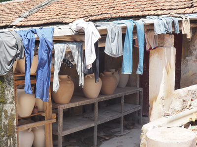
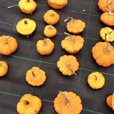
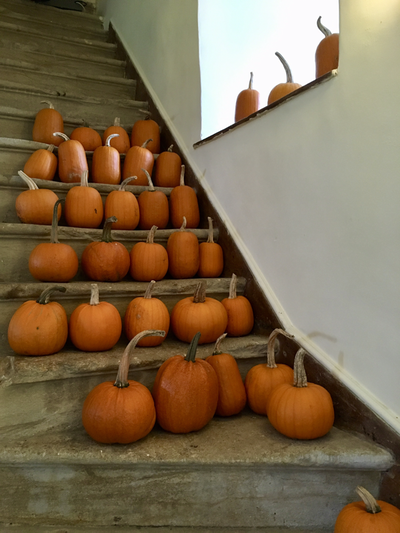
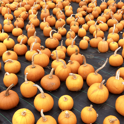
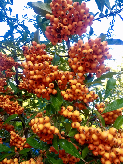
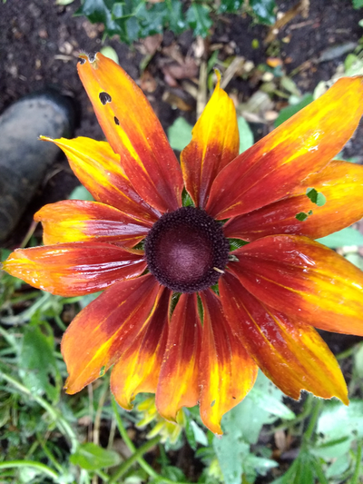
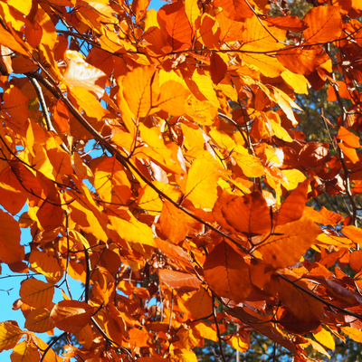
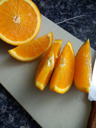
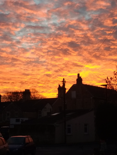
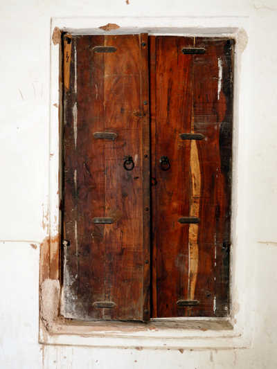
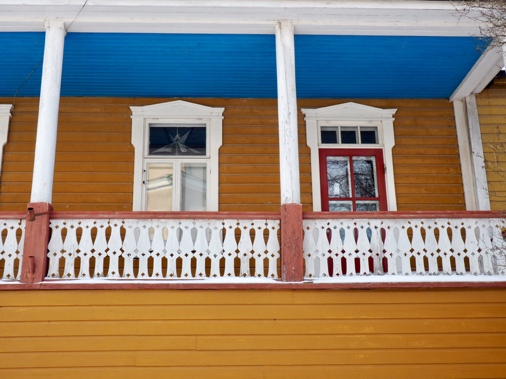
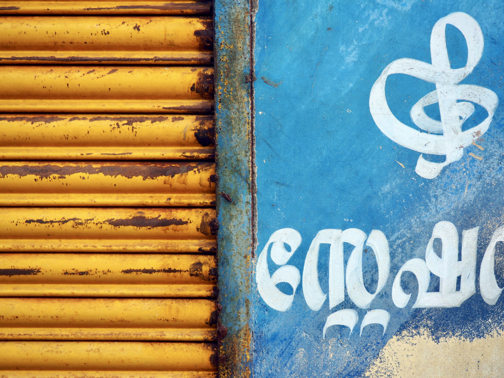
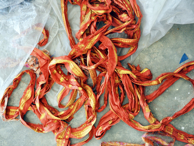
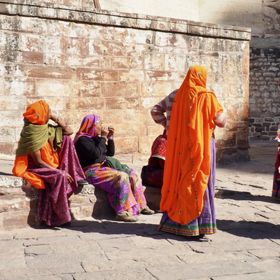
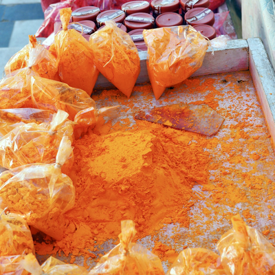
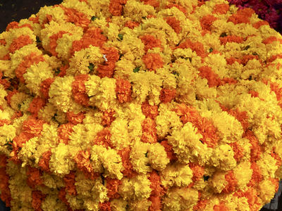
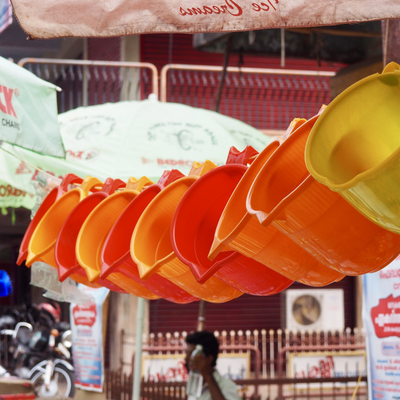
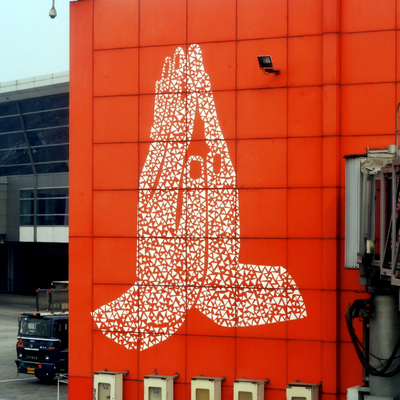
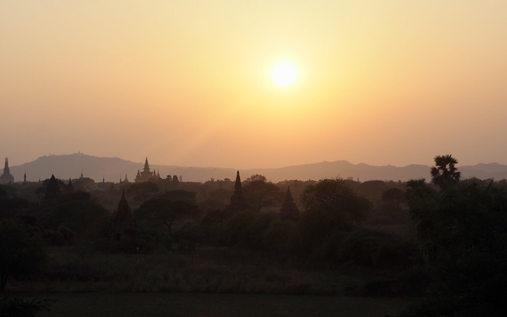
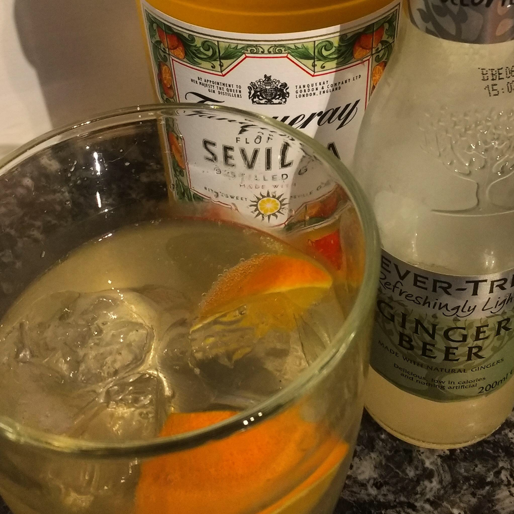
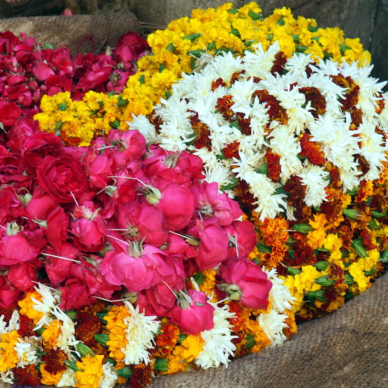
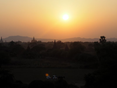
Dutch orange, saffron, amber, ginger, minium and nude. Coral, terracotta, peach, apricot and tangerine. Call it what you will, orange was described by Wassily Kandinsky (1866-1944) as 'warm red, intensified by a suitable yellow'. But I've had a love-hate relationship with the colour orange most of my life - is it because I'm a child of the 70's I wonder? Just like with blue cheese, red wine and olives though, as I've grown older I'm finding myself, however, willing to dabble with the odd flash of orange every now and then. It's autumn here in the UK, and at this time of year there's a lot of orange about, as Terry found when she visited Forde Abbey in Somerset to see the pumpkin and squash harvest ripening in the sunshine. Here in Hampshire the garden still has plenty of colour, with orange coloured flowers, leaves and berries galore. The colour orange is named after the fruit, which was probably first cultivated in China before spreading west across the world. In Sanskrit it is narangah, naranja in Spanish, orenge in French and of course orange in English; but it wasn't until sometime during the sixteenth century that orange was used as a name for the colour, up until then English speakers referred to yellow-red (geoluhread). Orange is a secondary colour, sitting between red and yellow and above brown in the colour wheel and seems forever in danger of sliding one way or another and often down below. Until relatively recently, no doubt due to the advent of digital mixing, it was difficult for the colour to appear 'pure' and in its own right. 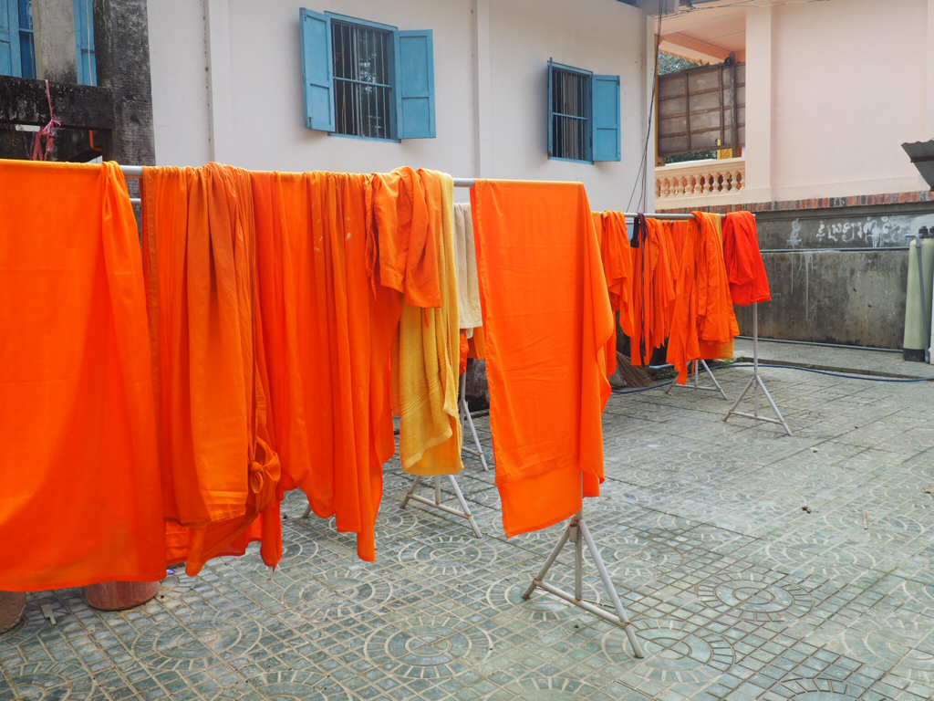 When paired with blue, its complimentary colour from across the colour wheel, the colour scheme is zingy and never dull - although I don't think the Buddhist monks were concerned at all about that when they hung their freshly washed robes out to dry in the court yard underneath the blue shutters! Just look at the stunning colour scheme of this traditional wooden house on the island of Suomalinna, just a short ferry trip from Helshinki, Finland and again here on a canal side tin shack of a shop in Kerela, India. Orange cloth, often associated with Hinduism and which would have originally been dyed with saffron, has been worn in parts of India for over 2000 years. The Hindu festival of Holi to celebrate the coming of spring sees children and young people throwing coloured paints everywhere. Originally the colour orange would have come from natural plant-based sources such as turmeric but nowadays it is increasingly a water-based commercial pigment; and hopefully washable! From the cheerful orange marigolds piled high on rugs laid out on the roadside, rows of bright orange plastic jugs strung across a market stall to the huge namaste hand gesture of greeting on the terminal wall in Delhi airport - the colour orange is everywhere across India. 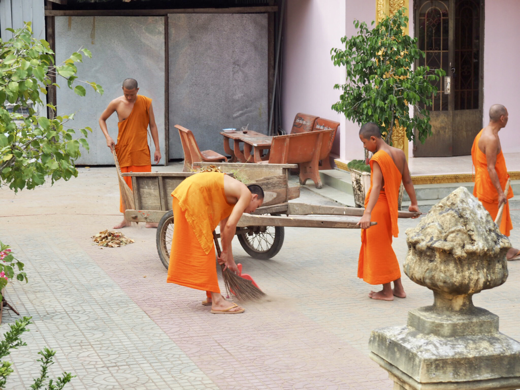 It's in many other far eastern countries too as I found out last year, as I cycled around Myanmar- it is also the traditional colour of Buddhist monks' robes. Many brands have harnessed the power and energy of the colour orange - Penguin, Lufthansa, TNT, Mastercard and MacDonald's, to name but a few. Festive, fun, happy and joyful. Optimistic, balanced, ambitious and energetic. Always flamboyant, warm enthusiastic and generous, vibrant, expansive and organic: orange is a versatile colour. It's the national colour of The Netherlands and their royal family is the house of Orange-Nassu; in Thailand it is the symbol of Thursday. And it's the colour of a perfect sunset. So let's raise a glass, perhaps a Seville Gin garnished with a slice of fresh orange?, and toast the colour orange - have a happy weekend!
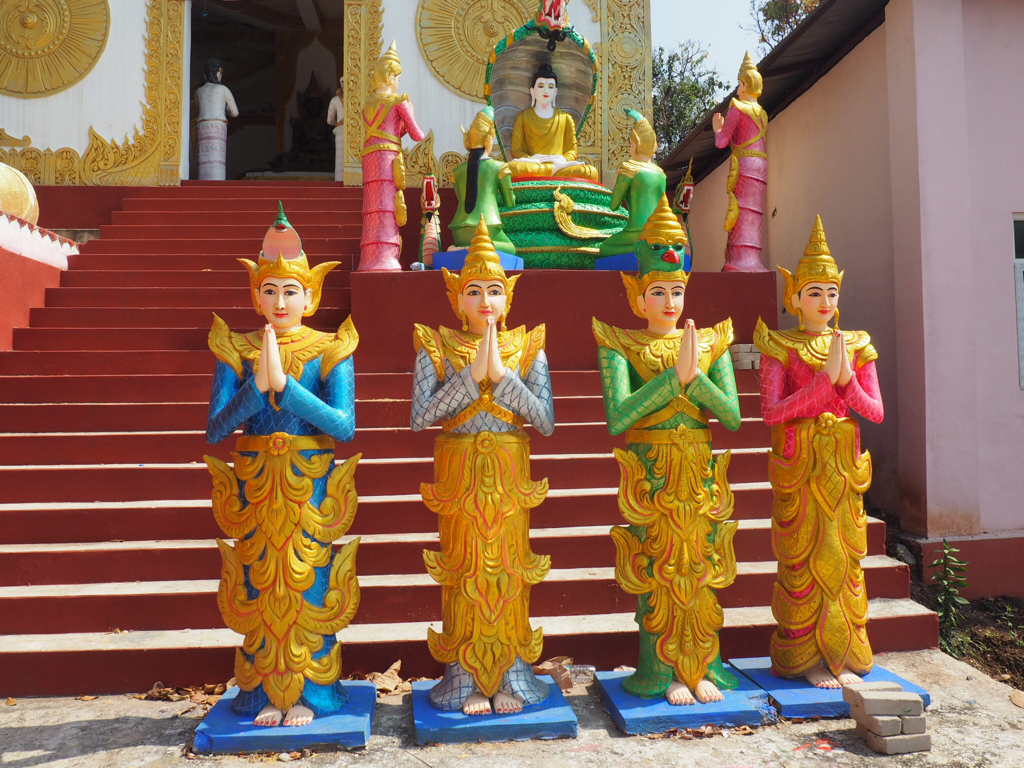
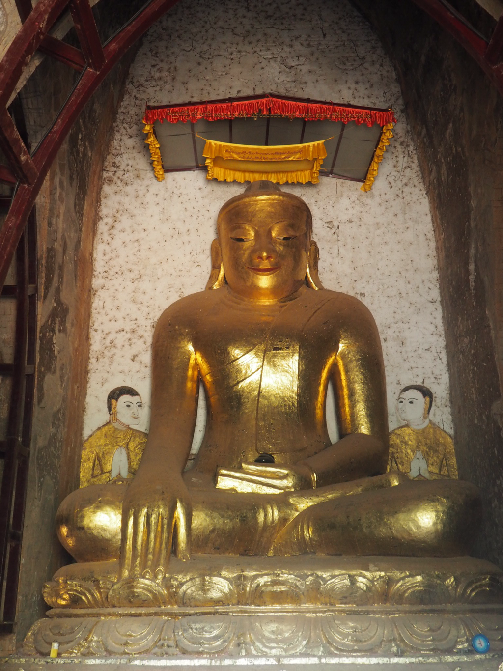
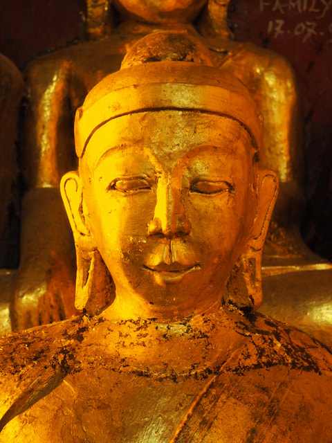
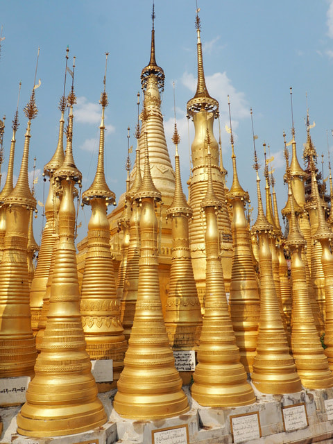
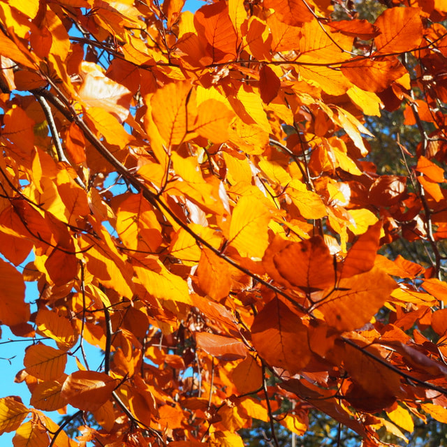
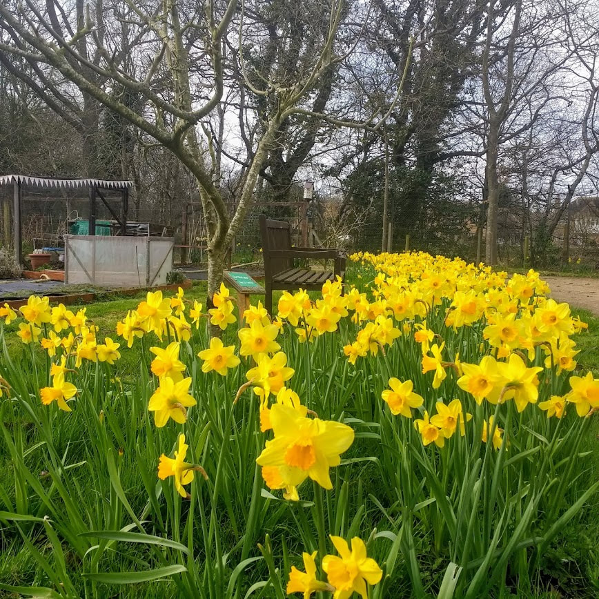
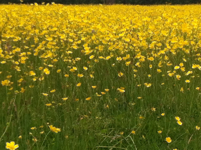
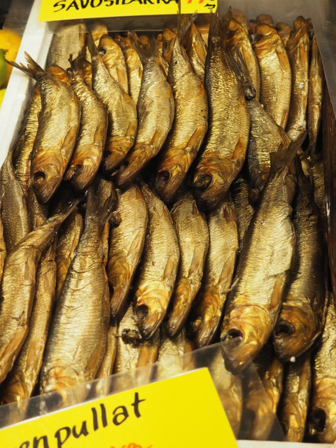
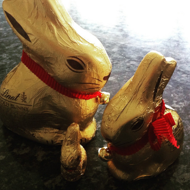
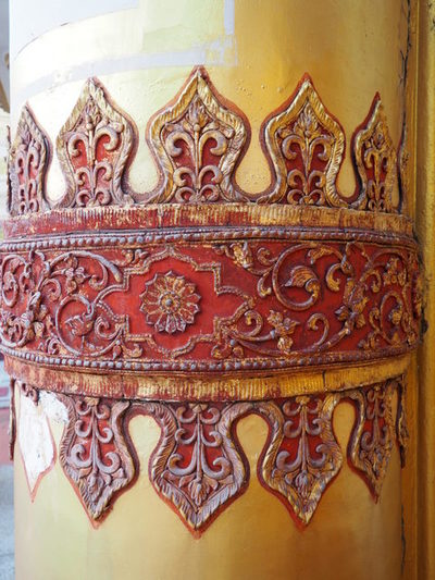
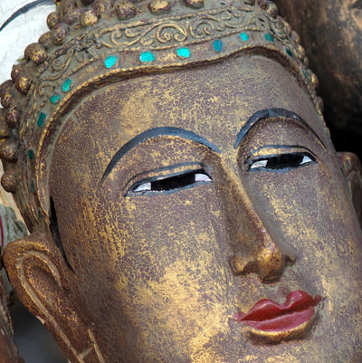
Hazel & Terry That it exists is beyond doubt, but is gold actually a colour? Throughout time artist the world over have used gold in their art work, to symbolise extravagance, wealth, riches and excess. The colour gold is a warm colour that can be either bright and cheerful, like on these Burmese statutes ,or it can be more sombre and traditional; mind you, in this photograph Buddha looks as though he's smiling! In all of these the gold colouring is from the application of gold leaf not an actually pigment paint. Part of the allure of gold is it's colour and as it's a metal it's scarcity and therefore value. Cloth woven with gold threads has been around since Roman times and is often associated with wealth and Royalty - imagine how sumptuous and glittering the meeting of King Henry VIII and Francis I of France would have been in what became known as the Field of the Cloth of Gold in 1520. Henry is reported to have had a marquee made entirely from golden cloth! Gold has also been used to inspire awe and wonder; is seen as the colour of reverence and is often used in religious iconography and on statues. Last year in Myanmar I lost count of the number of golden Buddhas I saw. Despite living very economically challenged lives I was amazed as hundreds of people bought small squares of gold leaf to apply to the surface of an already glittering Buddha. And the sight of so many golden stupas in the harsh mid day sun was enough to burn the image onto the back of your eyes. The colour gold is closely associated with yellow and brown. Closer to home, think of the golden canopy of autumnal leaves against the cooling blue autumnal sky or a host of golden daffodils in springtime! A meadow full of buttercups, nodding their golden heads or as they are just now - golden brown (or more accurately Wheatabix brown, and no, that isn't a Farrell & Ball colour! From the golden skins of Finnish smoked fish to golden Easter bunnies, gold is an enduring choice of colour.
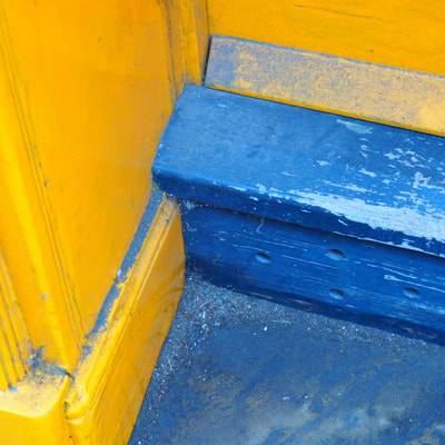
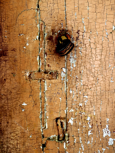
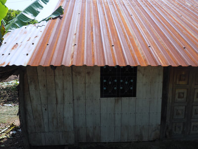
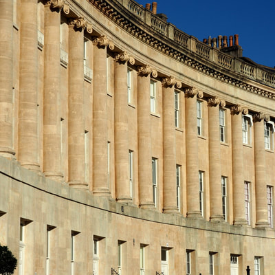
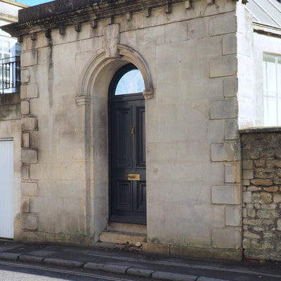
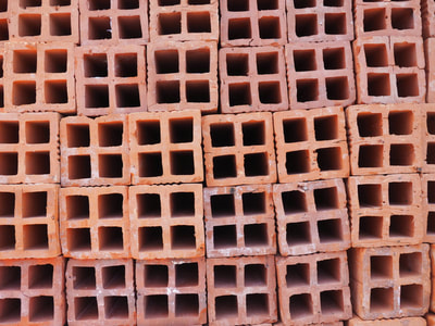
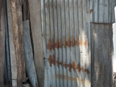
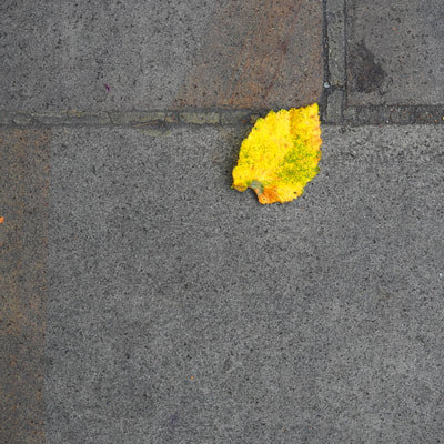
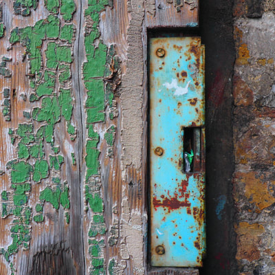
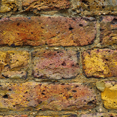
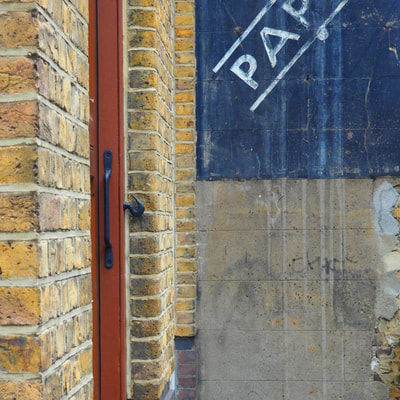
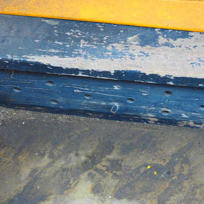
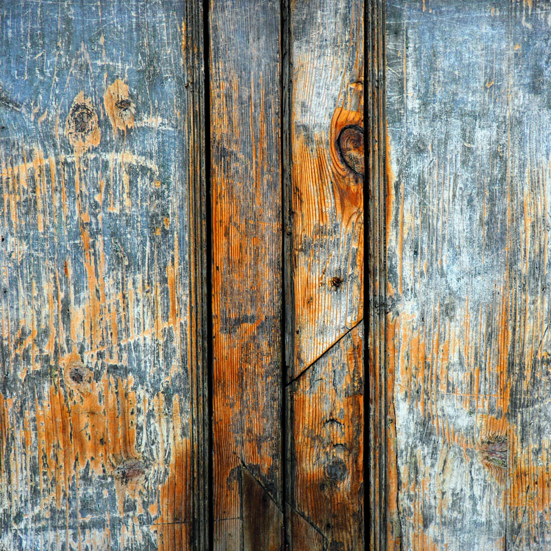
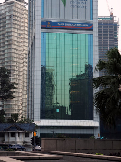
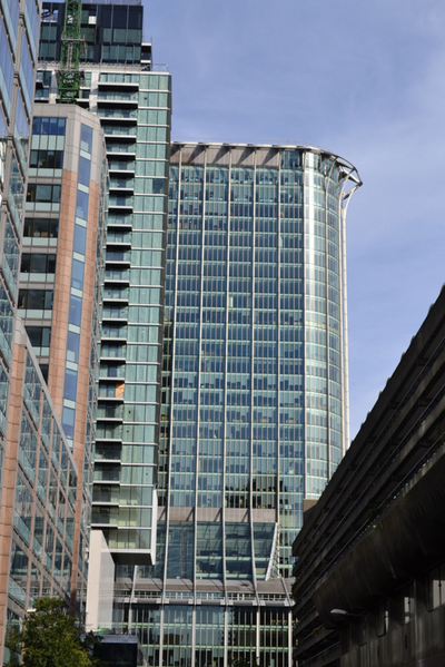
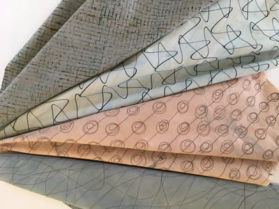
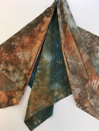
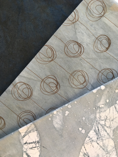
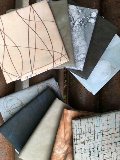
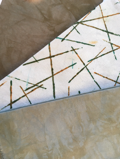
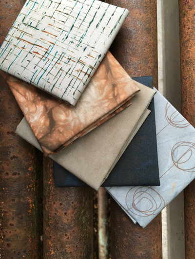
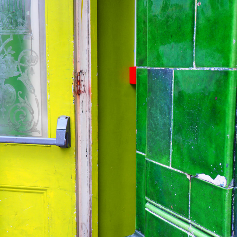
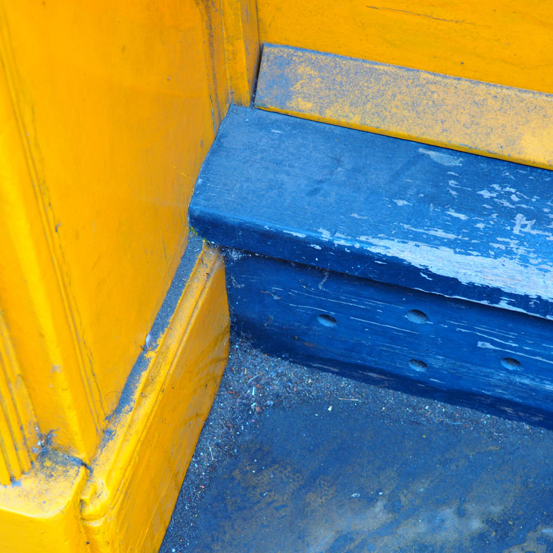
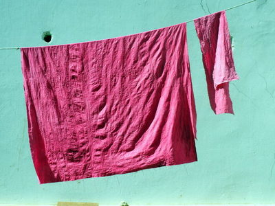
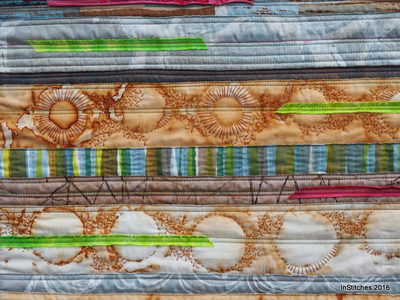
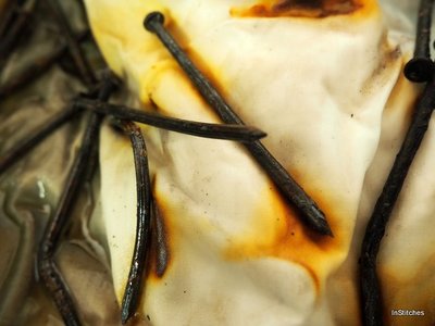
It's just started to rain...so may be our next colour will be green! Best wishes Hazel & Terry Where do you find your colours ? Flowers, fruits and natural landscapes are often used as inspiration, but have you ever thought about looking at the hard landscape - the buildings, the roads and man-made structures? From Wakefield to Bath via the Mekong Delta. The peeling, the rough and the weathered or the modern, the reflective and the graffic? You can see how we've been inspired in our new range of fabrics - Sticks & Stones, which will be available to buy on our stand at this summer's shows.
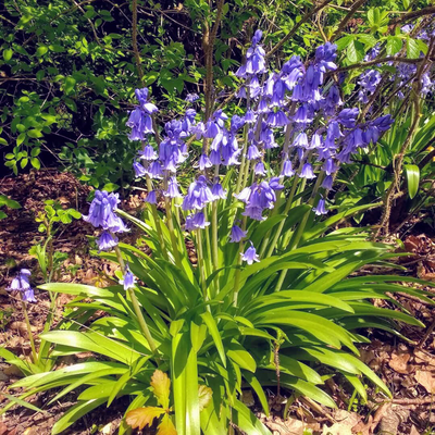
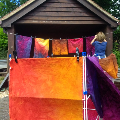
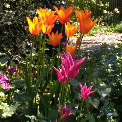
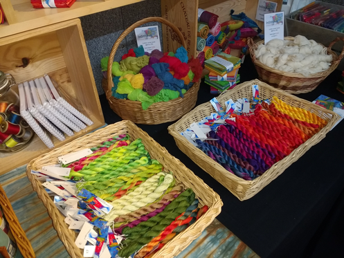
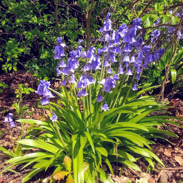
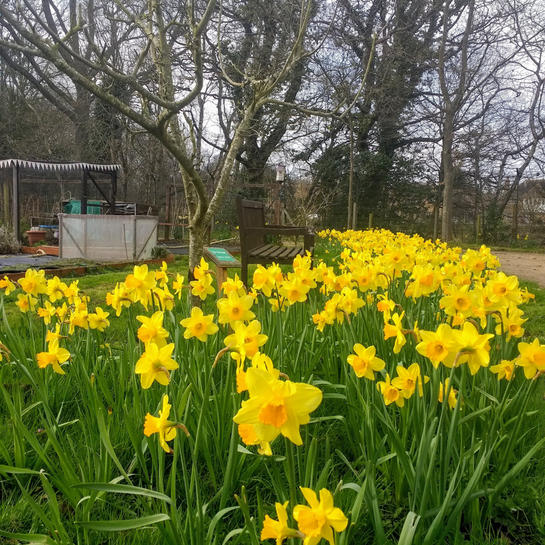
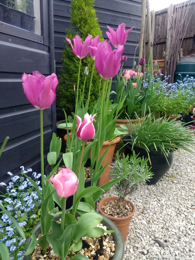
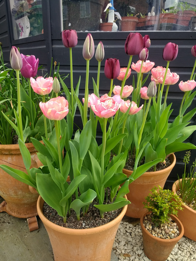
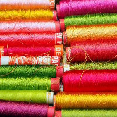
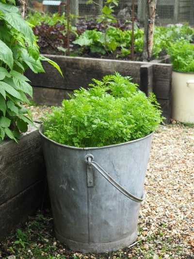
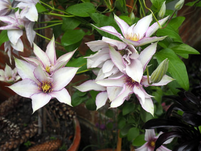
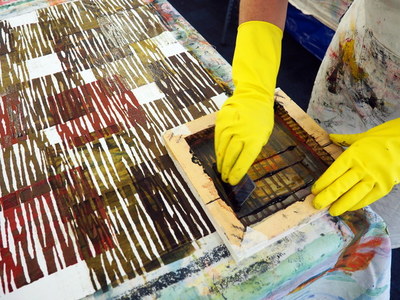
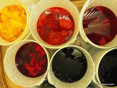
Until next week it's back to the print bench, there's still plenty to do! Hazel & Terry We’re working in the studio this week getting ready for thread - a festival of textiles at Farnham Maltings on Saturday 30th June and of course The Festival of Quilts later on in August . We have stands at both shows so that’s a lot of fabric and thread we need to print and dye! We don't just dye pot-luck but have several different themes, so when you visit our stand you can buy a range of fabrics and threads which complement each other beautifully. So where do we find our inspiration for colour? A lot of our colour inspiration comes from the world around us; nature provides us with the most amazing colour palettes so I thought this week I would share a few of the flowers and plants which have been inspiring us recently. If you follow us on Instagram or Facebook you’ll have seen our recent posts of the beautiful display of bluebells which greets us as we come up the drive. On my allotment the vegetable beds aren’t looking their best just yet, but there was a magnificent display of daffodils earlier this spring. Just wait until the sweet peas, rainbow chard and globe artichokes get going - it will be a veritable feast for the eyes never mind the stomach! And in my garden the tulips have finally burst into all their glory. When I set out my garden a couple of years ago I deliberately painted my garden shed a very dark inky blue to act as a foil to the ever changing pots of colour. I think it works very well, don't you? It’s a very busy time of the year for us as we get ready for the show but I always try to make time to enjoy going out and working in my garden or on my allotment. Not only do the flowers and plants provide plenty of inspiration for my textile work but being outside tidying the borders, weeding the vegetable rows and harvest the crops as they ripen helps calm and soothe. These days I can even find joy in mowing the lawn !
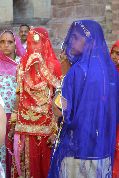
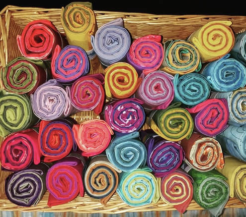
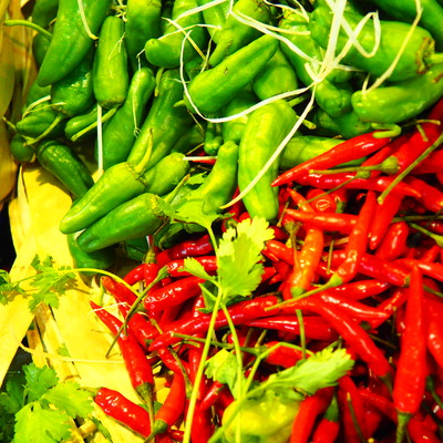
So if you come to visit our stand at the various shows over the summer take a look at the fabric and threads and see if you can guess which plants and flowers have inspired us! Hazel & Terry How do you chose a colour scheme? Do you go for bold and bright? or do you prefer a more subtle palette? Very often the starting point for a colour scheme comes from observing the world around us. Whether it’s walking through the vibrant but chaotic bazaars of Jaipur, whipping up a storm in the kitchen or strolling along the Cornish beaches in winter - they all tickle our creative senses and we love capturing that moment in fabric and thread. If you would like to create your own bespoke stash of fabrics too then head over to the Bringing colour to life page and read all about our brand new year-long course. We are very excited about it as it'll bring all the techniques we love using to colour and add texture to fabric into one course. Plus we will be in our new 'new' studio by the time it starts in September. We'll be telling you more about the new studio shortly, but as it has been built with us in mind we will have masses of light and space plus plenty of height adjustable work benches - so come and join us, be inspired!
|
Welcome to our blog! Here you'll find out what's been going on, plus plenty of ideas and inspiration and the odd cake recipe! Check back often to see what we're up to - it's great to have you along Hazel & Terry Categories
All
Archives
June 2020
|













 RSS Feed
