Hazel & Terry
|
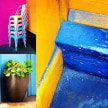
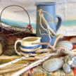
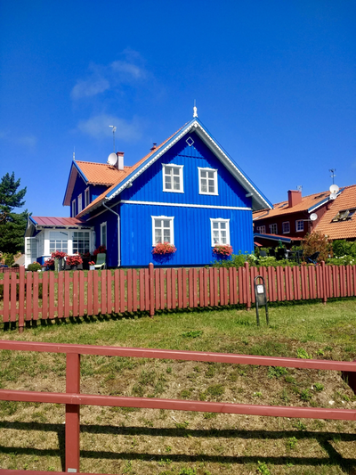
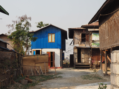
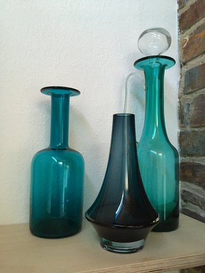
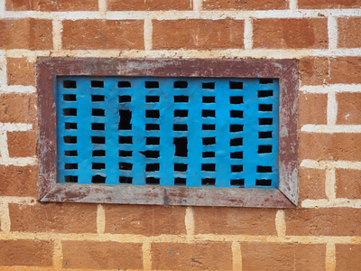
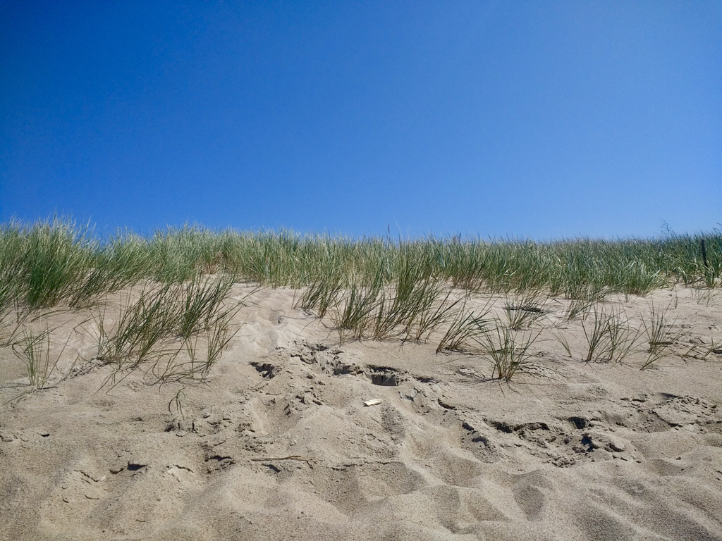
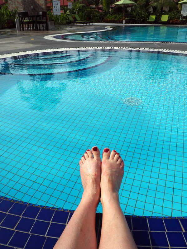
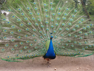
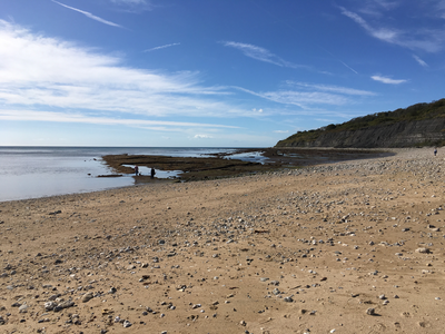
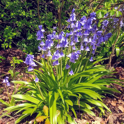
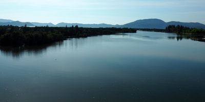
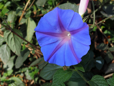
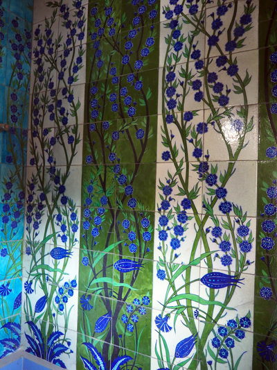
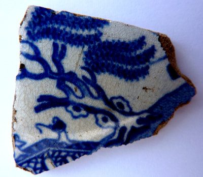
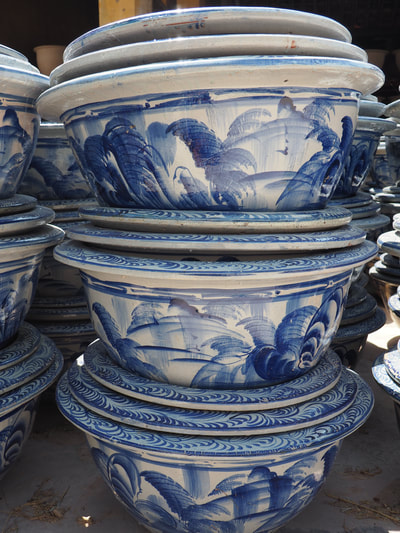
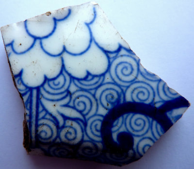
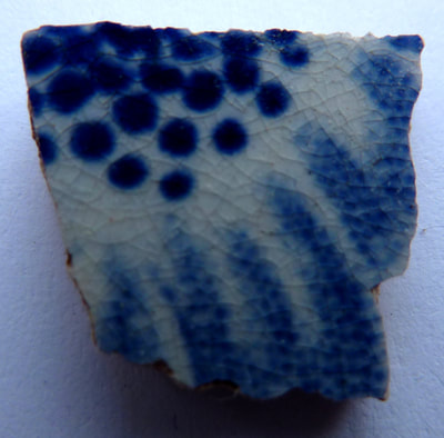
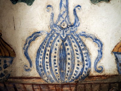
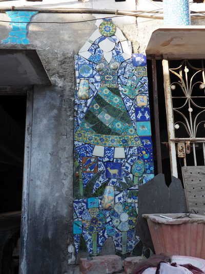
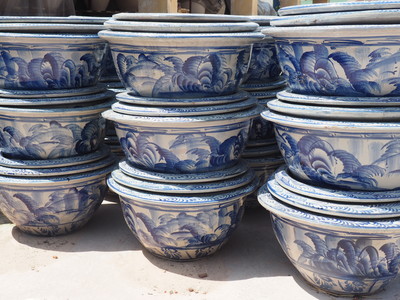
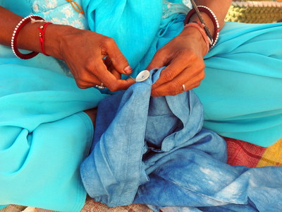
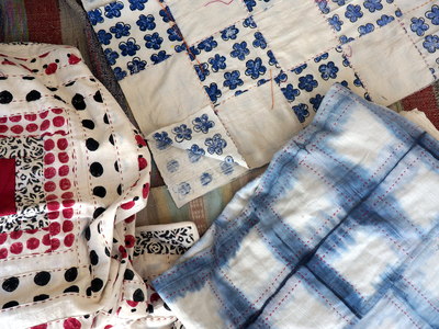
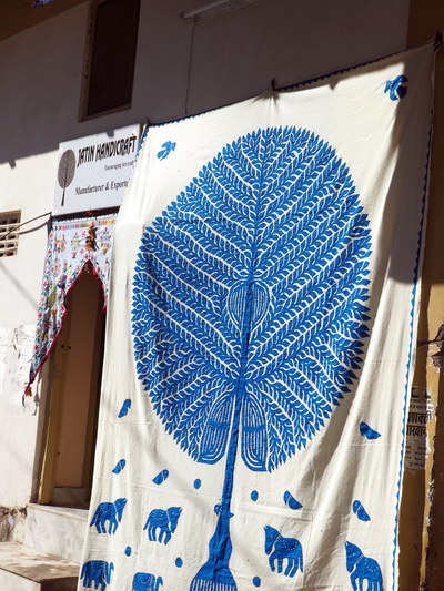
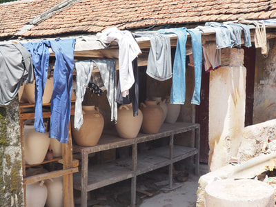
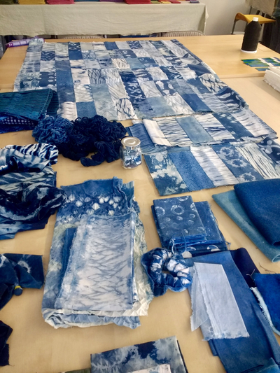
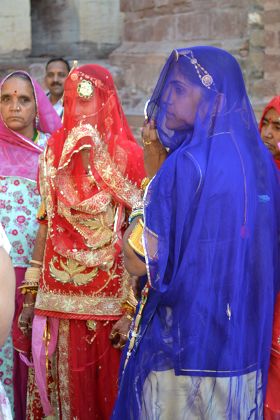
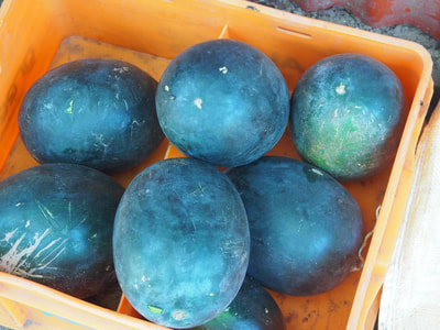
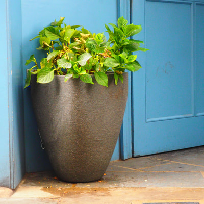
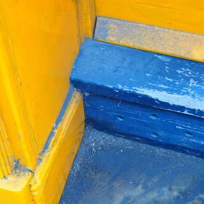
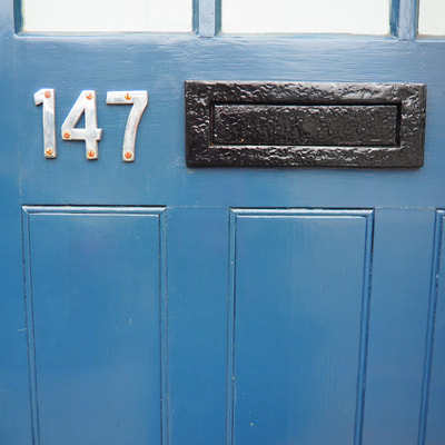
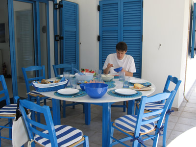
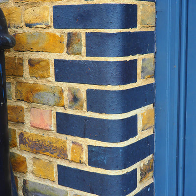
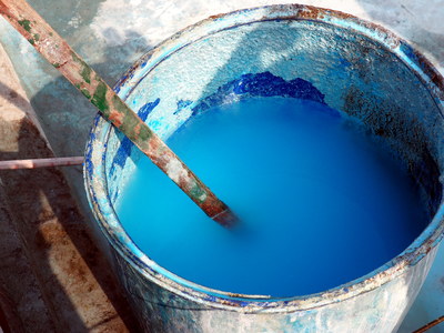
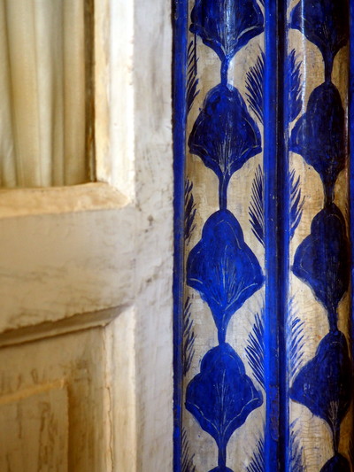
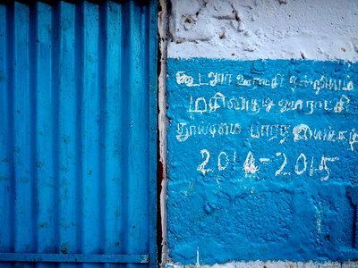
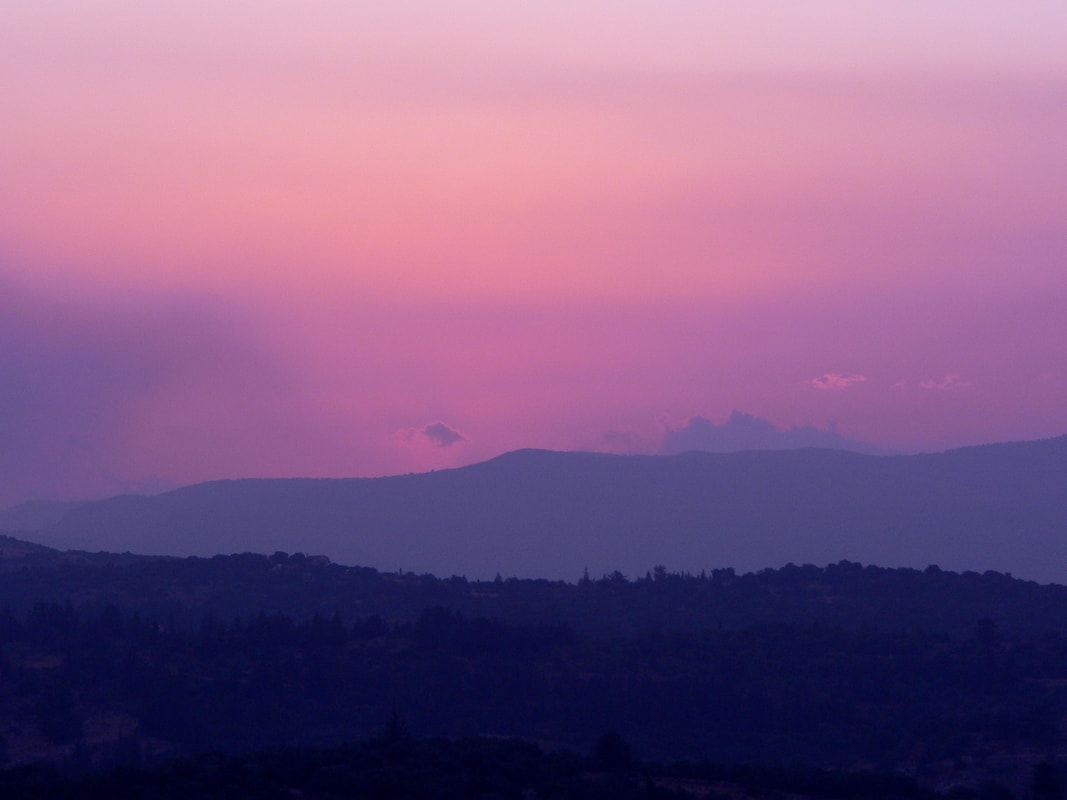
Feeling blue, blue Monday, dolly blue, blue suede shoes, Mediterranean blue, once upon a blue moon, Rhapsody in blue, Blue Valentine, blue yonder, listening to the blues, blue cheese, blue blood, sporting blue, Bluetooth, Picassos' blue period, blue light, blue airmail, blue beard, Blue Planet ... Blue is the colour of the oceans, the sky and many a swimming pool. An essential colour of nature, blue is probably the world's favourite colour. Cooling and calming, who doesn't feel that little more relaxed at the sight of a clear blue sky and a view of the sea? But it's not been an easy history for the colour blue - often undervalued and passed over for greatness, the ancient Greeks and Romans preferring black, white and red and often associated with barbarism - think of the early Celts smearing their faces and body with woad before going into battle. Only the Egyptians seemed to value the colour blue, where it was thought to dispel evil and bring prosperity. In the 12th Century, due to the influence of the church, many colours, including blue became to be seen as divine. It was around this time that the Virgin Mary was first depicted wearing blue robes and the colour began to be seen as a symbol of beauty, purity and wisdom and seen as a very feminine colour. The Chinese used to depend on Persia for the blue for their Ming porcelain and I always regard it a lucky day when I dig up a blue and white china fragment on my allotment! Blue is an easy colour to wear, the work-a-day blue jeans developed by Levi for the manual labourer are today's default 'off-duty' wear. All shades of blue are often used for uniforms from schools to the military, not forgetting 'the boys in blue'. It was synthesising indigo dye in 1860s that helped German chemist, Adolf von Baeyer win the Nobel Prize for Chemistry in 1905. A direct consequence of this was the catastrophic effect on the Indian economy and a decline in the demand for natural indigo, whilst the German chemical dye industry expanded and the profits undoubtedly help fund the German war effort. There's a lot of blue out there in the world and when you tilt your head and look at the night sky it's ever deepening shades of blue that you see but I'm left wondering, could this actually be sky blue pink, shot with a carrot?
Hazel & Terry
1 Comment
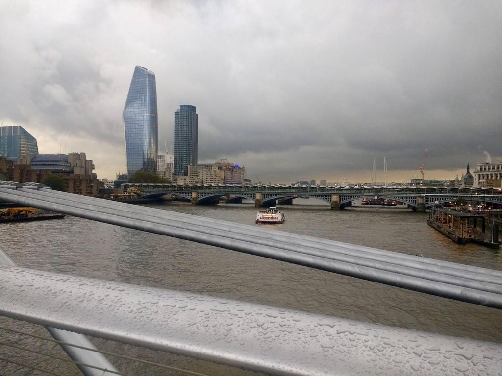
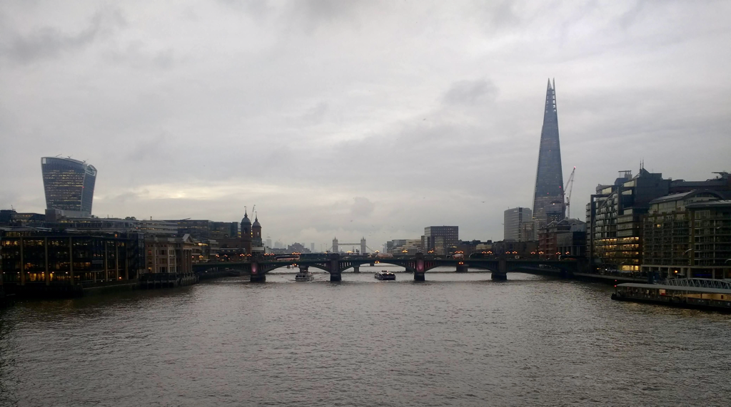
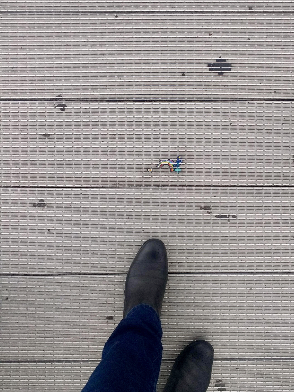
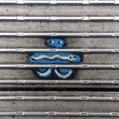
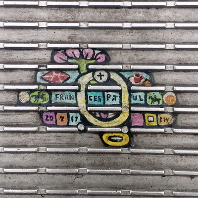
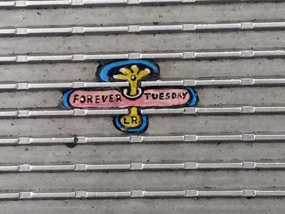
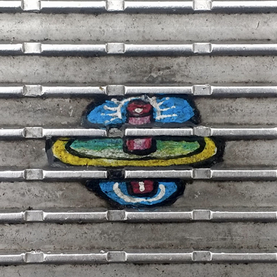
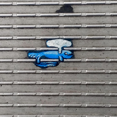
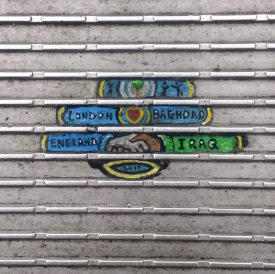
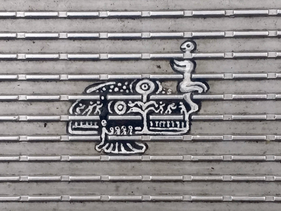
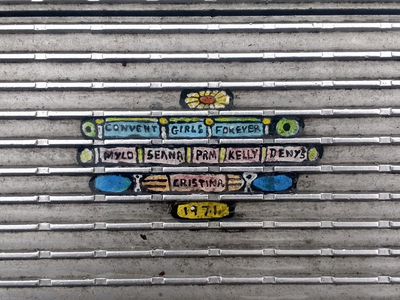
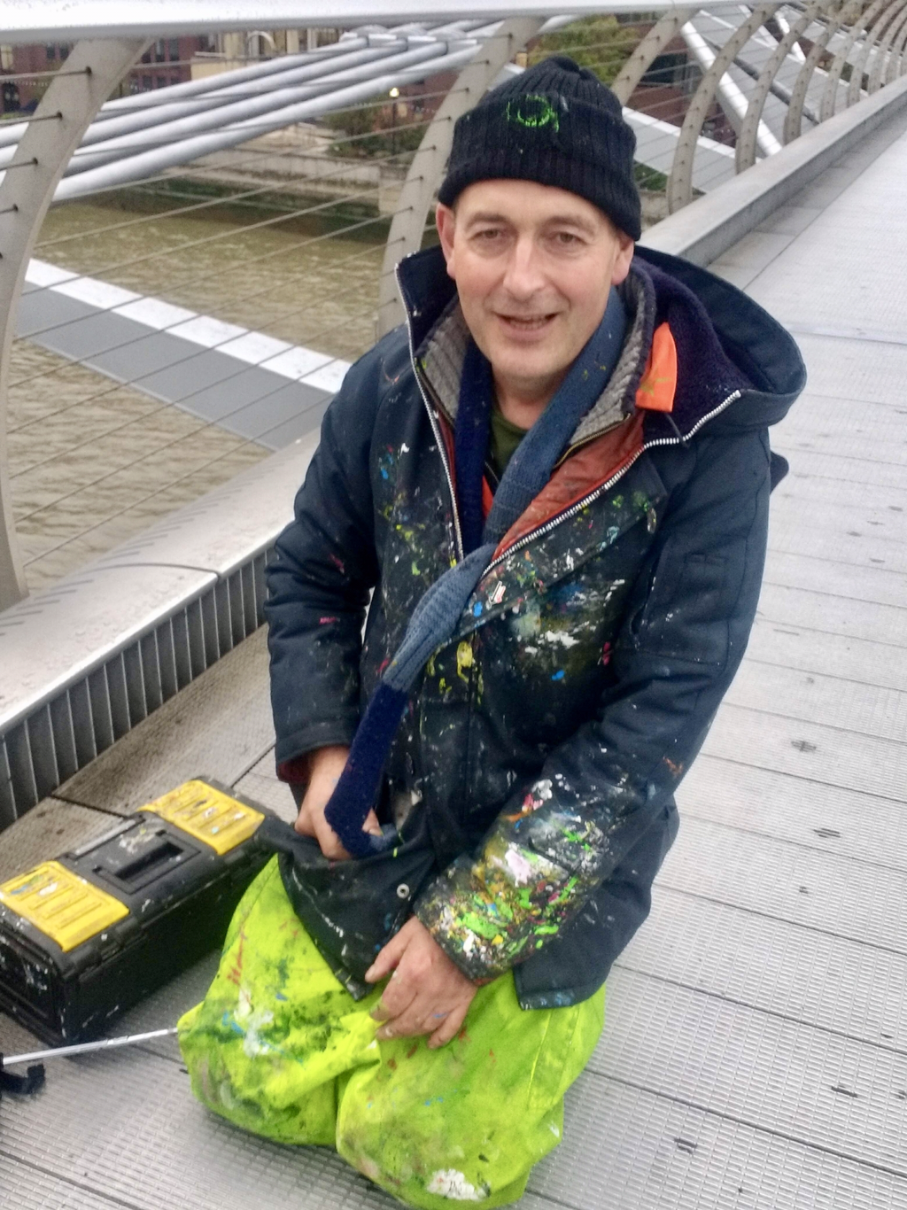
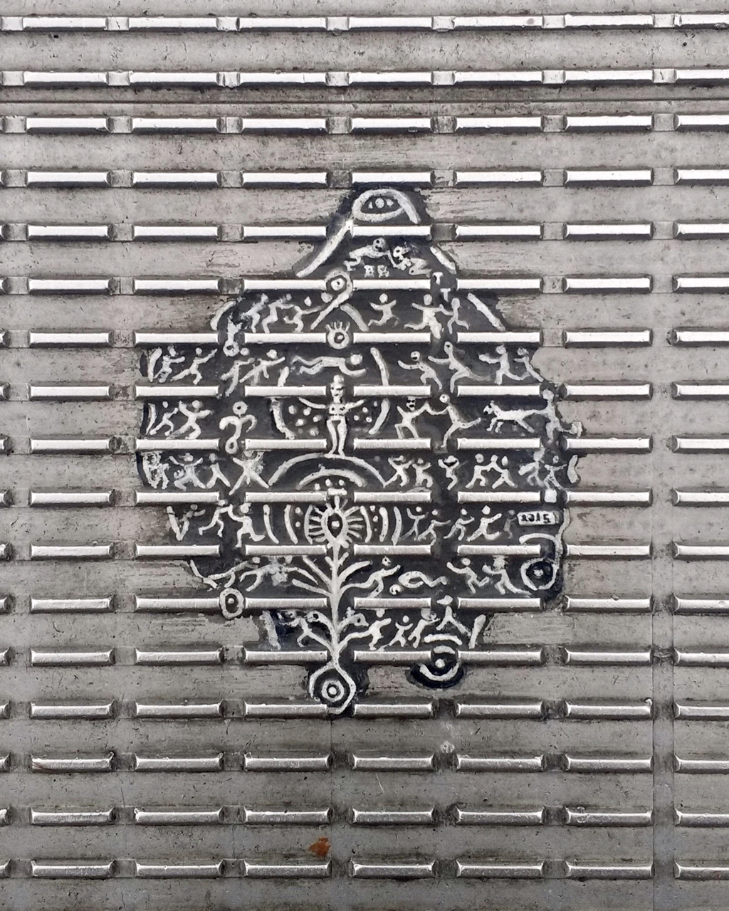
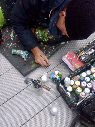
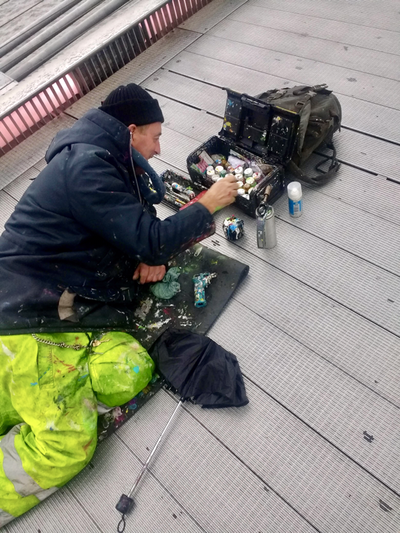
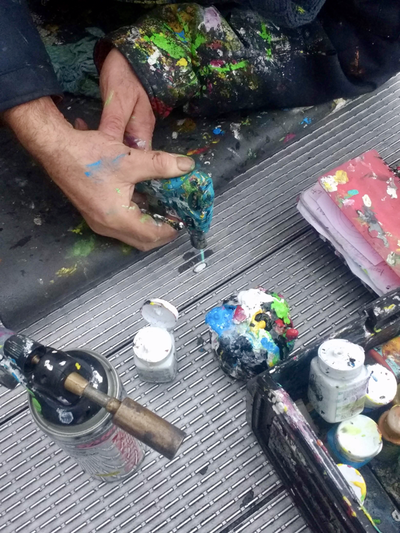
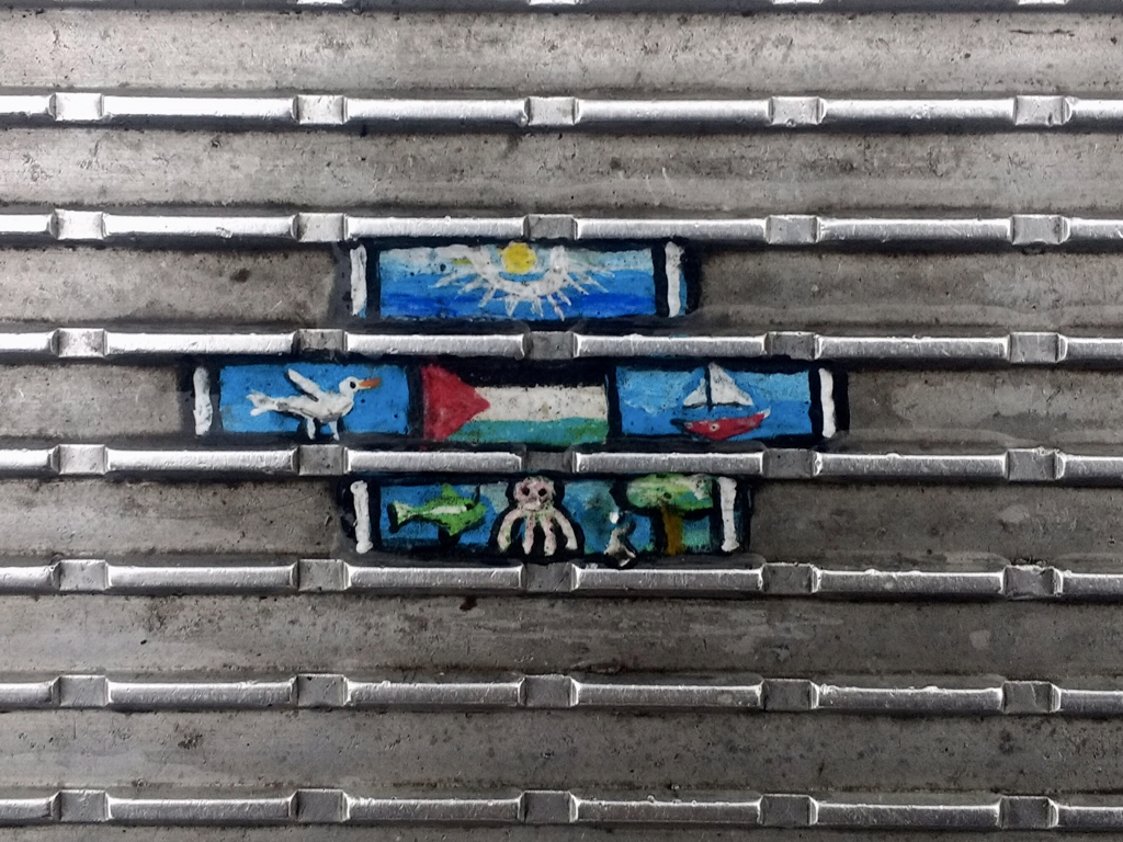
Yesterday we had a day out in London, first to catch the Frida Kahlo exhibition at the V&A and then we headed over to the Tate Modern to hear the curators talk about the newly opened Anni Albers exhibition. It wasn't raining, so we decided to walk from Blackfriars Station, across the Millennium Bridge, to the Tate. And quite a nice walk it was too. I always like crossing the Thames on that bridge, it gives you a marvellous opportunity to stop and look at London - with out being mown down by traffic. But how many of you ever look down and see where you are actually walking? I don't usually, but today I did and I'm glad, because I found something really quite amazing, and puzzling. I've been over the bridge many times before, but never spotted them; have you? They're all over the entire span. So there we both were, staring at the floor and wondering what they were, and more to the point, who had put them there. Was it some subversive form of advertising, a promotion for a Tate event or a new form of lovers declaration (remember the locks on bridges?)? Then I spotted this chap, so I asked him - 'is it you who does these?' And do you know what? - it was! How about that? Apparently he works all over the world making street art, so what were the chances that we'd see him today? Pretty slim I'd say! Chewing-Gum Man is actually Ben Wilson, an outsider artist. He creates tiny, and often intricate works of art by painting chewing gum that's stuck to the pavement, or in this case, a bridge. Ben creates work out of other's discarded rubbish all over the world, from London to Helsinki via the USA and Serbia. His art hasn't always made him very popular with the authorities, but he's not breaking any law because he's not defacing private property but merely painting rubbish! There's lots about him on t'internet if you Google him, I'm quite late to the party it seems! And the Anni Albers exhibition?
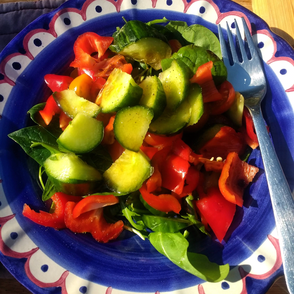
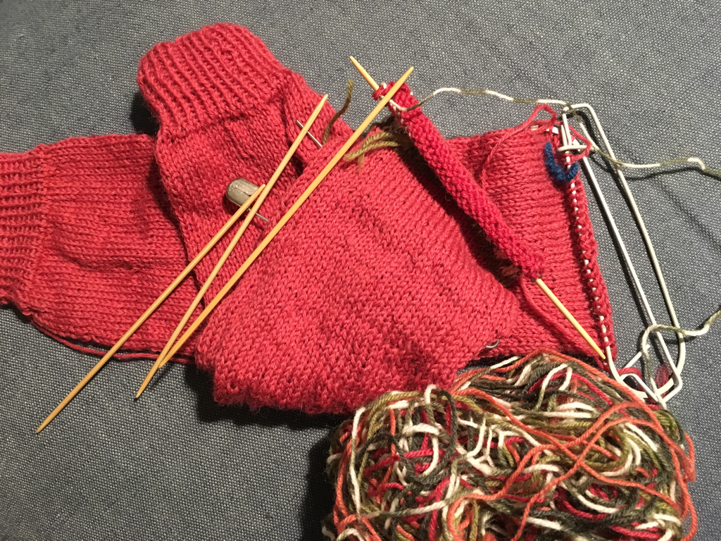
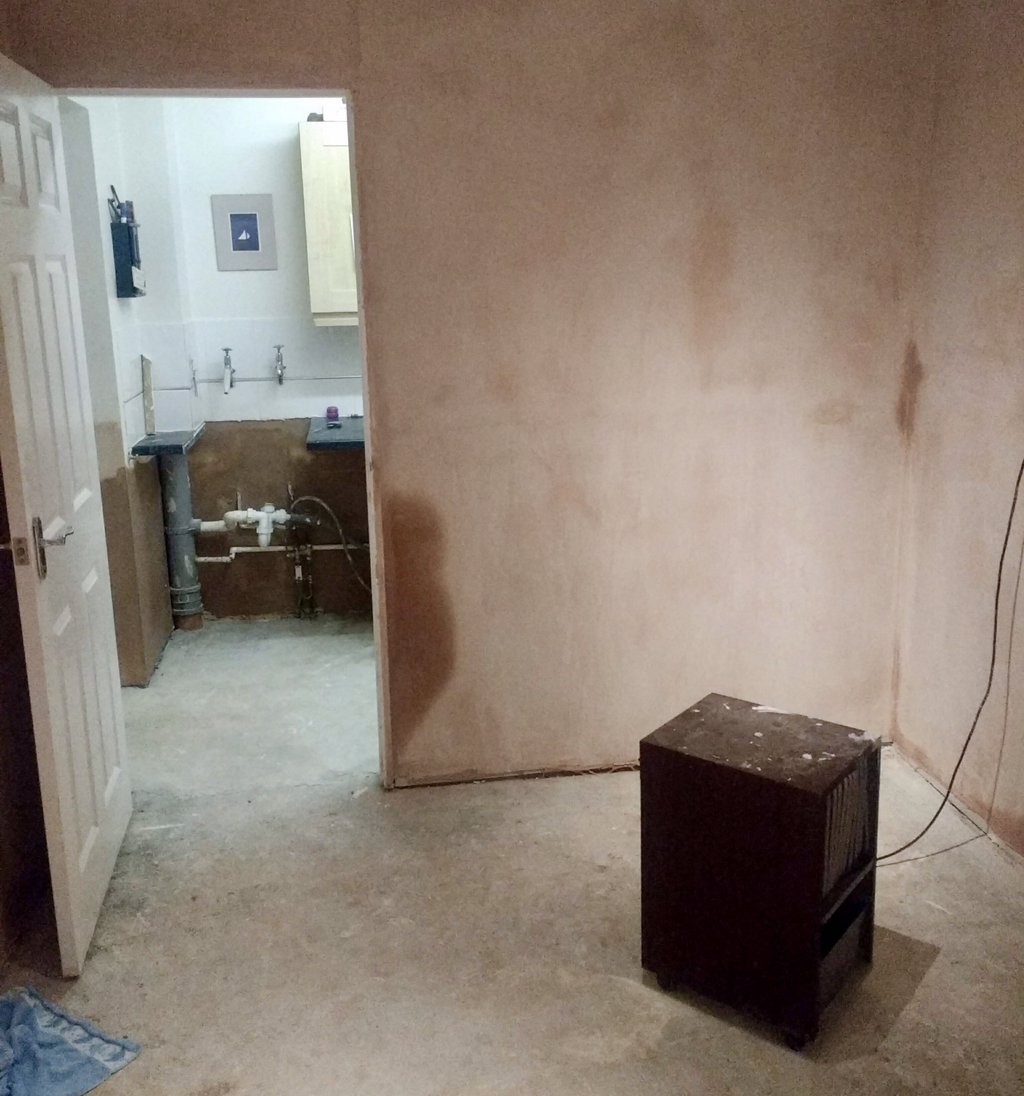
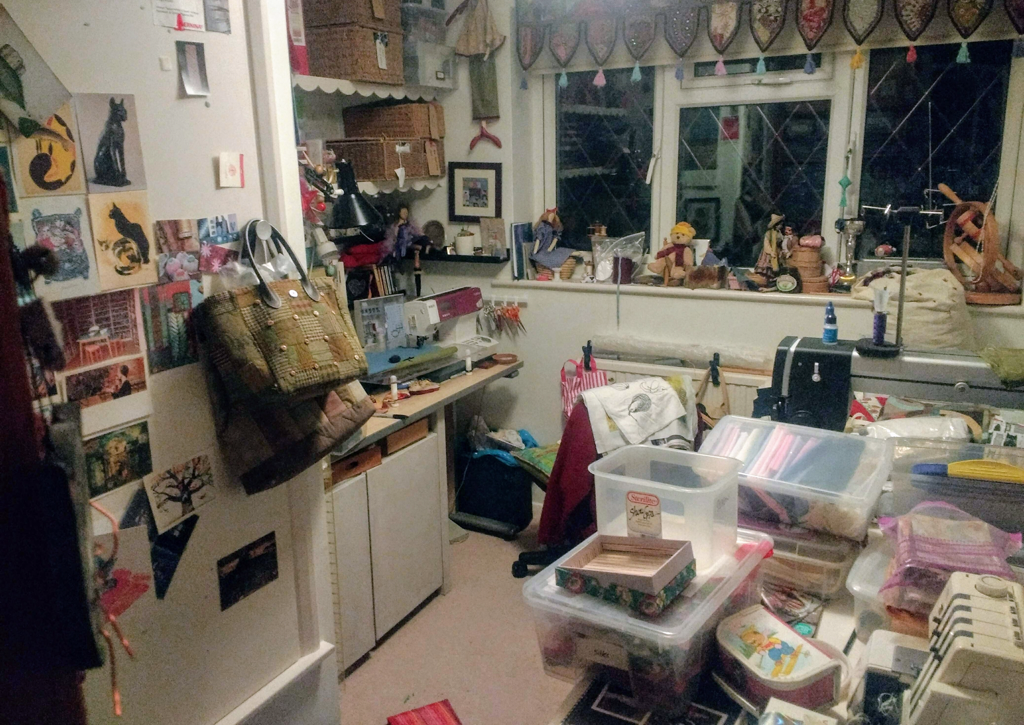
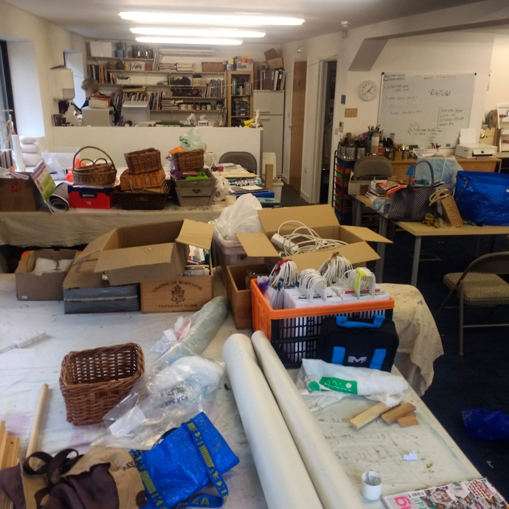
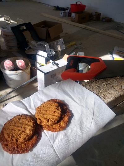
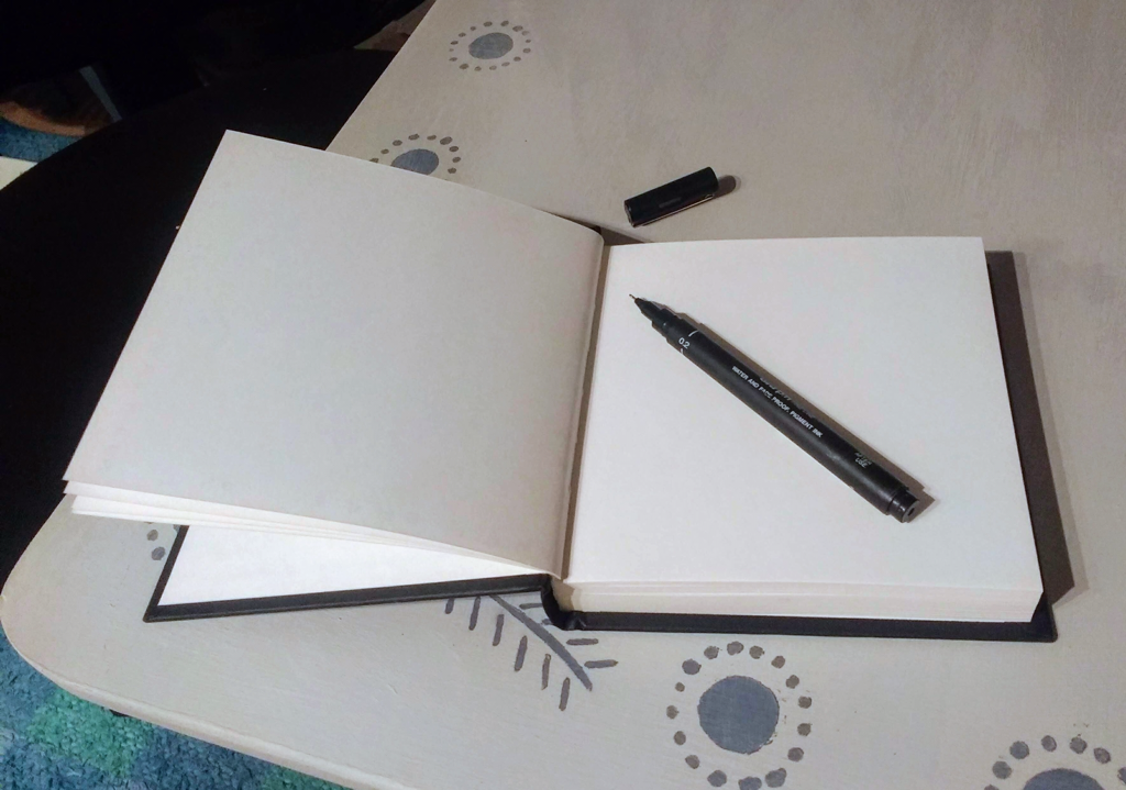
We never saw it, by the time we finally reach the Tate Modern the gallery had shut. So that treat will have to wait for another day! Hazel & Terry Yesterday it was 24 degrees in my garden and as I sat in the beautiful autumnal sunshine eating a salad lunch, after a morning spent gardening, it felt like summer could go on forever. How deluded was I. Today has been cold, damp and quite frankly miserable. True, Saturday looks a bit perkier, but there’s no denying, autumn is definitely on its way. Not before long some may say, but I have so loved these long warm summer days. Now it’s time to move back indoors and start thinking about some serious stitching projects. After the flurry (and I have to note, some success) of the three quilts I made earlier this year (if you missed them you can read all about then here, here and here!) I've been a bit lax on the sewing front it has to be said: too many cycling adventures, a lot of gardening, getting ready, setting up and taking InStitches to shows, and the knitting of socks (yes...really, doesn't everyone?!) Also taxing my brain was a certain tell-tale line slowly rising up my study wall. It certainly has put a dampener (#allpunsintended) on creative thought - take a look... How can such a 'tiny' leak create so much havoc? The whole of my study has spent weeks in the garage, Harry and Betty have been, quite rightly, flummoxed at times. But the plasterers finished today. Now there's 'just' a new floor, woodwork and full decorating to go and finally I shall have my study back. THEN I can begin creative work - surely?? True, I could have, of course, gone up to my workroom. But as you can see, the state of affairs in there isn't much better. In fact it's worse - only I can sort that mess out (actually, that's what happening, we all know you have to be messy in order to tidy up - don't we?) I know I also have a whole studio to play in...but quite frankly over the summer it hasn't looked that great in there either...if we'd been burgled I think they would have felt duty bound to tidy up for us! The new studio is progressing slowly, despite all the edible brides and encouragement. But all good things come to those who wait... (note: this picture was taken a few weeks ago and there's been a lot of activity - you'll just have to trust me on that one!) So there's nothing for it, I can't procrastinate anymore; no more excuses, I'm going to have to do what I'm always telling our students to do: get the sketchbook/workbook out, set an intention, make some notes and start exploring! I just need to begin... Carpe diem!
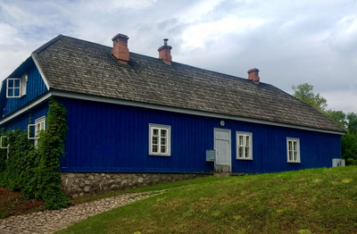
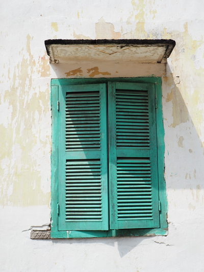
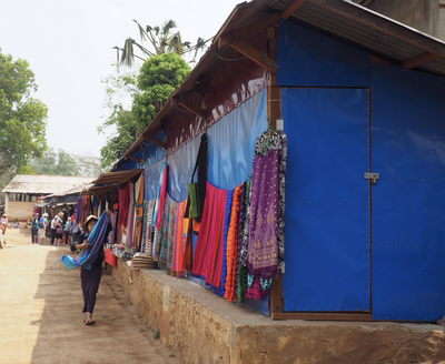
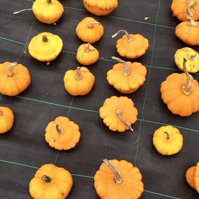
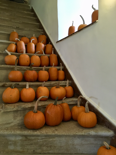
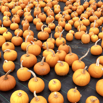
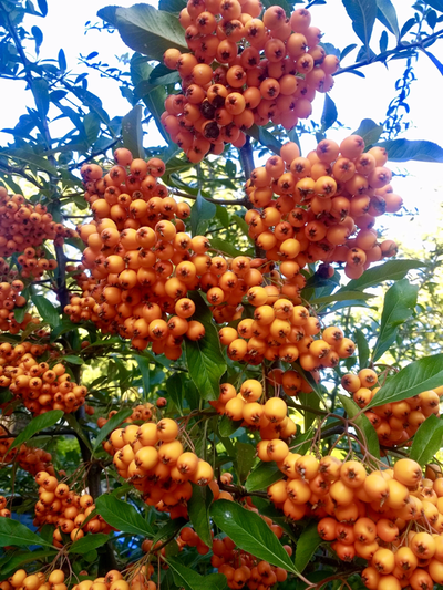
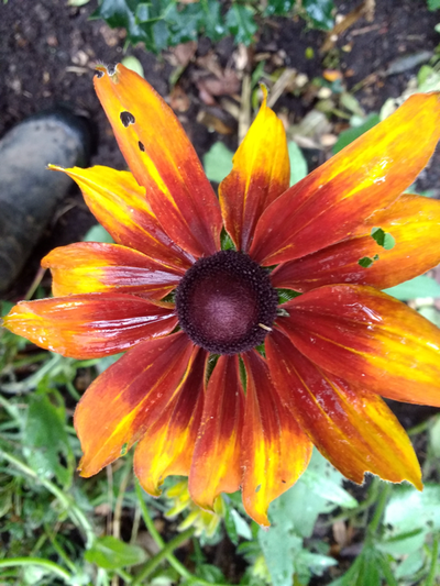
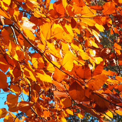
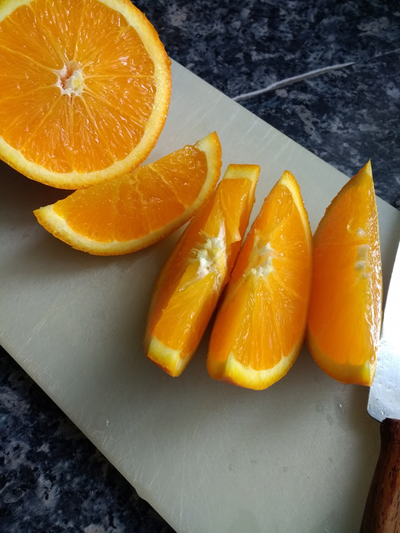
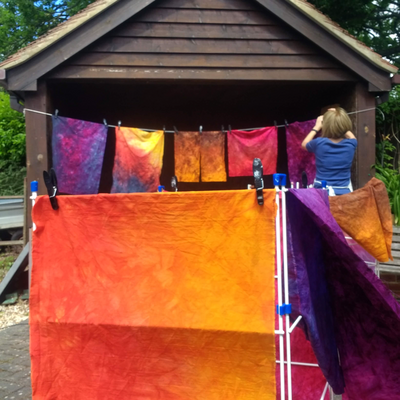
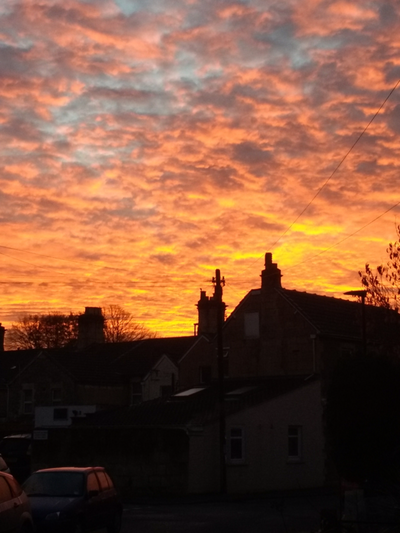
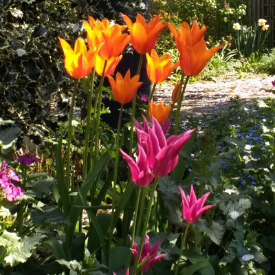
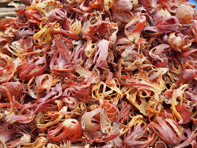
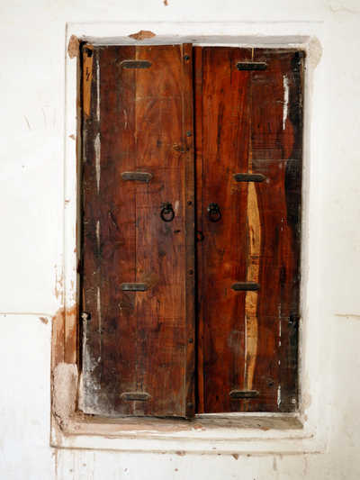
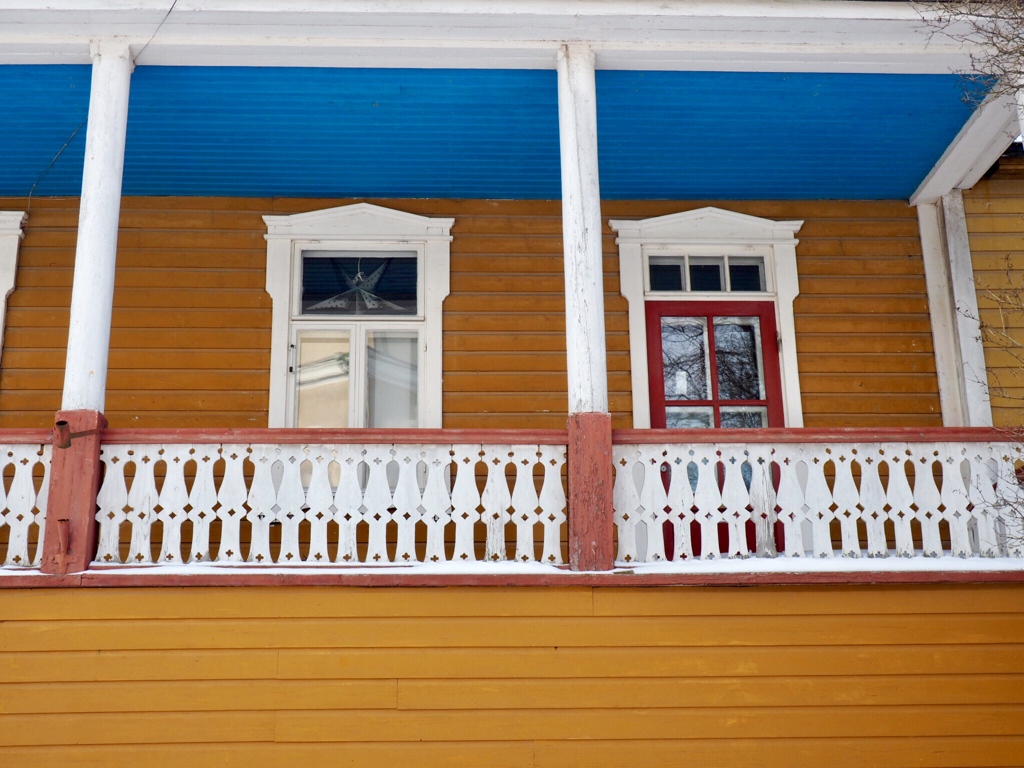
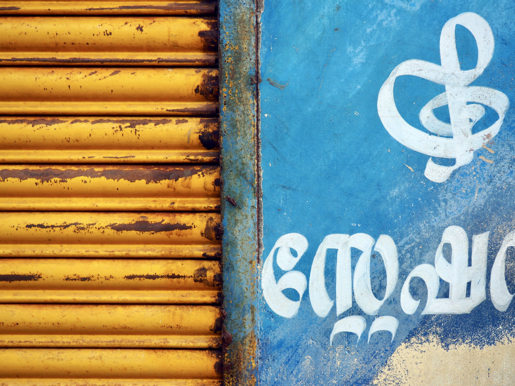
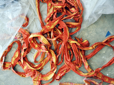
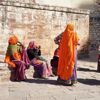
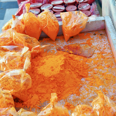
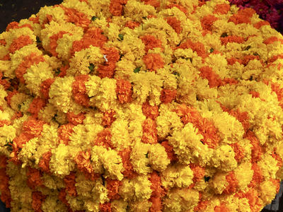
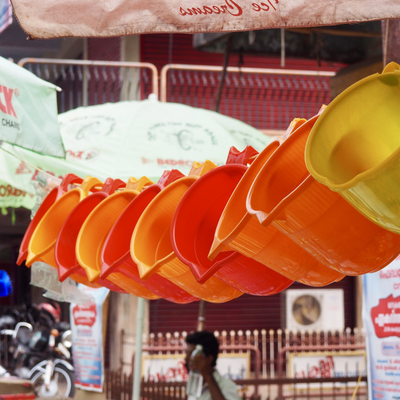
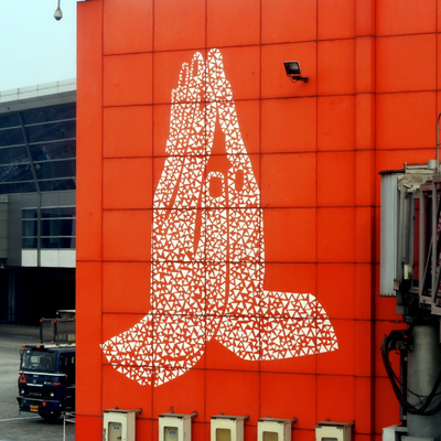
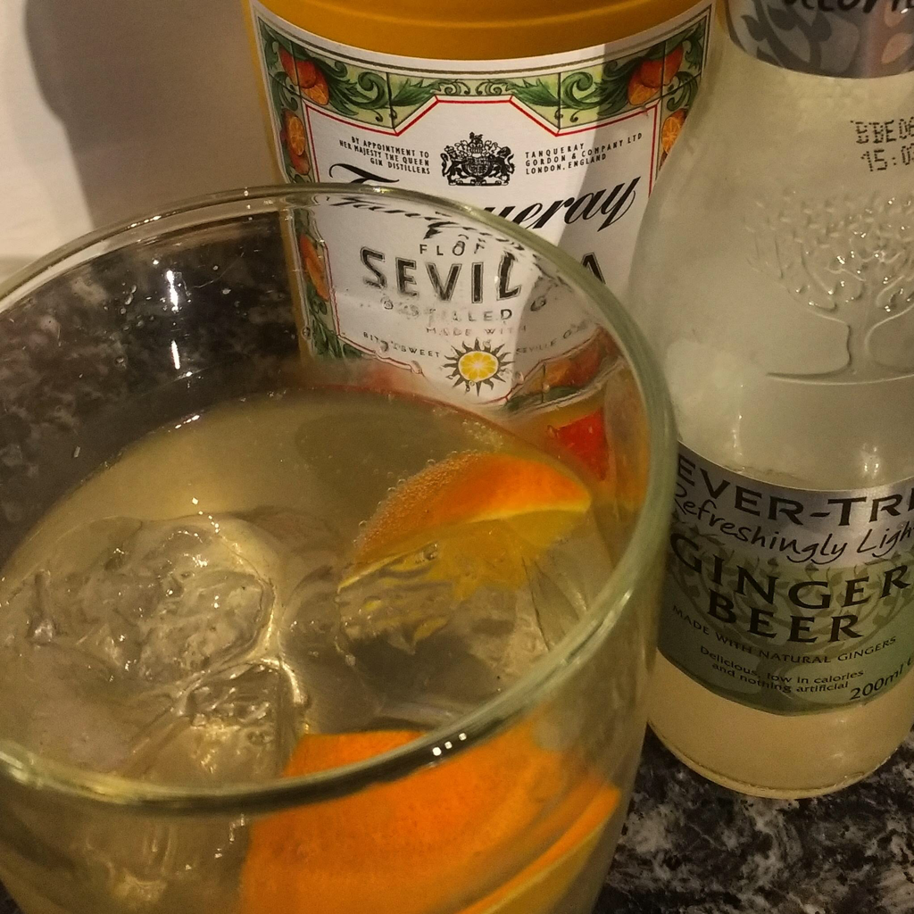
Hazel & Terry Dutch orange, saffron, amber, ginger, minium and nude. Coral, terracotta, peach, apricot and tangerine. Call it what you will, orange was described by Wassily Kandinsky (1866-1944) as 'warm red, intensified by a suitable yellow'. But I've had a love-hate relationship with the colour orange most of my life - is it because I'm a child of the 70's I wonder? Just like with blue cheese, red wine and olives though, as I've grown older I'm finding myself, however, willing to dabble with the odd flash of orange every now and then. It's autumn here in the UK, and at this time of year there's a lot of orange about, as Terry found when she visited Forde Abbey in Somerset to see the pumpkin and squash harvest ripening in the sunshine. Here in Hampshire the garden still has plenty of colour, with orange coloured flowers, leaves and berries galore. The colour orange is named after the fruit, which was probably first cultivated in China before spreading west across the world. In Sanskrit it is narangah, naranja in Spanish, orenge in French and of course orange in English; but it wasn't until sometime during the sixteenth century that orange was used as a name for the colour, up until then English speakers referred to yellow-red (geoluhread). Orange is a secondary colour, sitting between red and yellow and above brown in the colour wheel and seems forever in danger of sliding one way or another and often down below. Until relatively recently, no doubt due to the advent of digital mixing, it was difficult for the colour to appear 'pure' and in its own right. 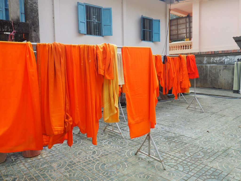 When paired with blue, its complimentary colour from across the colour wheel, the colour scheme is zingy and never dull - although I don't think the Buddhist monks were concerned at all about that when they hung their freshly washed robes out to dry in the court yard underneath the blue shutters! Just look at the stunning colour scheme of this traditional wooden house on the island of Suomalinna, just a short ferry trip from Helshinki, Finland and again here on a canal side tin shack of a shop in Kerela, India. Orange cloth, often associated with Hinduism and which would have originally been dyed with saffron, has been worn in parts of India for over 2000 years. The Hindu festival of Holi to celebrate the coming of spring sees children and young people throwing coloured paints everywhere. Originally the colour orange would have come from natural plant-based sources such as turmeric but nowadays it is increasingly a water-based commercial pigment; and hopefully washable! From the cheerful orange marigolds piled high on rugs laid out on the roadside, rows of bright orange plastic jugs strung across a market stall to the huge namaste hand gesture of greeting on the terminal wall in Delhi airport - the colour orange is everywhere across India. 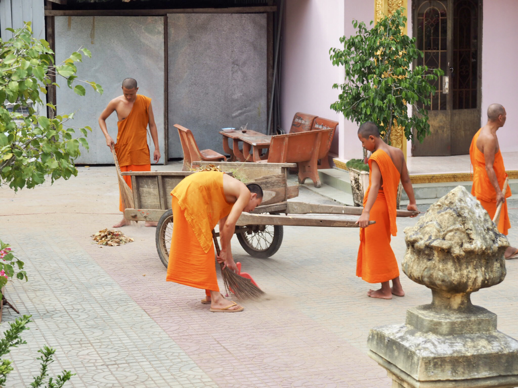 It's in many other far eastern countries too as I found out last year, as I cycled around Myanmar- it is also the traditional colour of Buddhist monks' robes. Many brands have harnessed the power and energy of the colour orange - Penguin, Lufthansa, TNT, Mastercard and MacDonald's, to name but a few. Festive, fun, happy and joyful. Optimistic, balanced, ambitious and energetic. Always flamboyant, warm enthusiastic and generous, vibrant, expansive and organic: orange is a versatile colour. It's the national colour of The Netherlands and their royal family is the house of Orange-Nassu; in Thailand it is the symbol of Thursday. And it's the colour of a perfect sunset. So let's raise a glass, perhaps a Seville Gin garnished with a slice of fresh orange?, and toast the colour orange - have a happy weekend!
Hazel & Terry |
Welcome to our blog! Here you'll find out what's been going on, plus plenty of ideas and inspiration and the odd cake recipe! Check back often to see what we're up to - it's great to have you along Hazel & Terry Categories
All
Archives
June 2020
|























 RSS Feed
