InStitches Creative Textile Courses
  • Home
    • Contact us
    • The Small Print
    • Privacy policy
    • COVID-19 information page
  • About us
    • The story of InStitches
    • How to find us
    • Want to stay locally?
    • News and events
    • What our students say
    • Gallery
  • Courses & workshops
    • Courses and workshops at a glance
    • short courses and workshops >
      • Artful Stitch
      • Free Motion Quilting
      • Colour to dye for workshops: Adding colour
      • Colour to dye for workshops: Adding marks & pattern
    • Studio Days
    • Inspiration to Stitch
    • Stitching by Design
    • Bringing colour to life
    • Textile adventures >
      • Guest tutors 2021 >
        • Liam Biswell - Experimental Printmaking
        • Debbie Lyddon - stitched collage 2021
        • Wendy Dolan - Architecture in stitch 2021
        • Judith Needham - weave your own chicken
        • Cas Holmes - Layers, lines and image 2021
        • Stewart Kelly - Following a line
        • Christine Chester Poetry of decay
        • Caroline Bell - eco printing on fabric Masterclass 2021
        • Amanda Clayton - Fragile Forms
        • Judith Needham - Willow apple basket
        • Caroline Bartlett - An Investigative Journey
        • Amanda Hislop - Abstracted Land 2021
        • Alice Fox - Natural Structures
        • Matthew Harris - Text-ile
  • Workshop Gift Vouchers
  • Shop
  • Blog
    • On our travels

Creative warm ups: drawing without looking

28/6/2018

0 Comments

 
I’ve been on Auntie duty this week and my three nieces are all dedicated creative play girls – paper and pencils, cutting and crafting and glitter - lots of it, everywhere. And now, care of the 12 year old, this summer will feature slime production on an epic scale– don’t ask, just Google it!

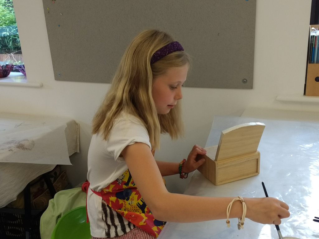
But have you ever watched young children when given a selection of paper and coloured pencils/ empty boxes and glue/ scissors and a bag of fabric scraps - there’s no hanging back! They’re straight in and off into their own creative world, making up drawn stories, building the next generation of intergalactic space craft or crafting clothes for teddy. To them they are just having fun, seeing what they can do, enjoying themselves: there’s no ‘I can’t draw’, ‘I’m no good at…’ or ‘I don’t do art’.

Picture

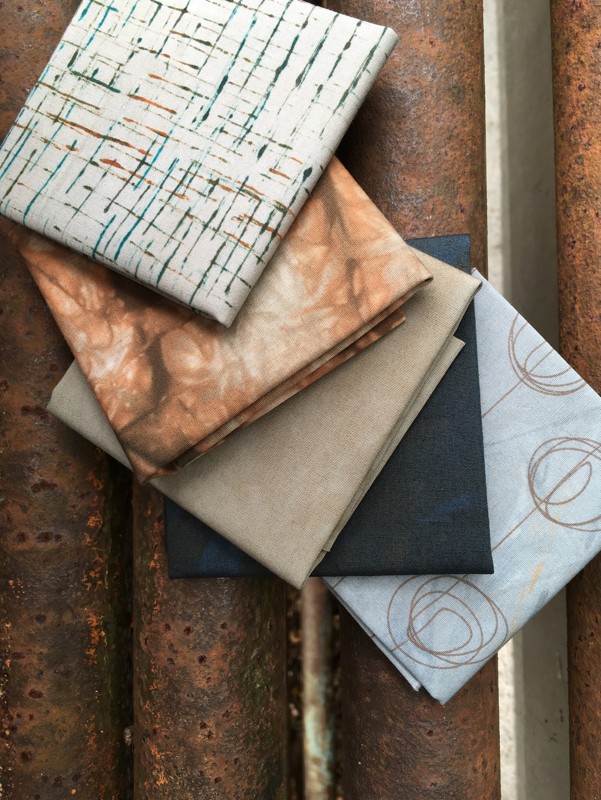
Why should the little people have all the fun? Our mission is to create courses for people who love stitched textiles, design and sketchbooks: we want to inspire you to a more creative life! However we know that not everyone can come on one of our year long courses and we also know sometimes it can be difficult to get started – you know the story: everyone wants a piece of your time, there’s nowhere to call your own creative space, you can’t summon up the energy.

So, how can we help? Well, we thought we’d share some of our simple creative warm-ups with you: see if we can tickle those creative juices, point you in the right direction or at least delay the ironing mountain for 10 more minutes. Go on, join in – you never know where it might take you!

Drawing without looking

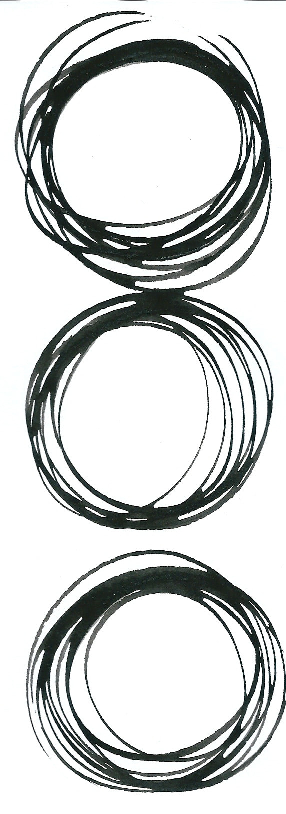
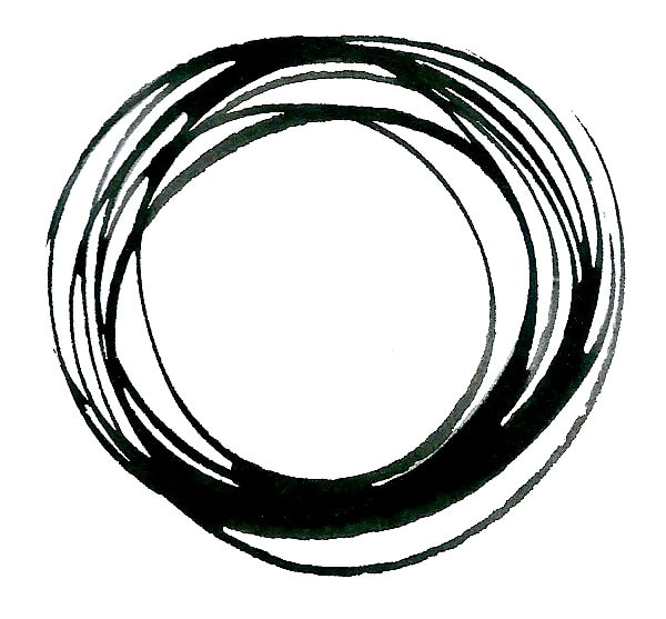
We both love this warm-up and use it frequently with our students. It’s a great way to improve your observation skills.

For this you will need a large sheet of paper – about A3 size, a couple of pens, one thin-nibbed and one thick (we like Sharpie markers, but remember they can go through the paper!), a few things to draw – keep them simple everyday items eg, banana, mug, pen, your hand etc.


Picture
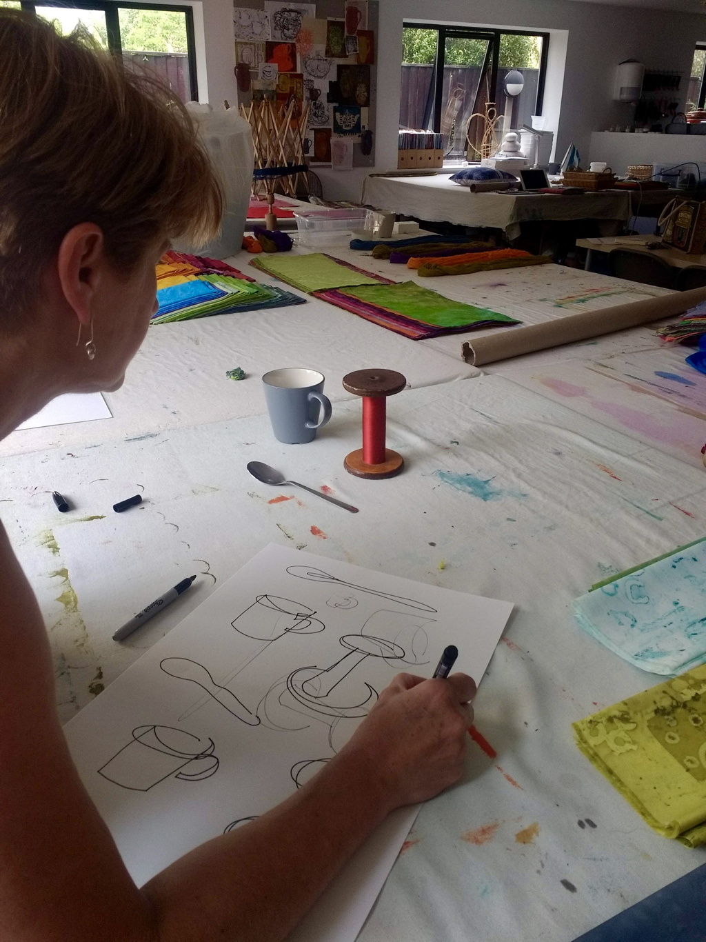
Without looking at your pen or your paper, use your eyes to “trace” the edges of the object, while, at the same time, using your pen to draw the outline in a steady, continuous line.

Don't look at your paper, and don't lift your pen!

Go slowly...

Picture

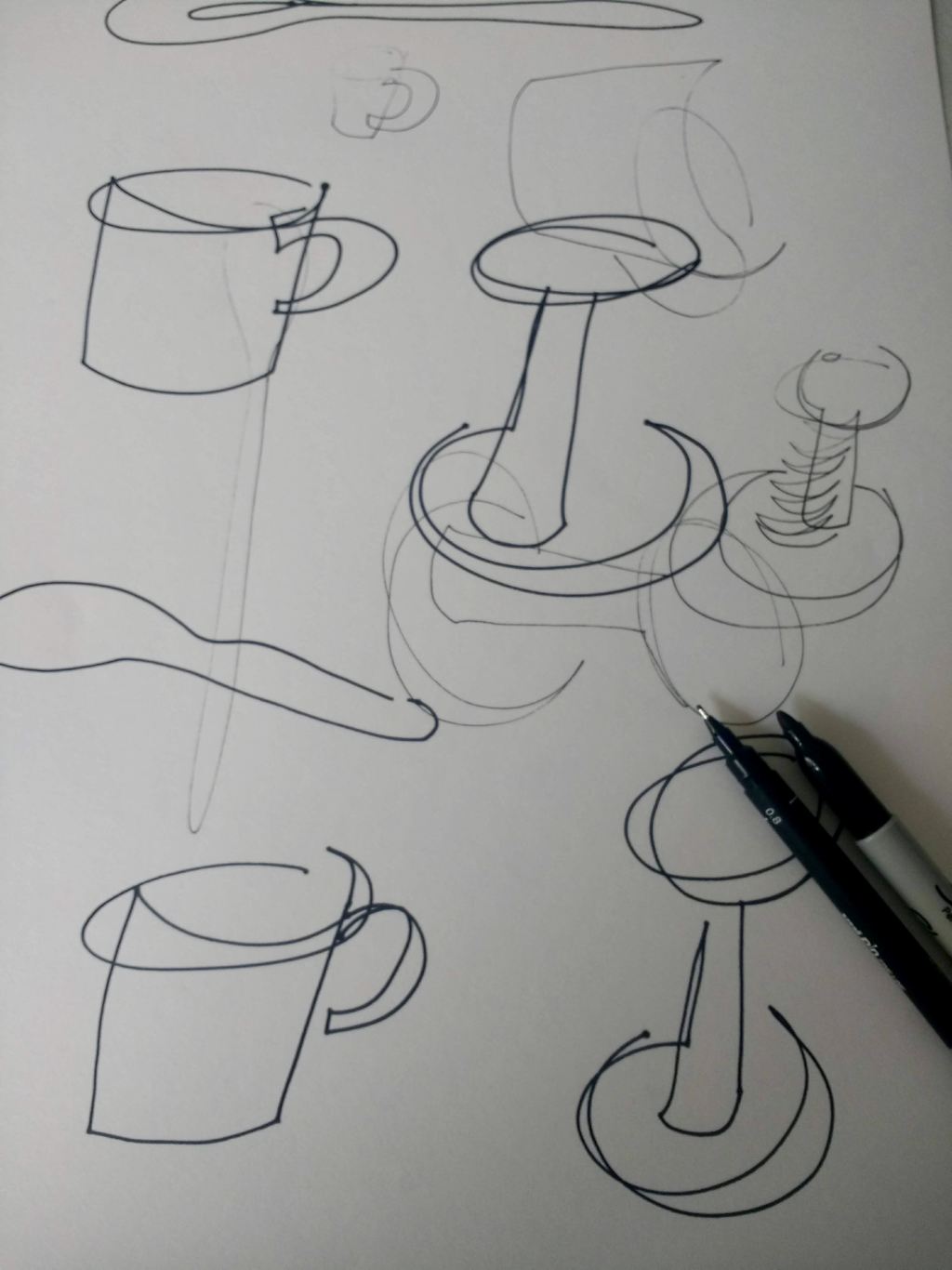
Your drawing probably won’t look anything like the object. That’s okay! However you’ll find that if you repeat the exercise several times (no need for a new piece of paper, turn your page around, over or upside down!) you’ll find your accuracy improves – you may even recognise the object you’ve drawn!

If you give it a go do write us a comment and let us know how you got on!

Hazel & Terry
0 Comments

Bringing colour to life: Pink

21/6/2018

0 Comments

 
Welcome to our new occasional series on colour - despite the fact we're usually to found dressed in various shades of blue we're fascinated by colour!

Picture

The first colour we've chosen is PINK, one of the youngest colour names. First referenced in The Oxford English Dictionary in the late seventeenth century as a colour to describe pale red, in the English language it was firstly the name of a delicate small variety of carnation, a member of the genus Dianthus, before being used as a name to describe a colour.

I don't grow pinks but there were plenty of other pink flowers in my garden this spring - from the delicate blossom on the apple tree, in the many pots of tulips and who could forget the amazing camellia? It started flowering just before Christmas and carried on until March was nearly through
and of course: Peony worship - you can never have too many peonies, *sigh* my favourite flower.
A blend of red and white, pink brings a softness to the colour palette but in the 21st century it's having a bit of an image problem, partly due to the backlash against old-fashion sexism. I still recall my own daughter crossly commenting on the commercial 'shrink it, pink it' mentality in the market place. But is pink really just for girls? It wasn't until the 1920s that western culture began to associate colours with genders; until then boys could often be seen dressed in pink, perhaps because it's related to red it was seen as a more masculine and decisive colour. Actually, thinking about it, I do quite like to see a chap in a pink shirt!
A couple of years ago we spent time in Jaipur, the pink city, in Rajasthan, India with its towering forts and temples glowing pink in the hot sun
shocking pink will always remind me of northern India.
We use many words to describe pink: blush, rose, shell, baby, shocking, fuchsia, magenta, puce, salmon, sugar, candyfloss, skyblue pink and even Barbie, to name just a few.

There's the pink of the London Financial Times, ‘in the pink' from the fox-hunting tradition and of course, the smallest finger on your hand is your 'pinkie'. Goodness, you can even be tickled pink! Interestingly though, pinking sheers have nothing whatsoever to do with the colour, but they are named after the genus Dianthus because the cut they produce resembles the flower petals. Neat, in all senses of the word!

Love and romance, sweetness, compassion and friendship, soft and tender: is Pink the colour for you? We certainly hope it is as this week we’ve dyed enough of it just for you!

Best wishes, until next week,

Hazel & Terry

0 Comments

The story behind the quilt: Pink Floyd this way

14/6/2018

2 Comments

 
A couple of years ago I travelled around India and spent some time in Rajasthan. Wherever I travel I take hundreds and hundreds of photographs and very often I come home, unpack, stick the laundry on and then don’t do anything with the images. Until, that is, when the 2018 Contemporary Quilters’ In Print challenge was announced.

The peeling, shabby walls of India tell their own stories and the walls of Pushkar were no exception. Wandering the back streets one afternoon, camera in hand, photographing anything and everything I took a series of images and it was these which were to become the starting point for my quilt.

This part of Pushkar had definitely seen better days - black mould crept across the once white walls, the paint worke was peeling and tatty posters and handbills were stuck everywhere. Graffiti spread like a rash. Much to the amusement of my fellow travellers and accompanying guides I often photograph graffiti. From Cambodia to Vietnam, Myanmar to India I’ve photographed a lot because, I don’t know about you, I think that when it’s in a script I can’t read, a lot of it, far from looking destructive, looks creative! The pattern of these words inprinted on the walls are telling stories often only know to the writer.

If you’ve followed the blog for awhile you’ll know I often photograph doors, walls, windows and now graffiti! So out came the photographs (actually, on went the computer – isn’t that where all photographs are stored nowadays?) and these two images immediately caught my attention. I remember photographing them and being amused – Pink Floyd, playing here, right here in the back streets of Pushkar, really?! Absurd, but it tickled me that’s for sure.

Picture
As with all the CQ challenges there is a size restriction and for this challenge it was 100cm x 45cm in either a horizontal or vertical format. I tried both and ended up selecting horizontal which meant I had to modify my original ideas, but it made me focus!

First step was to fuse the two images, nothing technical, I simply printed them off onto normal copy paper, married them up and glue them into place and rephotographed them!

Picture

This fused image was then uploaded to Adobe Sketch on my iPad. This app allows you to have different layers so I was simply able to trace marks, shapes and text . SSSh! No drawing required...

This whole cloth quilt is a piece of vintage linen. To create the rusty marks for the door I draped the fabric in a large plastic tray, the rusted objects (and we have quite a lot at the studio!) were strategically placed on the door area, as well as littered over the rest of the ‘wall’ surface and then I poured over black tea. It’s the black tea combined with the rust which gives the grey, black and finally rusty marks which I needed for the first layer of colouring. This is definitely a quilt of layers!

Picture
Once I’d rinsed and dried the fabric the door area’s rust marks weren’t as distinct as I’d hope for. Balancing nails on their head for the nail marks isn’t an easy task! What is easier is to dip a nail into pva glue, print the required mark and sprinkle with rusting powder before spritzing with a water /vinegar mix. The cup of ground coffee which had gone cold by this time was useful for adding extra colour to the door ‘wood’. Nothing goes to waste when you’re being creative!
Picture
Machine stitching came next to give structure to the door with hand stitching to blur the edges. Then it was time for another layer of paint. White opaque fabric paint, mixed with puff paste, was sponged onto the wall area and then heat set to expand – I was after that slightly blown, bubbly texture of old painted wall. The creeping damp was created by sponging over black fabric paint.
Picture
I’d already ‘traced’ the text in the Adobe Sketch app so it was a simple step to create cut file and send it to the Cricut for cutting as a stencil. A couple of test runs using copy paper were needed to find the correct size (the separate arrow was tricky!) before I then set it to be cut in freezer paper. The Cricut has been in the studio for quite awhile but it’s a struggle finding time to play with it and put it through its paces. We have it for making repeatable stencils as it’ll cut through a wide variety of materials so I’m sure that once I’ve figured it out it’ll be a brilliant tool to have at our disposal.....

Anyhow, freezer paper stencil ironed into place, it was time to add colour with Markal oil pastels. I over did the black slightly so then I had to used several cotton buds to carefully remove some. Curing takes a couple of days before I could start stitching. For a little quilt there was a lot of hand stitching to create the surface texture, thank goodness for tv box set!

I didn’t want a visible binding so chose to apply a facing to finish the edges. The last step was to apply, using red Markal pastel and a stiff brush, the red graffiti numbers.
Picture
I’m pleased to say it was juried into the In Print exhibition and you can see it at a variety of venues around the UK until spring 2019. At the moment it’s at the Forge Mill Needle Museum in Redditch and at the end of August it’ll be at the West Country Quilt and Textile Show, which is where I will catch up and see the whole collection.

Bye for now,
Hazel& Terry
2 Comments

Colour from the streets

8/6/2018

0 Comments

 
Where do you find your colours ?  Flowers, fruits and natural landscapes are often used as inspiration, but have you ever thought about looking at the hard landscape - the buildings, the roads and man-made structures?
From Wakefield to Bath via the Mekong Delta.
The peeling, the rough and the weathered
or the modern, the reflective and the graffic?
You can see how we've been inspired in our new range of fabrics - Sticks & Stones, which will be available to buy on our stand at this summer's shows.

Until next week it's back to the print bench, there's still plenty to do!

Hazel & Terry


0 Comments

The story behind the quilt: Black across the Sun

1/6/2018

0 Comments

 
​Following on from Hazel's post last week, here's the story of my quilt, Black across the Sun II, which will also be travelling with SAQA's Wide Horizons VI ​exhibition later this year. One of the things that is good about this exhibition is that the call for entry allows older pieces to be entered - up to three years old in fact. Which meant that this quilt of mine which was originally made for a Grosvenor exhibition of my work in three of their southern quilt shows gets to be seen by a wider audience.
Picture
Black across the Sun II
This quilt is an attempt to depict the strange feeling you experience during an eclipse - right at the point of totality, and the route by which I came up with the design is quite convoluted!

To go right back to the beginning, a while ago Contemporary Quilt, one of the specialist groups of the Quilters' Guild, had an exhibition where the theme was Dislocation. They specified dimensions of 50x120cm, but I also wanted to try out a square format. ​Although this is the second quilt in the series, and not the one I made for the CQ exhibition, they have a shared story.
Picture
Black across the Sun
​It took me a long while to think of something to do for this theme. I knew couldn’t involve the obvious interpretations using bones and X-rays or displaced peoples and refugees as I have no experience of these. Having been a nurse in a former life I was thinking about the odd feeling people experience when coming round from an anaesthetic (I have no direct experience of this either!). While I was working I was listening to a prog rock song called Anesthetize by the band Porcupine Tree (don’t ask!). I usually listen to music while I work, but I have to know the lyrics well, otherwise I spend my time trying to work out the words and no work happens! On this day the words crept into my consciousness and I realised they could be describing an eclipse.
I remembered my experience of the eclipse in the UK in 1999, seen at its full extent only in parts of SW Cornwall and South Devon. In the middle of the day the sun was obscured; there was an eerie quiet darkness, with no birds singing or flying and a strange otherworldly landscape - not quite dark, but definitely not normal. This was a sense of Dislocation that I could relate to. I researched the phenomena which accompany an eclipse and learned a lot in the process, and this enabled me to develop ideas and imagery for the quilts.
Circles and scribbled rings have long been one of my go-to symbols when I'm at a loss for what to draw: they're very versatile and can represent pebbles, shells, fossils, or the cycle of life and many other concepts, so my sketchbook already contained marks and ideas that I could use for this piece.  Luckily in my stash were several black fabrics, mostly hand-dyed in various combinations of black and brown, which were great for printing with discharge paste to remove the colour.

I created the main fabrics for the pieces using monoprinting techniques for the large fractured rings,  freehand drawing with a needle-nosed bottle for the smaller rings and zig-zags and Thermofax screens of some of my sketchbook pages of texture and rings for the positive and negative prints on the supporting fabric. I added in a breakdown printed fabric and a 'plain' dyed blue for a pop of colour in the thin shards which fracture the surface at intervals. ​
​The textured fabric was printed using a Thermofax screen of one of my sketchbook pages containing a text exercise that I love. Start by writing words or a phrase repeatedly to cover the page in one direction (then turn the page through 90 degrees and write it all again; repeat this twice more and the words will no longer be legible, but will read as texture. This is a great way of adding layers of meaning to a piece.
 
I constructed the quilt with simple strip piecing, free-cut so that the strips tapered to nothing. The machine quilting developed from a phenomenon called shadow bands - thin shafts of scattered light from the edge of the eclipse, and I used a variegated black and white thread - normally too high contrast for me, but perfect for this quilt. The centres of the large circles are hand quilted with black crosses or FMQ'd with a spiky vermicelli, and some hand stitched orange circles in the text areas echo the circle on the sketchbook page which remarkably come out on the Thermofax screen (usually only black and white is reproducible).
Picture
The water so warm that day
I was counting out the waves
and I followed their short life
as they broke on the shoreline
I could see you, but I couldn't hear you
You were holding your hat in the breeze
turning away from me
In this moment you were stolen
There's black across the sun

Anesthetize part 3 © Steven Wilson 2006
0 Comments

    Welcome to our blog! Here you'll find out what's been going on, plus plenty of ideas and inspiration and the odd cake recipe!

    Check back often to see what we're up to - it's great to have you along

    Hazel & Terry
    Picture

    Enter your email address:

    Delivered by FeedBurner

    RSS Feed

    Categories

    All
    #10minutedrawingproject
    And There Was Cake!
    Artists To Inspire You
    Blog Changeover
    Bringing Colour To Life
    Colour
    Craft Ptoject
    Creative Play
    Creative Warm Ups
    Creative Warm-ups
    Festival Of Quilts
    Finding Inspiration
    How To...
    Inspired By Cloth
    #institchescreative2020
    Line
    Places To Inspire You
    Quilt Shows
    Text
    Texture
    The Story Behind The Quilt
    Tools Of The Trade

    InStitches travelblog
    InStitches textiles travel blog
    Picture
    Picture

    Archives

    June 2020
    May 2020
    April 2020
    March 2020
    February 2020
    April 2019
    March 2019
    February 2019
    January 2019
    December 2018
    November 2018
    October 2018
    September 2018
    August 2018
    July 2018
    June 2018
    May 2018
    April 2018
    March 2018
    February 2018
    January 2018
    December 2017
    April 2016
    March 2016
    October 2015
    September 2015
    August 2015
    July 2015
    June 2015
    May 2015
    April 2015
    March 2015
    February 2015
    January 2015
    December 2014
    November 2014
    October 2014
    September 2014
    August 2014
    July 2014
    June 2014
    May 2014
    April 2014
    March 2014
    January 2014
    November 2013
    October 2013

    Visit InStitches's profile on Pinterest.
InStitches: exciting courses for people who love textiles, quilting, design, stitching and sketchbooks

Connect with us

follow us on Facebook
read our blog
Instagram inspiration
Pinterest pinnings
newsletter signup
follow us on Facebook
read our blog
Instagram inspiration
Pinterest pinnings
newsletter signup

Courses and workshops

Courses and workshops at a glance
Short courses and workshops
Longer courses
Guest tutors 2020
Guest tutors 2021
​Studio days

InStitches

About
How to find us

Support

Contact
​
The small print
Privacy policy

Our address

Sunfield Studio,
Unit 12, Sunfield Business Park
New Mill Road
Finchampstead
Wokingham
RG40 4QT
We support
Just a Card logo
Copyright © InStitches 2010-2020
All rights reserved.