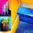
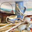
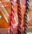
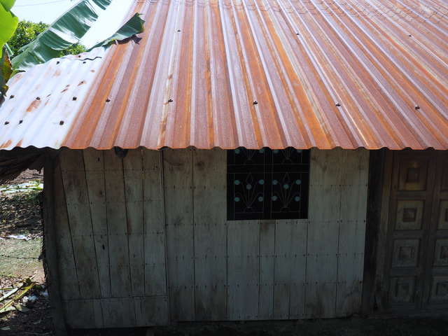
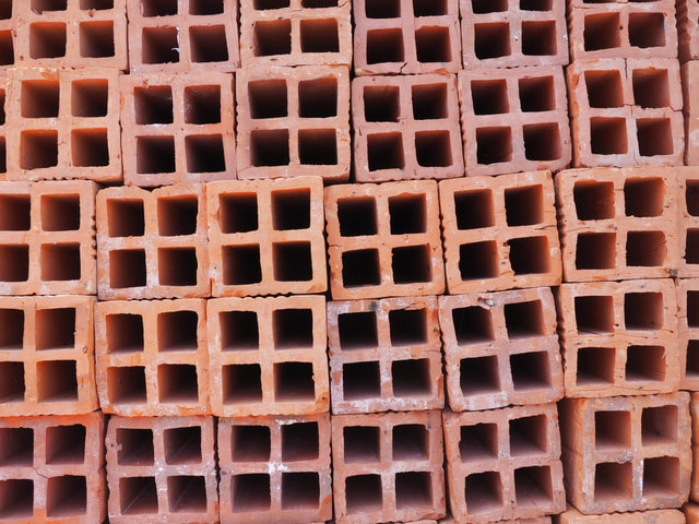
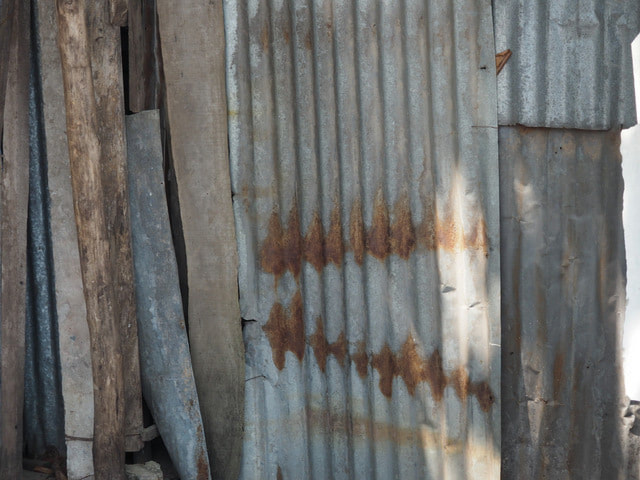
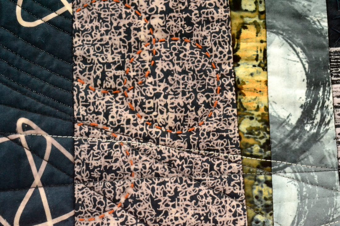
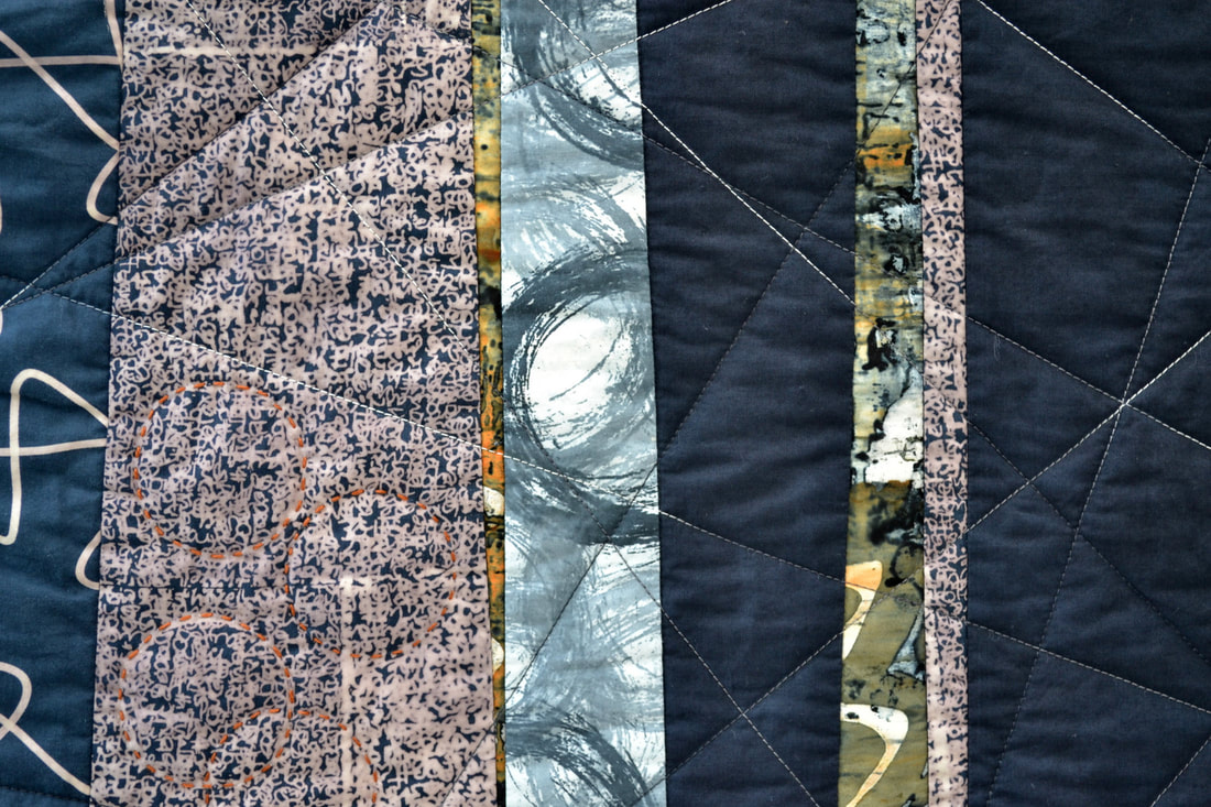
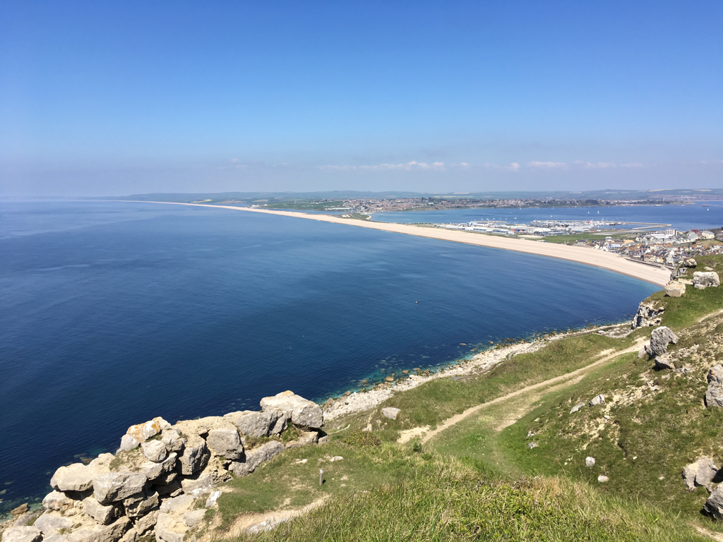
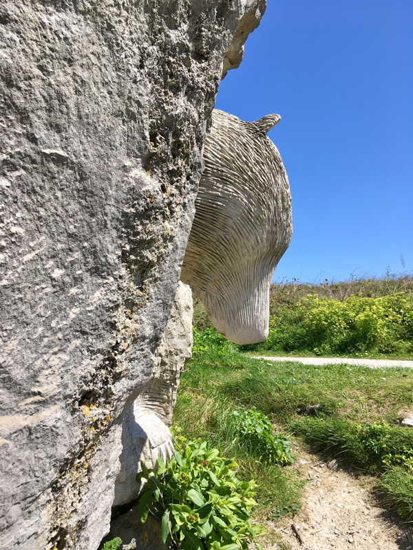
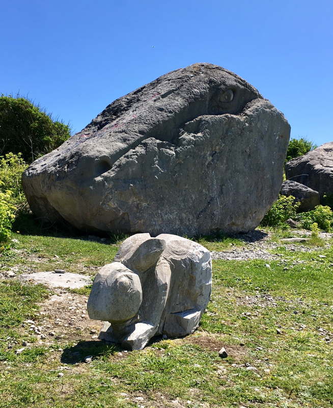
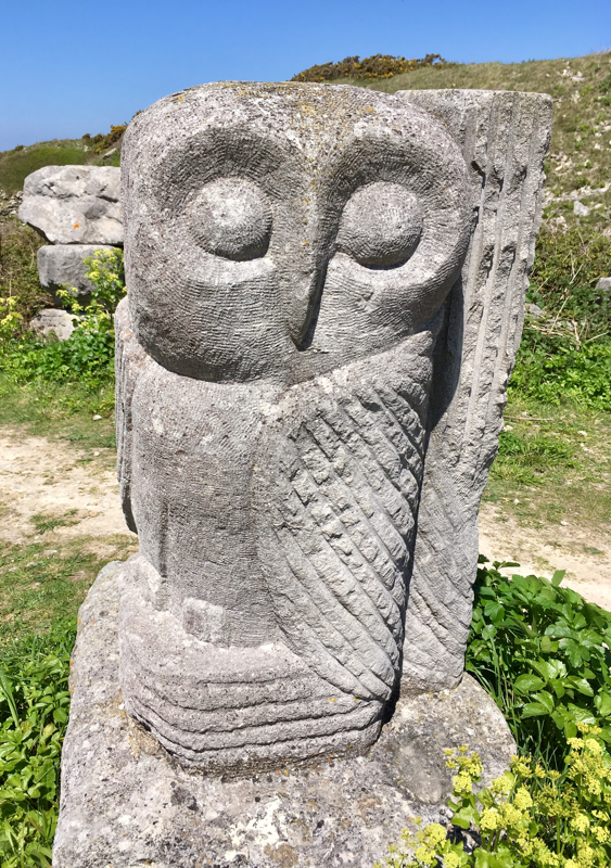
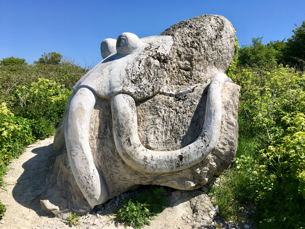
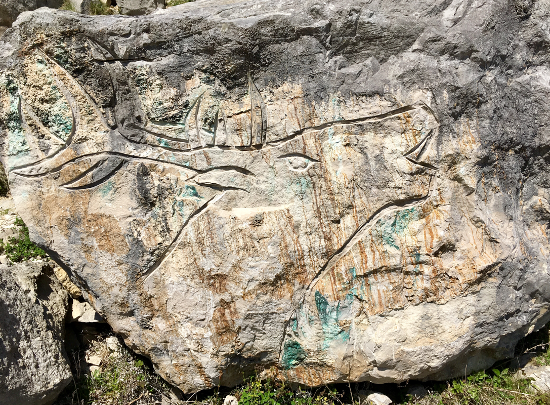
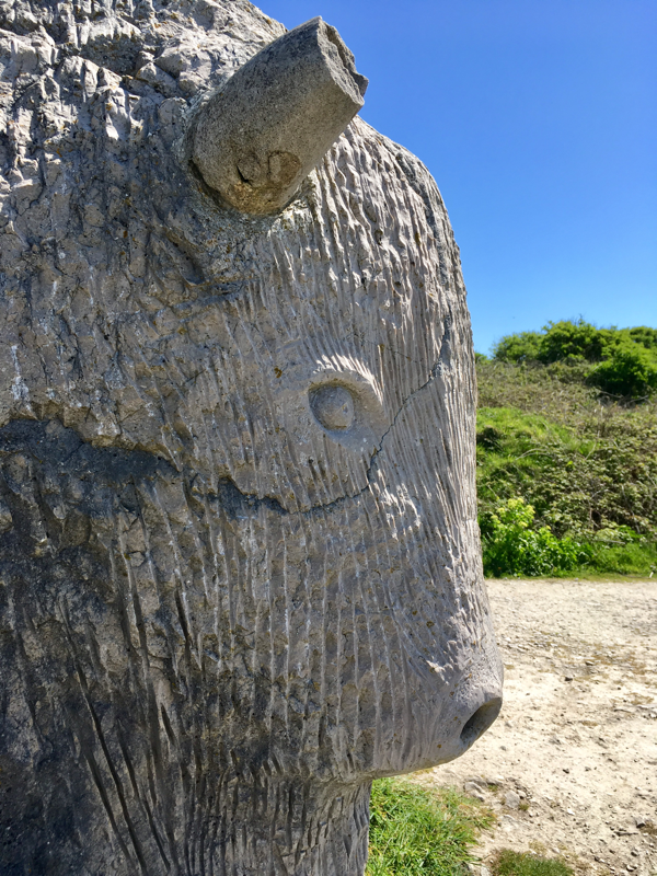
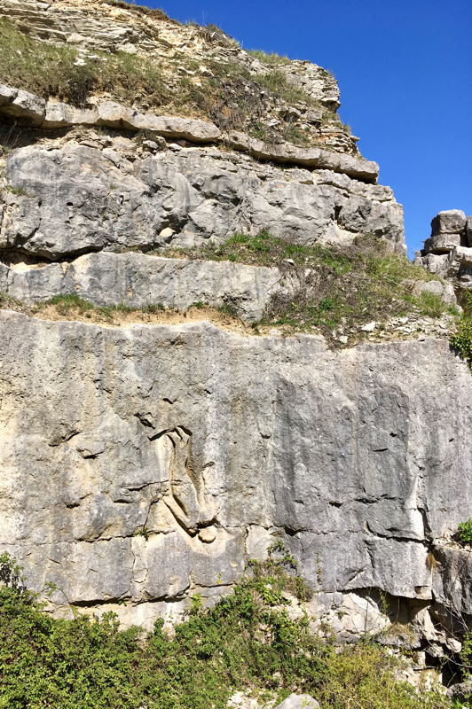
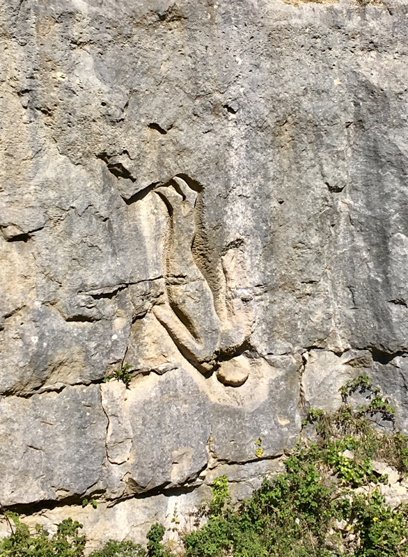
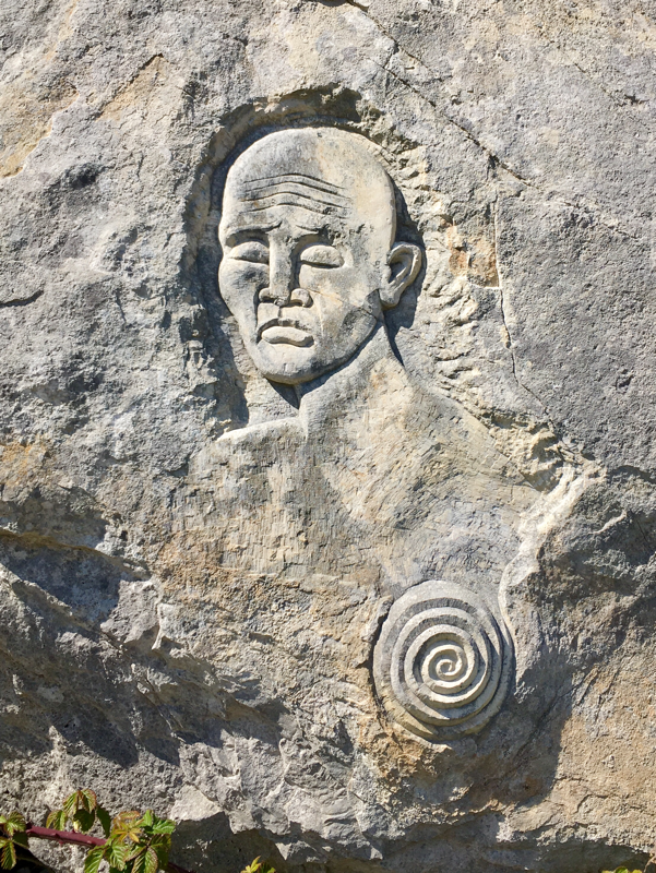
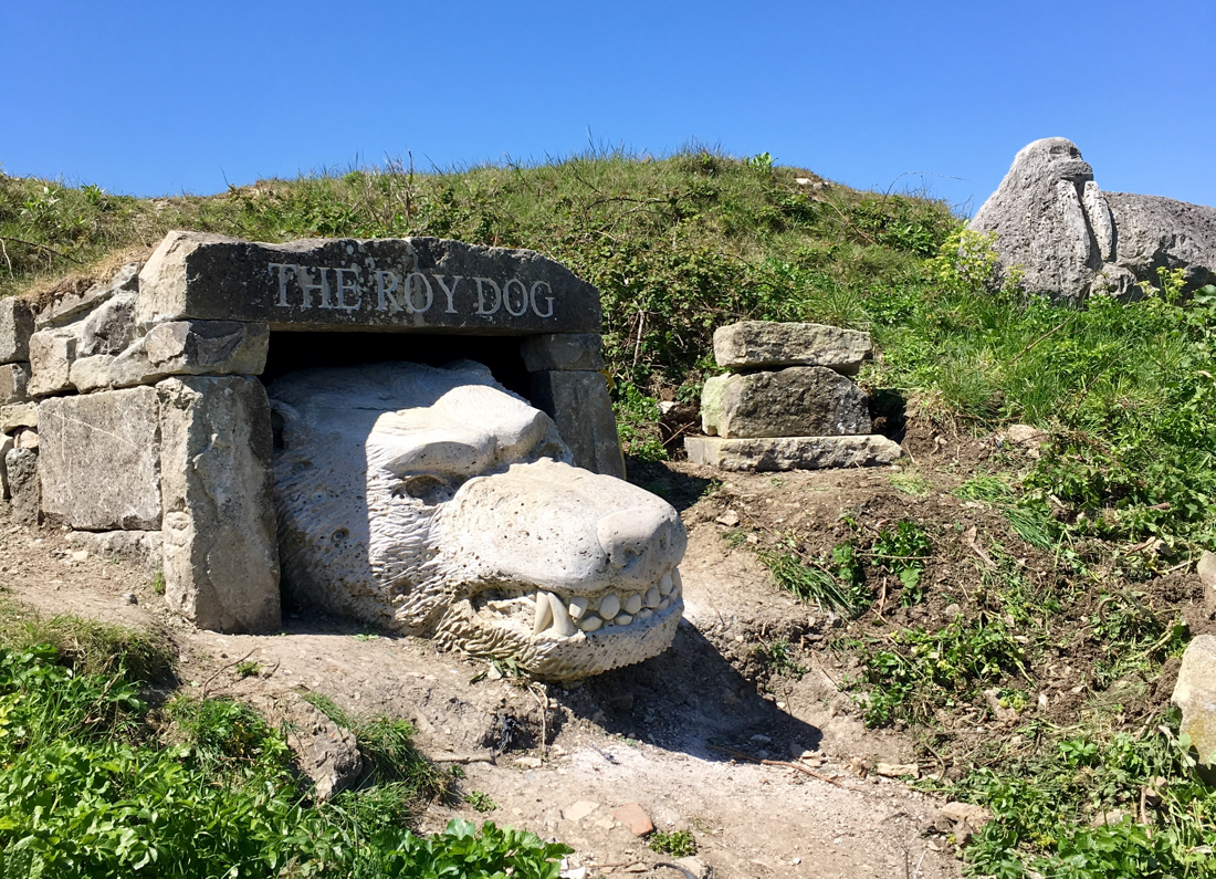
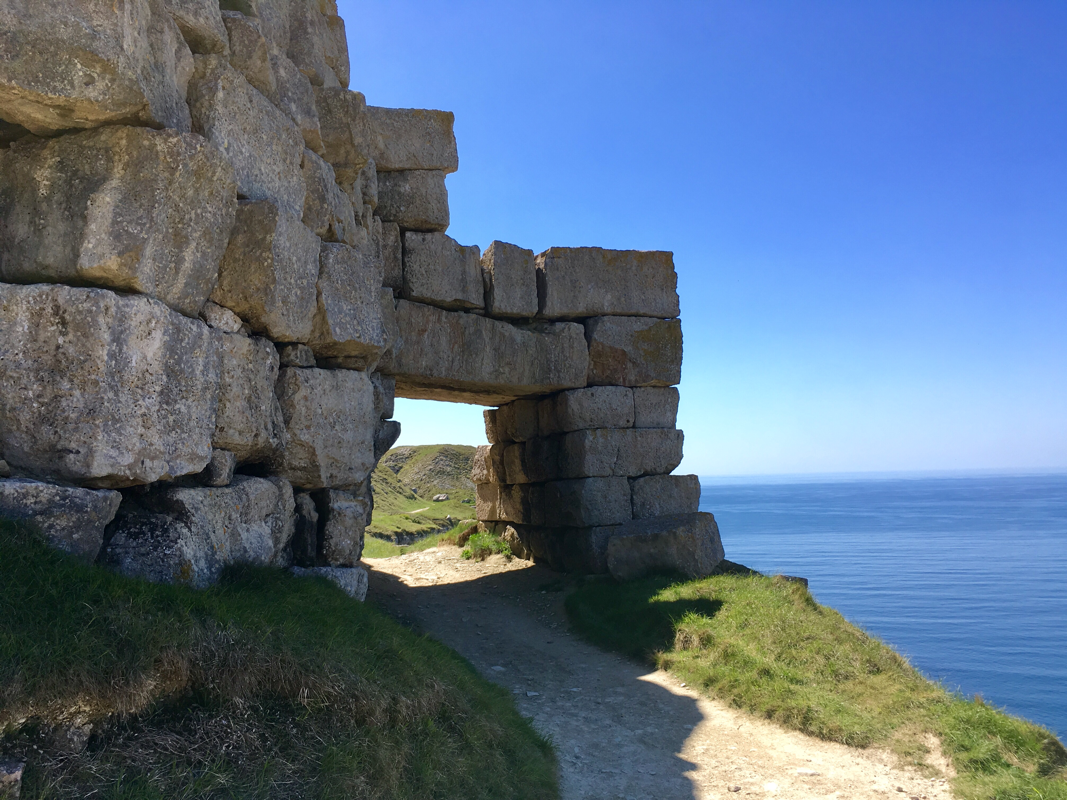
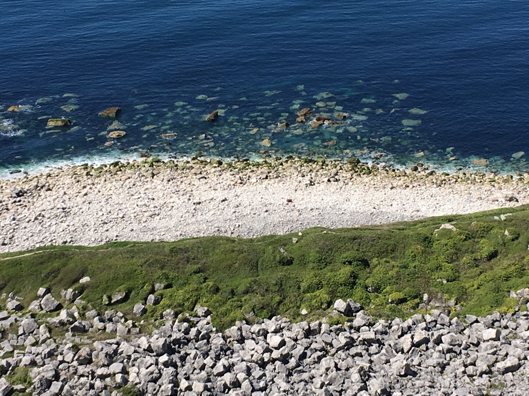
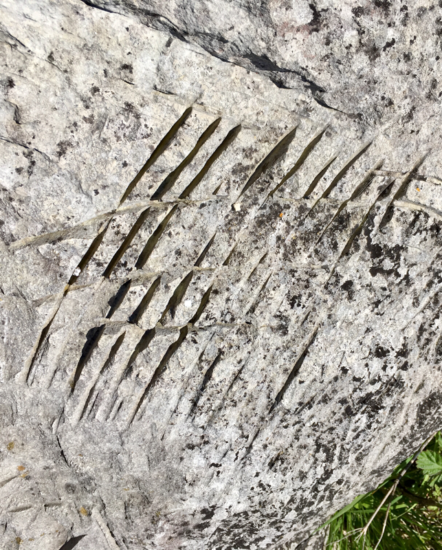
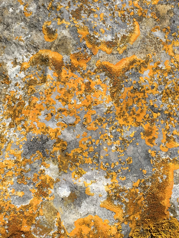
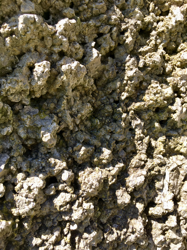
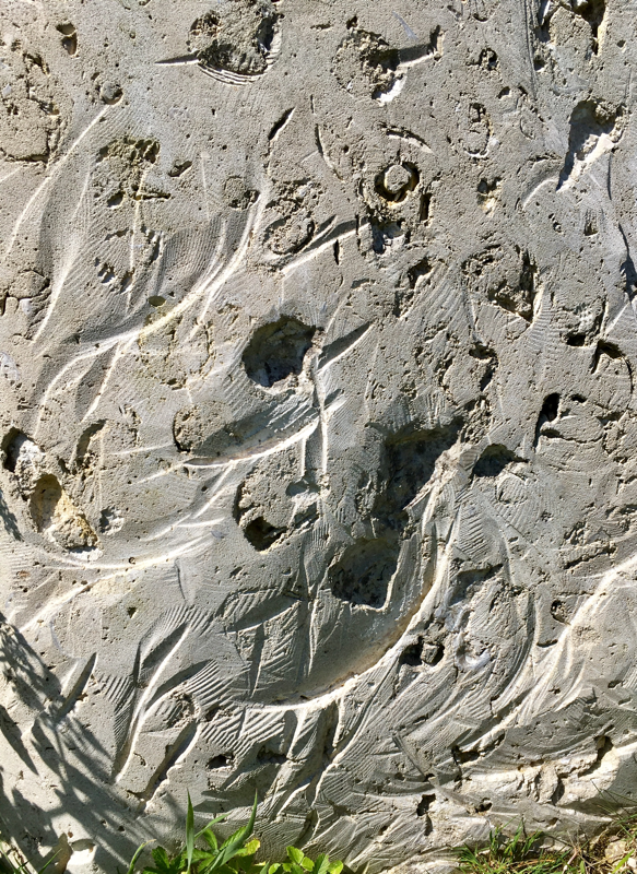
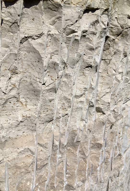
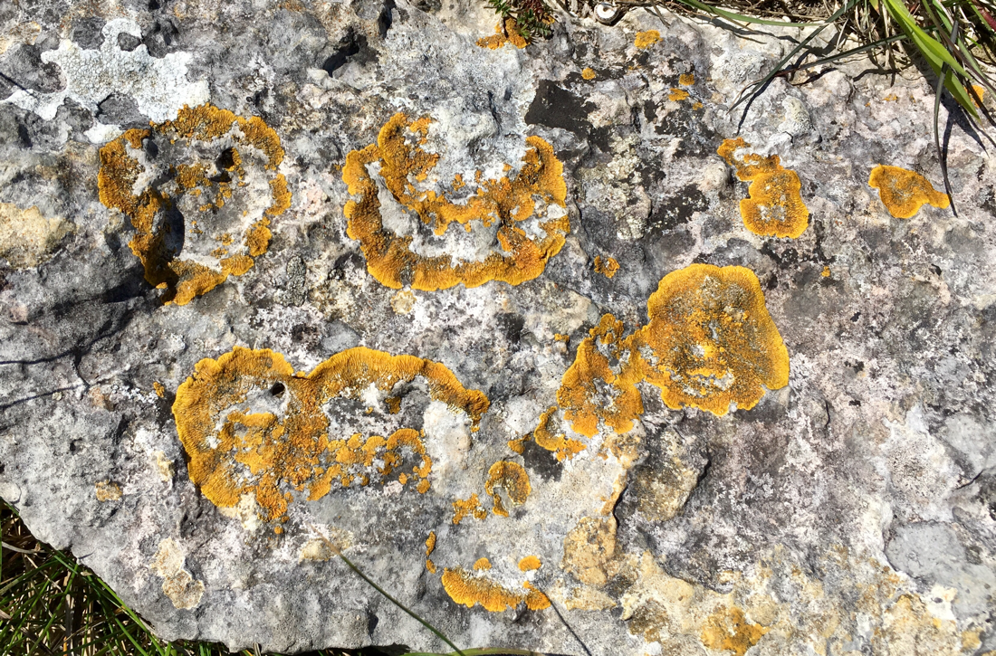
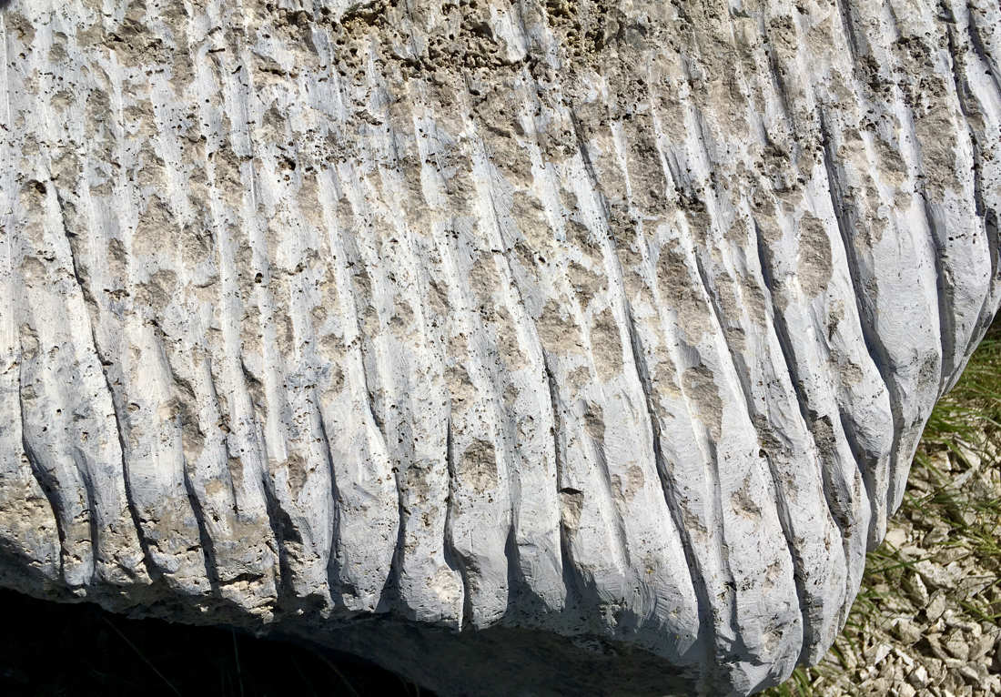
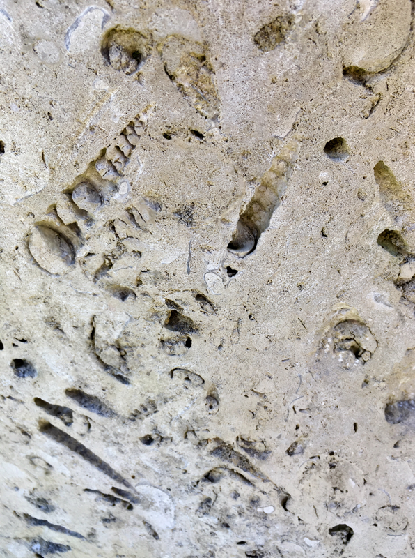
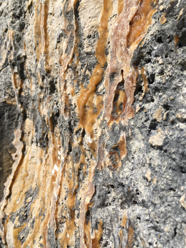
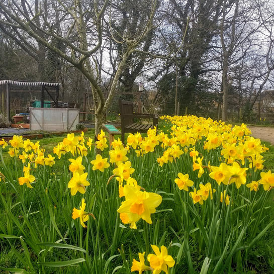
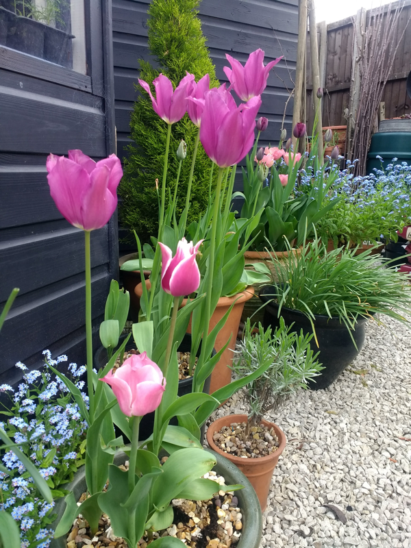
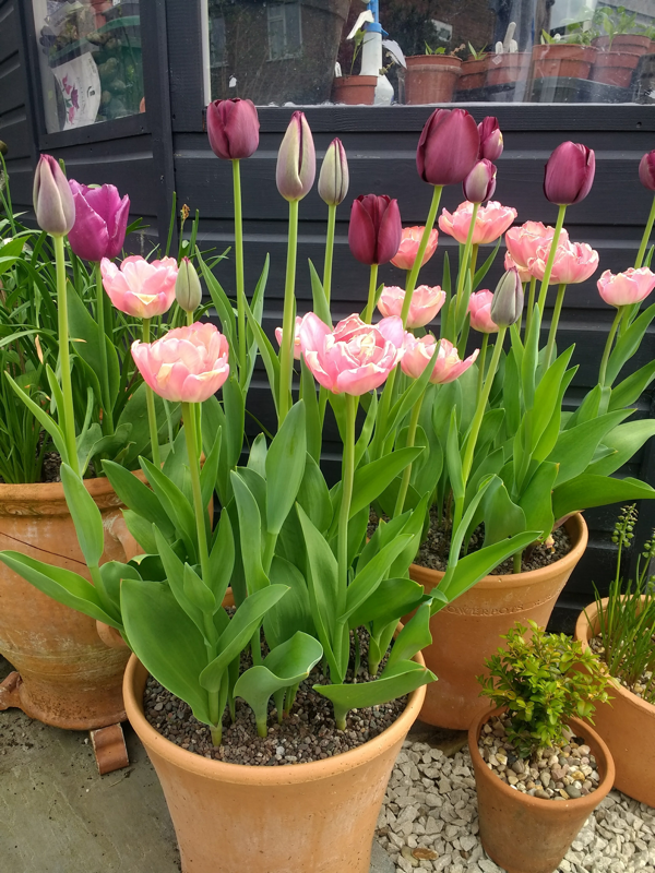
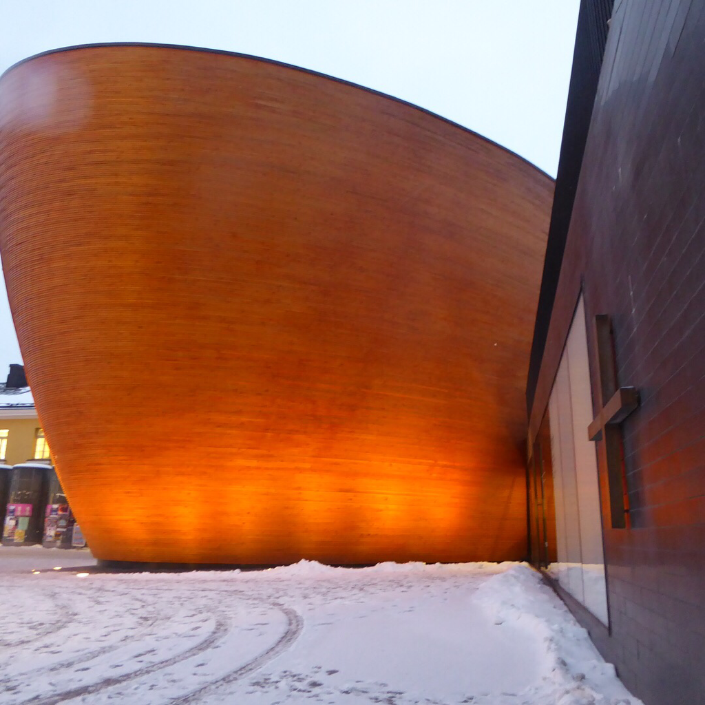
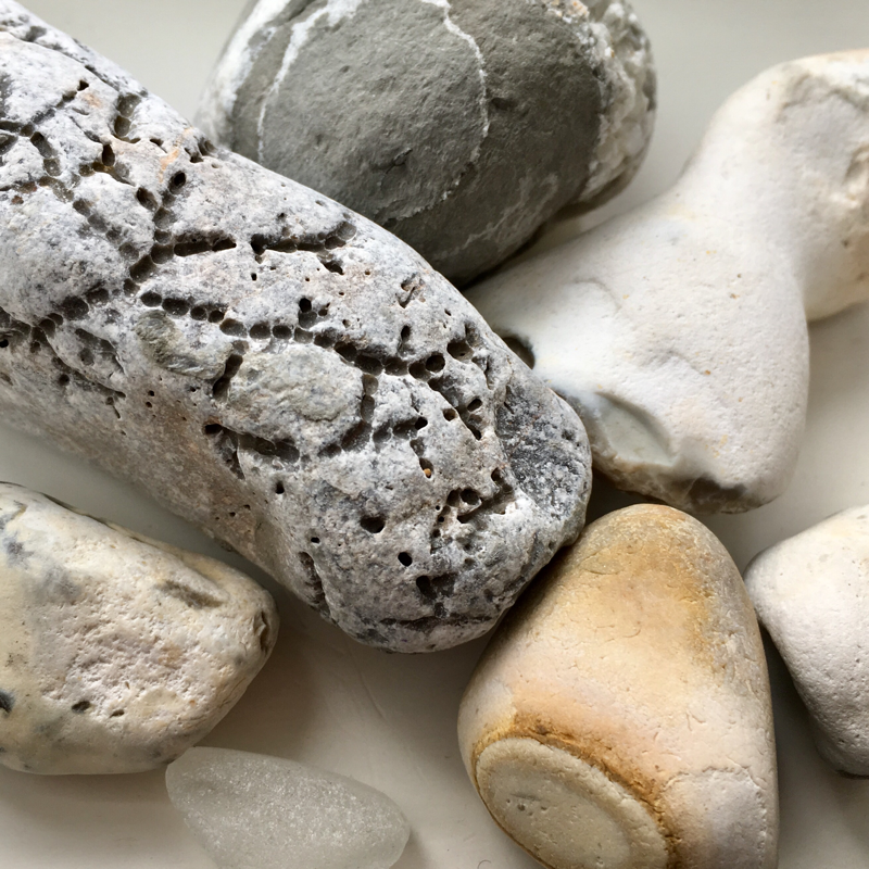
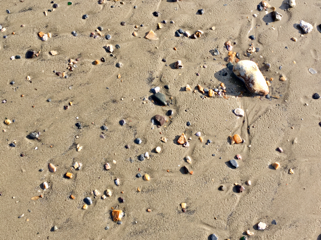
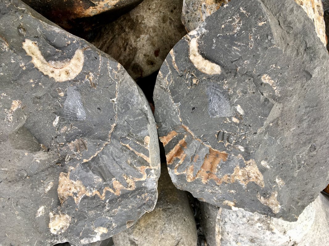
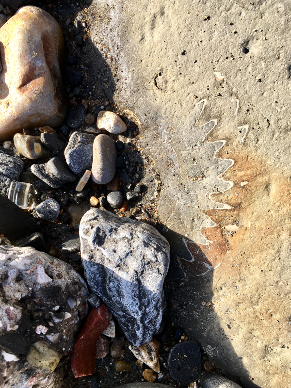
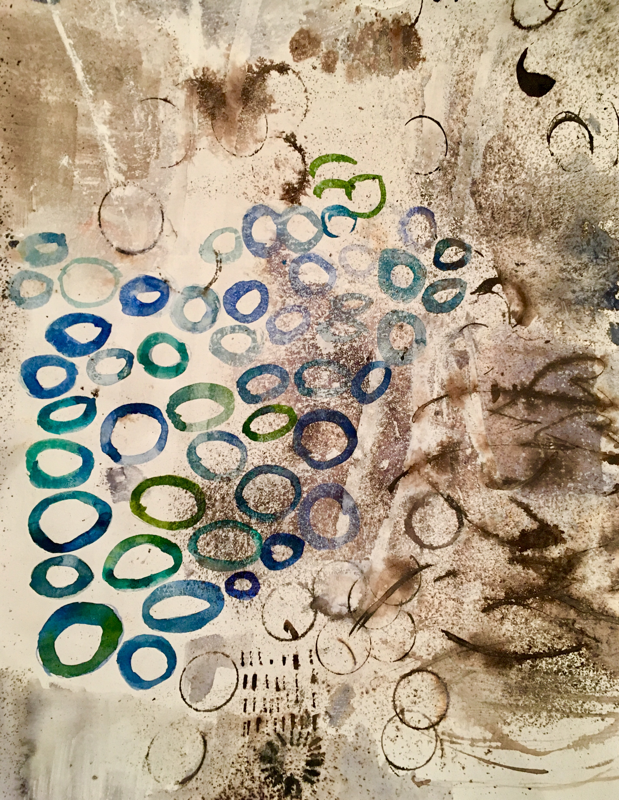
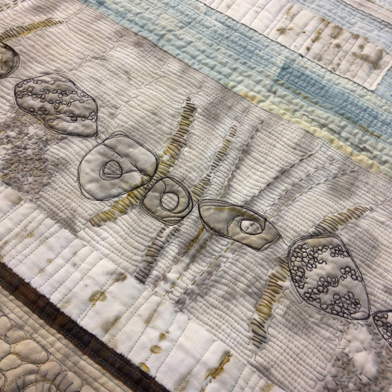
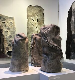
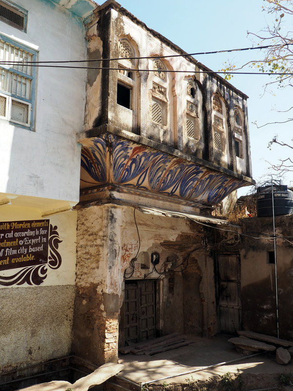
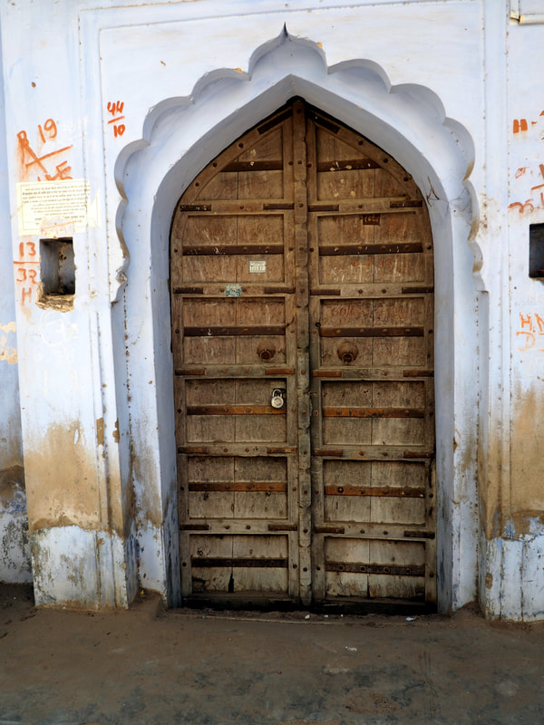
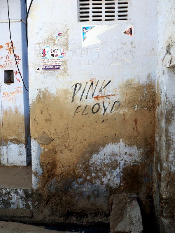
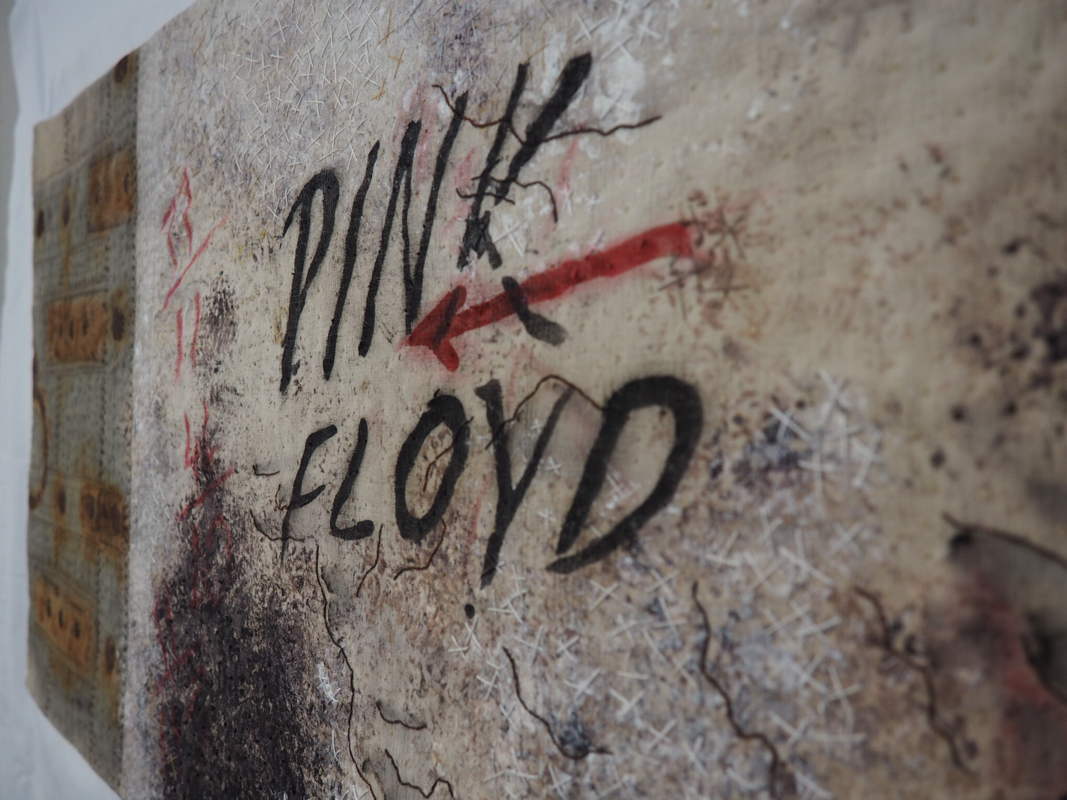
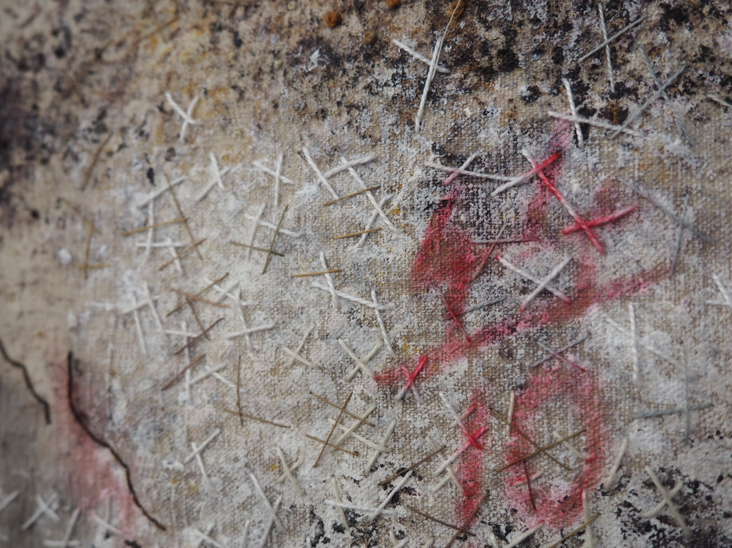
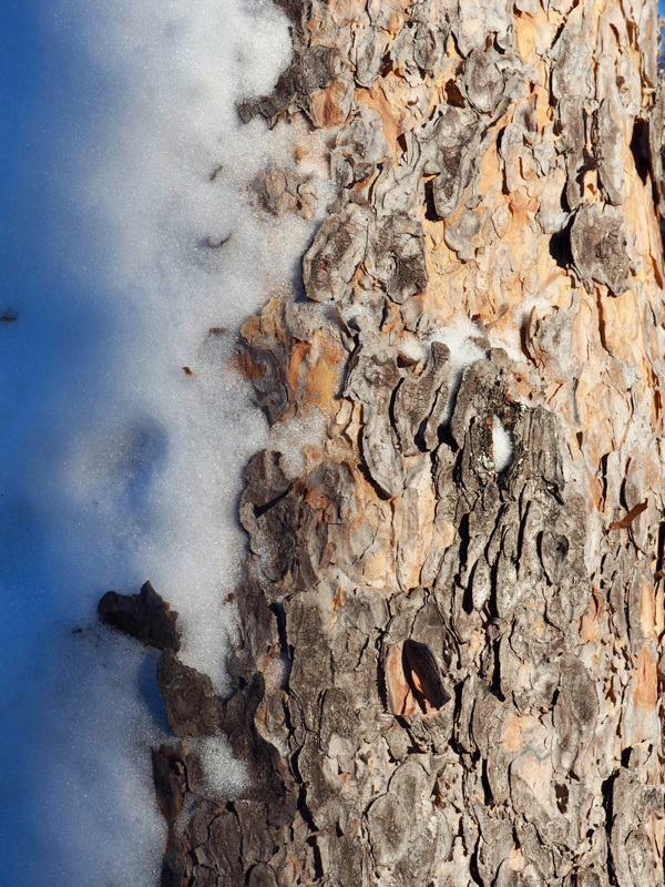
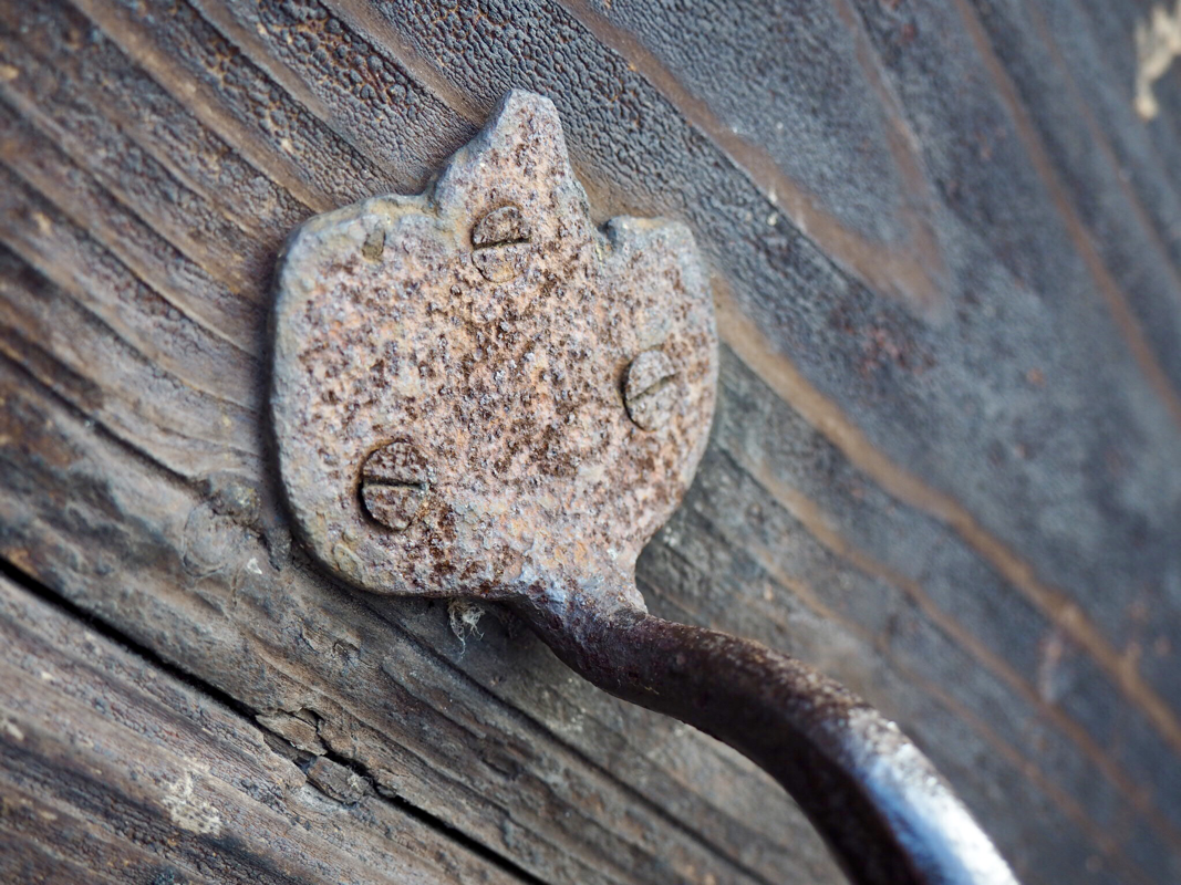
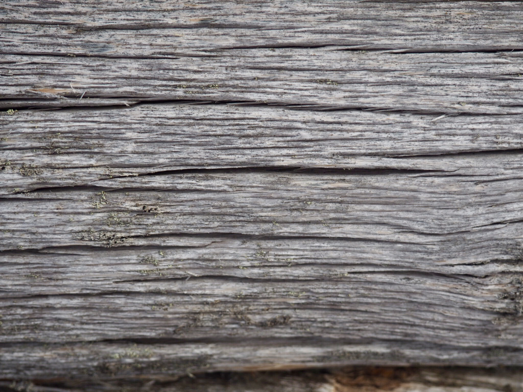
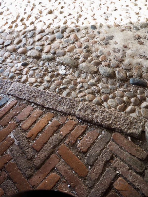
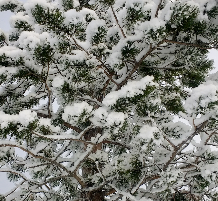
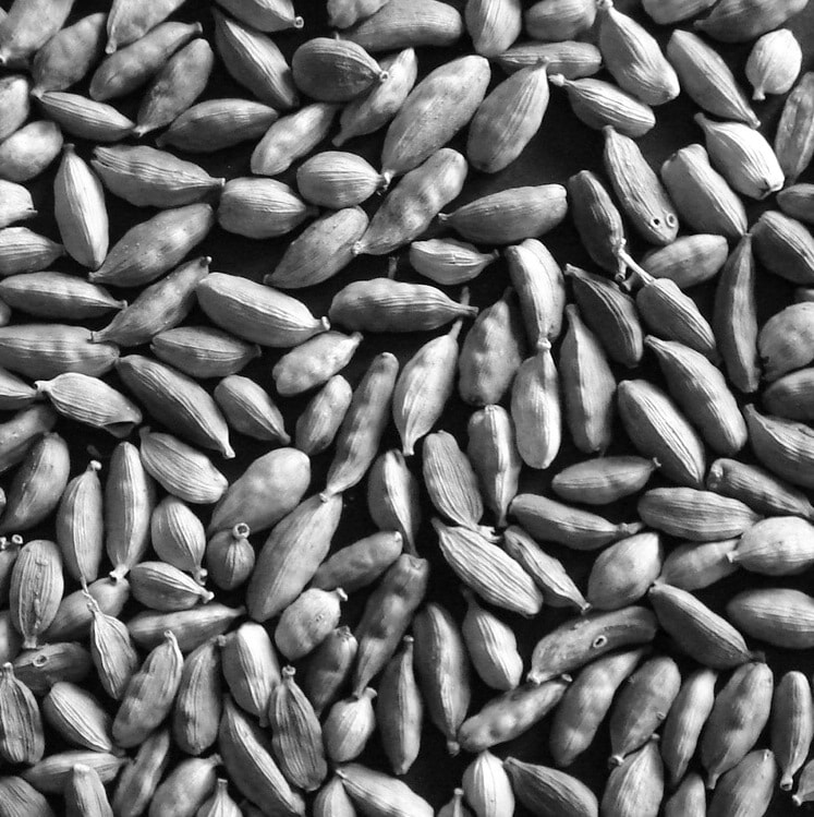
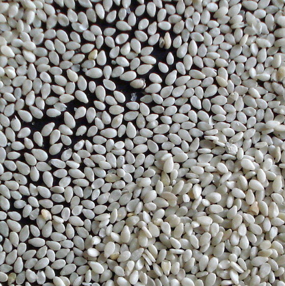
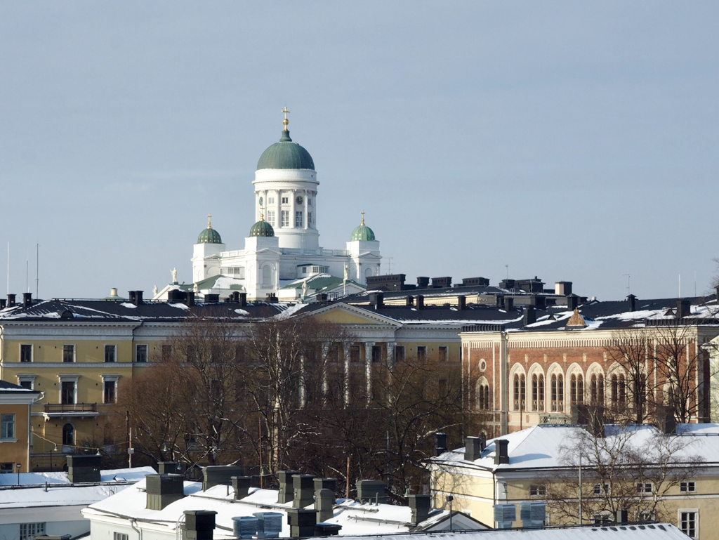
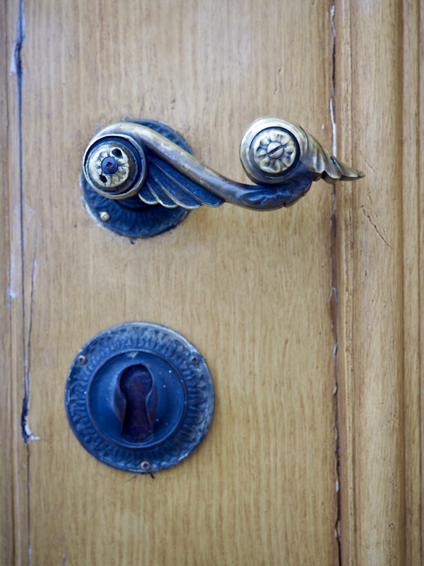
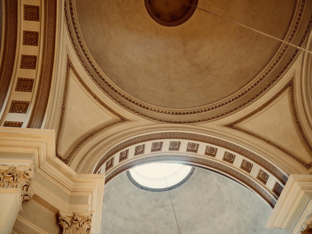
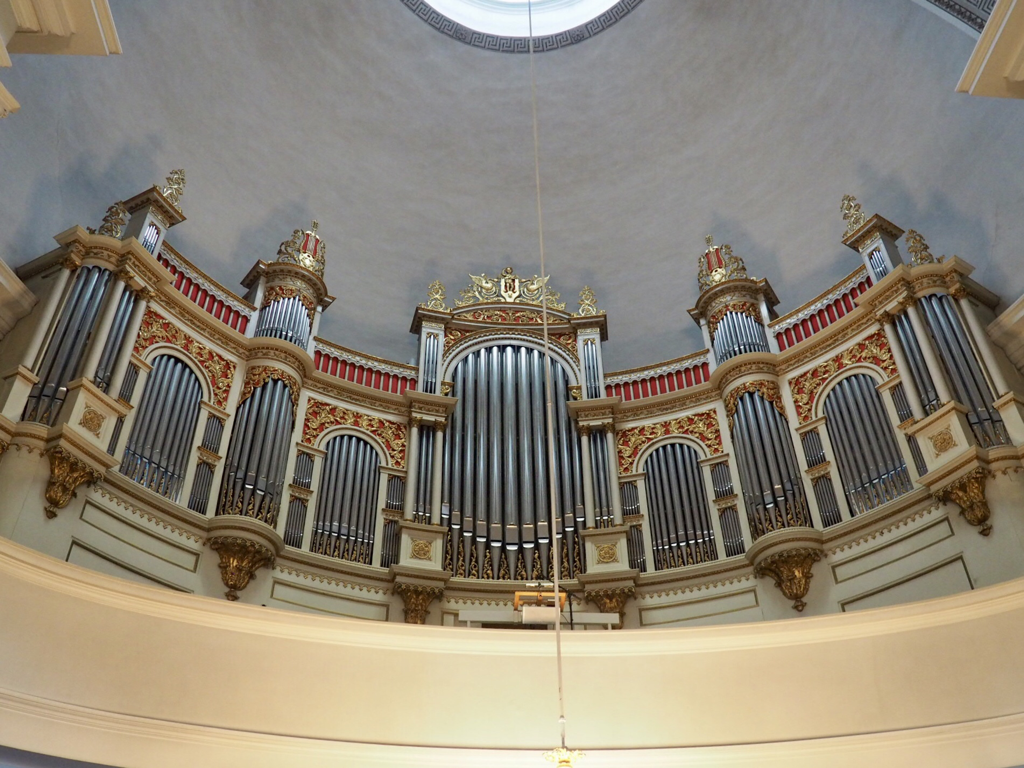
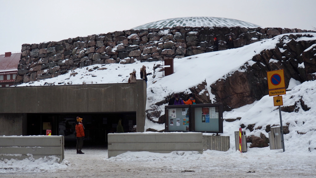
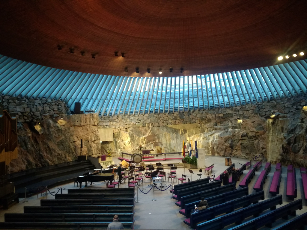
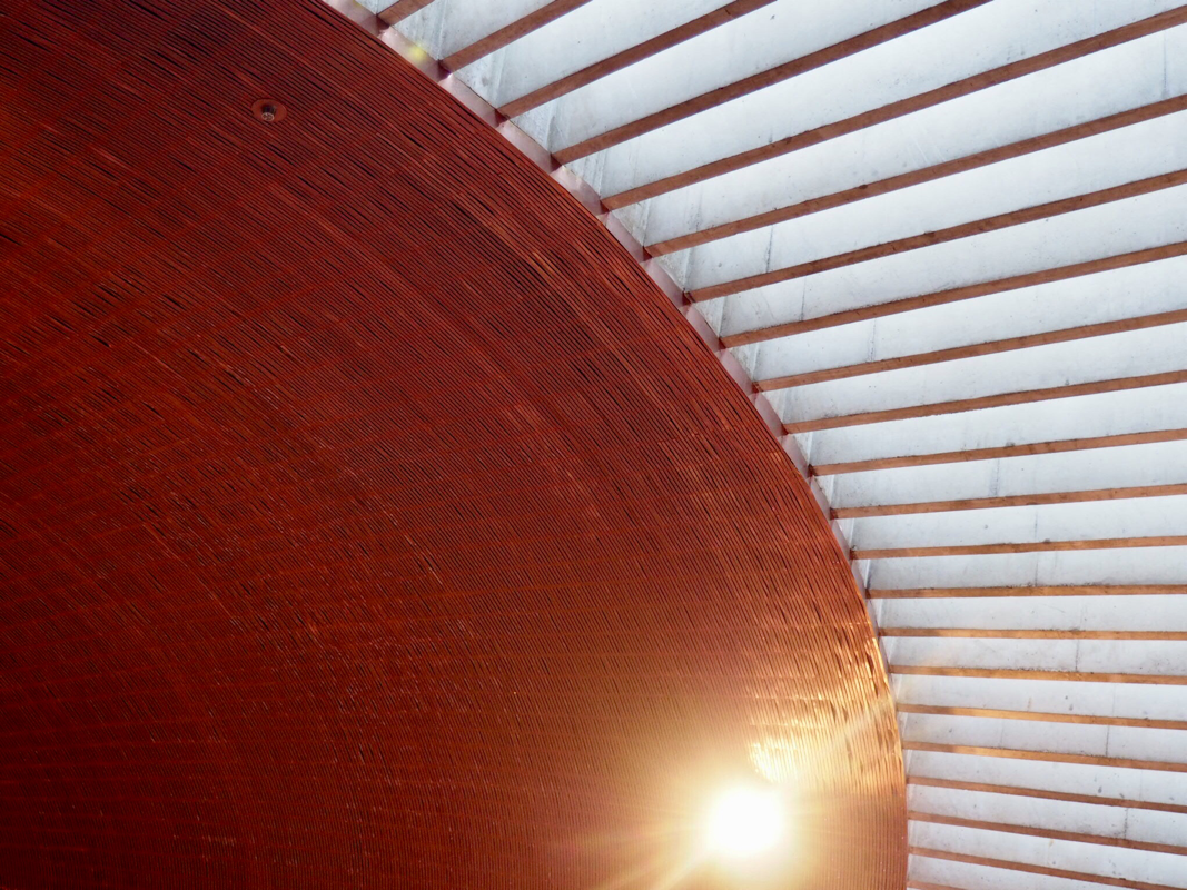
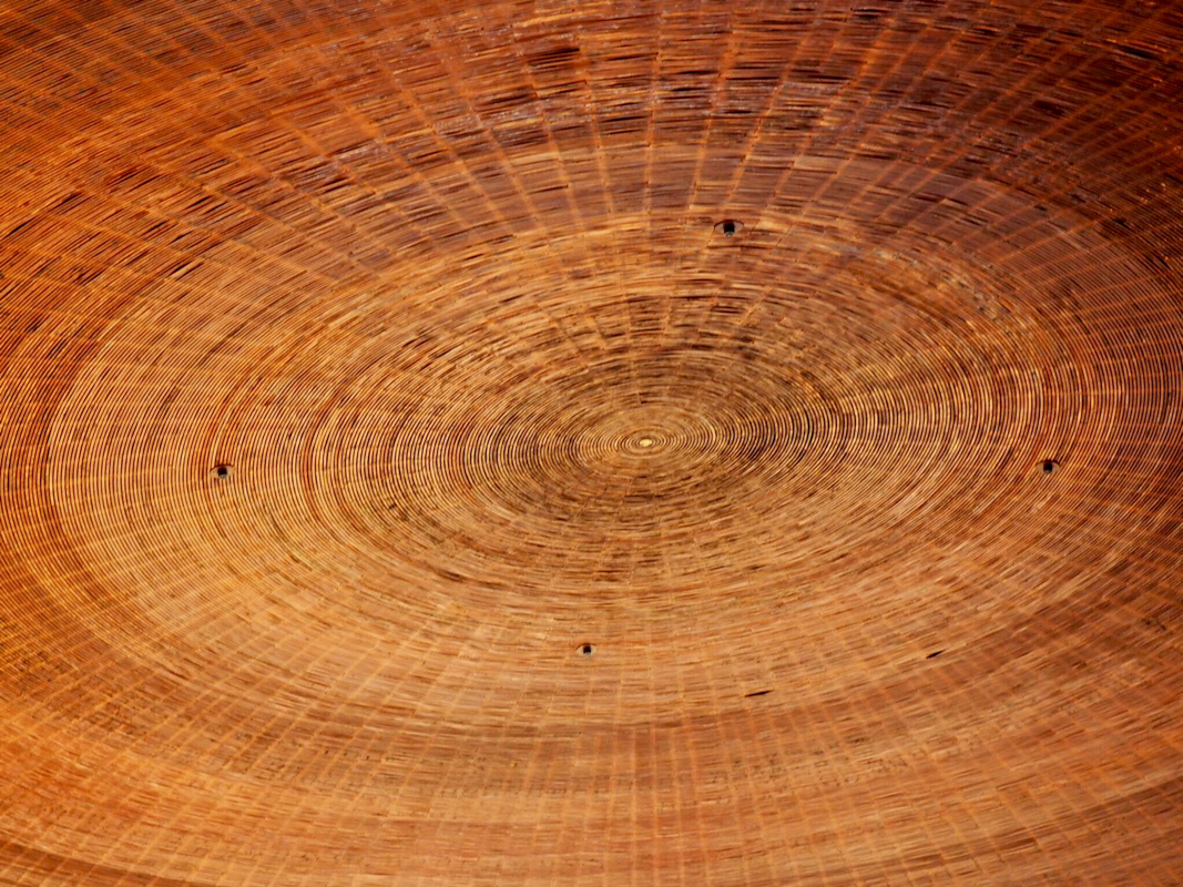
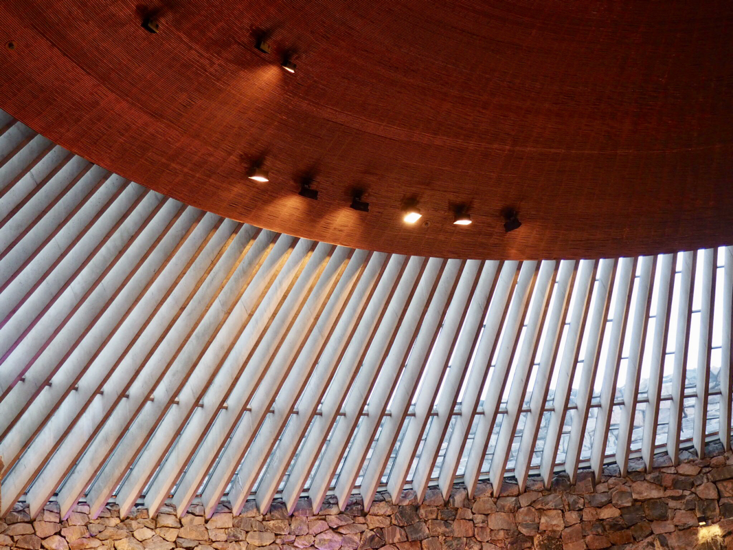
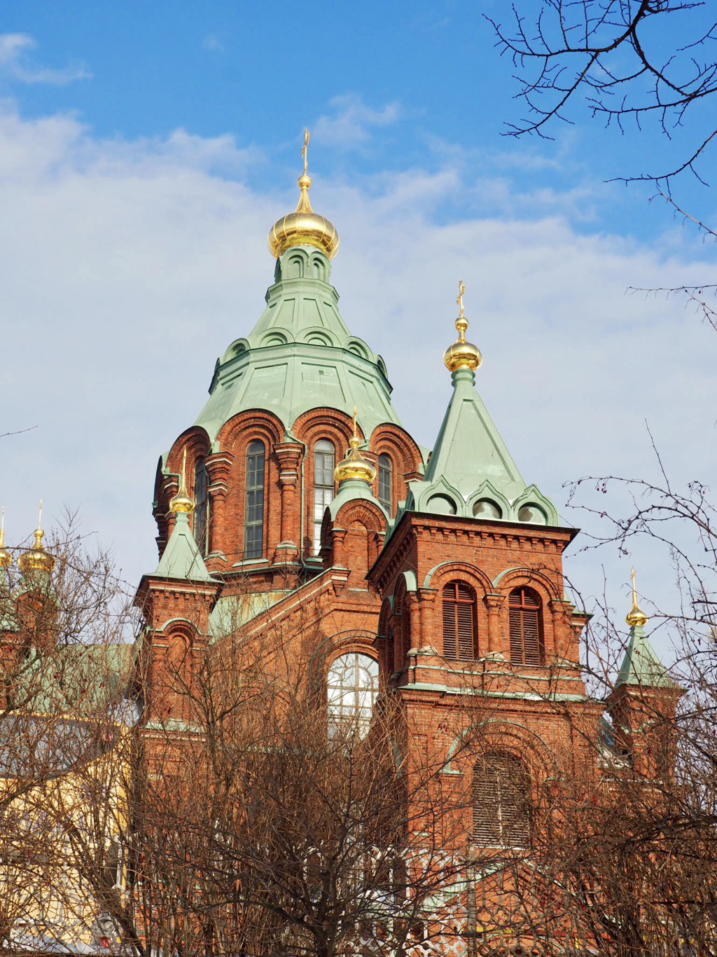
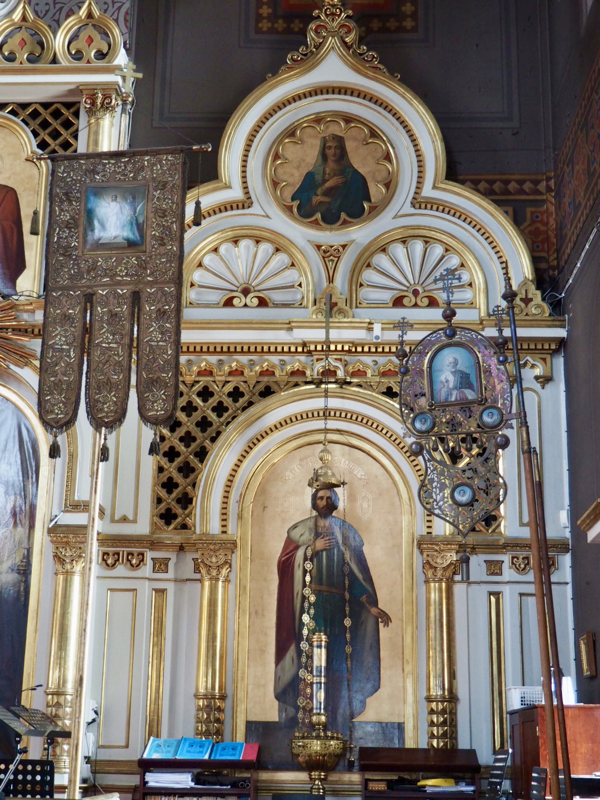
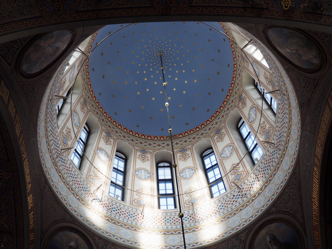
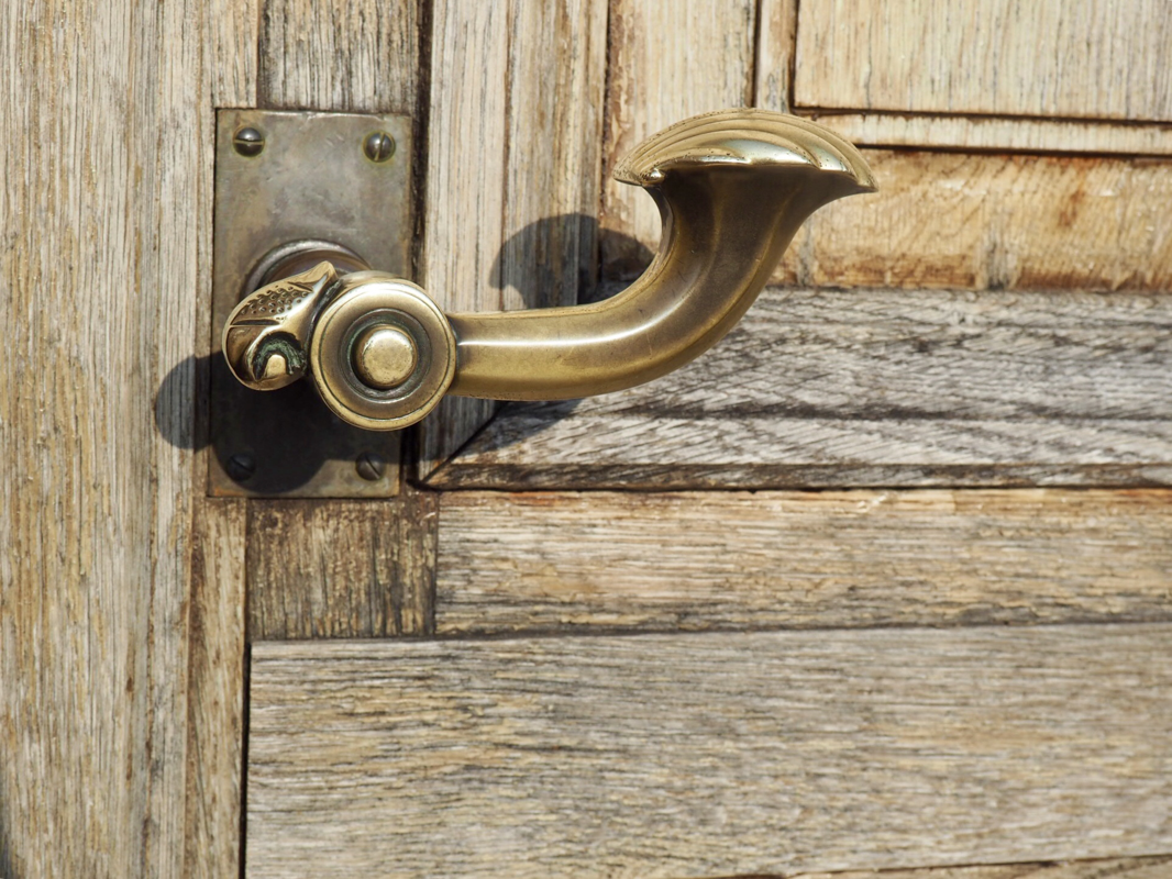
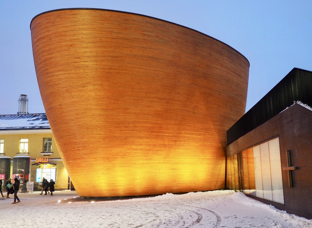
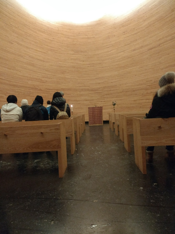
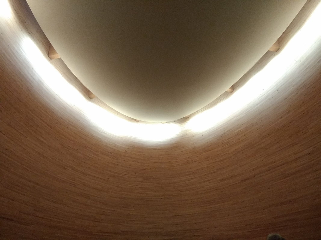
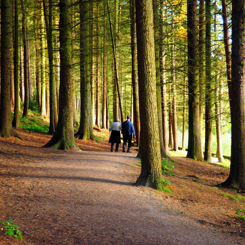
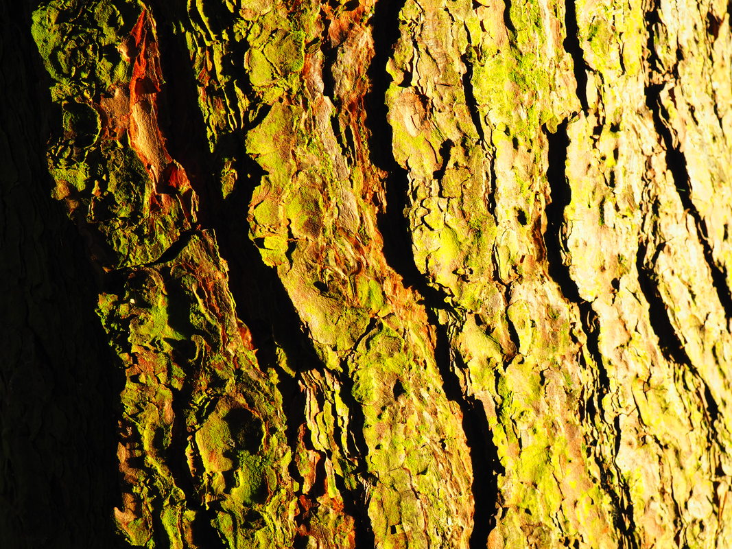
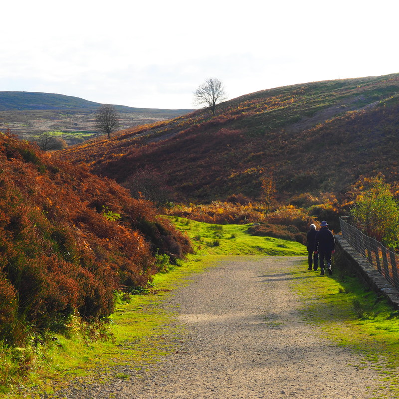
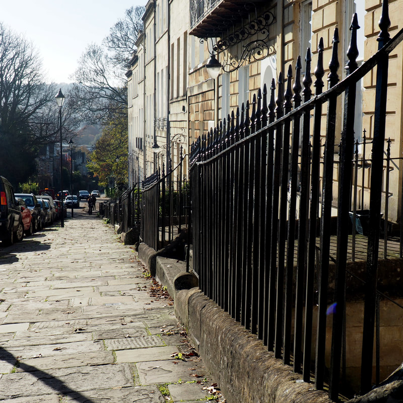
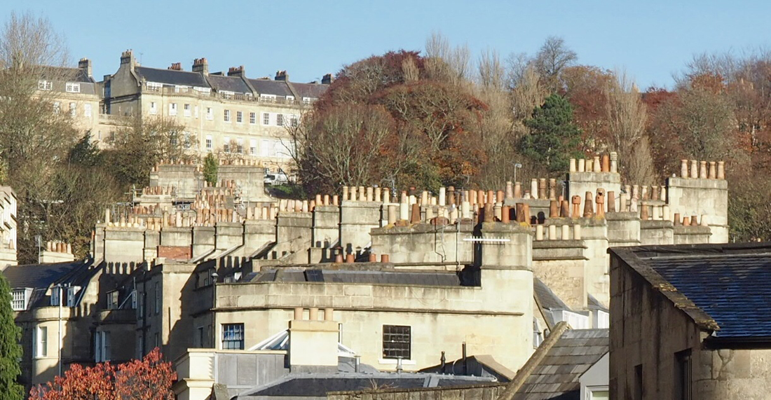
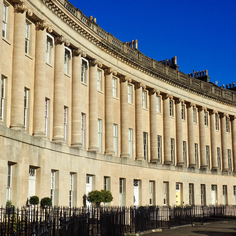
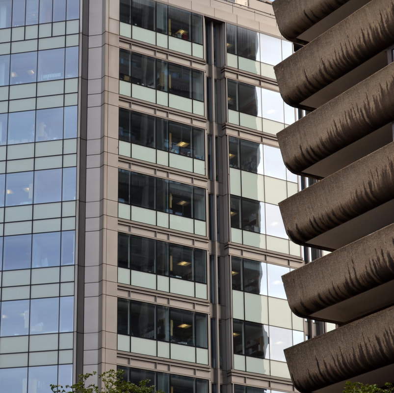
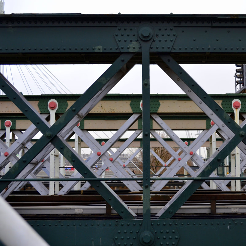
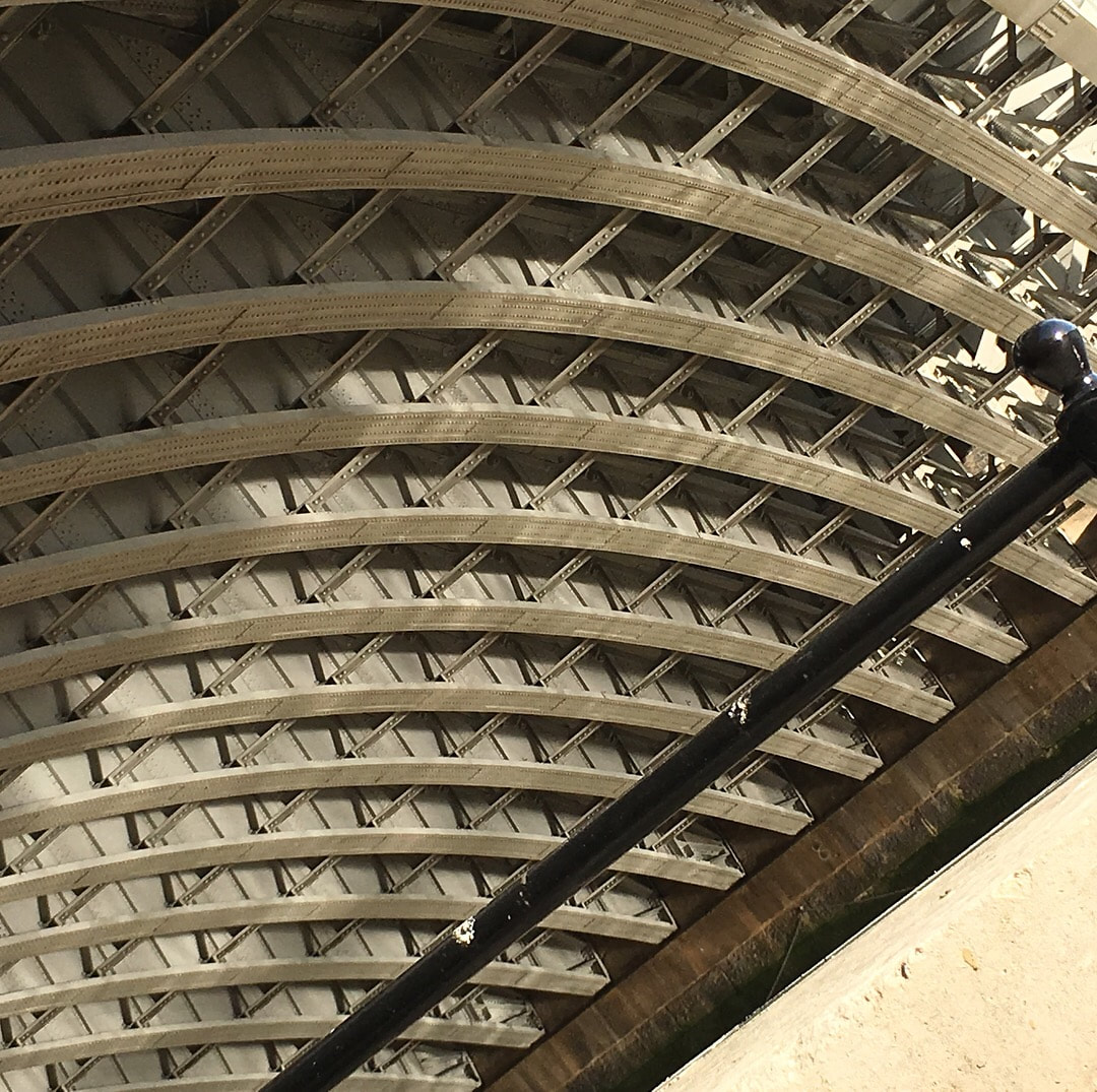
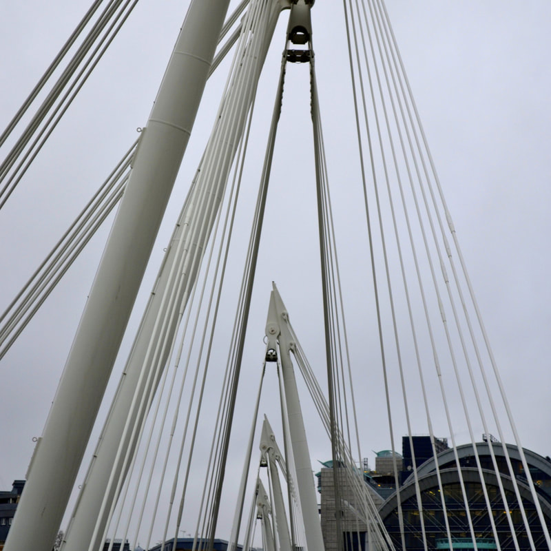
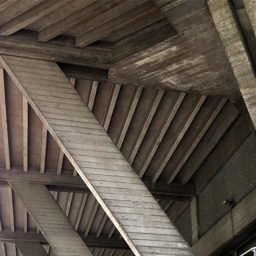
Where do you find your colours ? Flowers, fruits and natural landscapes are often used as inspiration, but have you ever thought about looking at the hard landscape - the buildings, the roads and man-made structures?
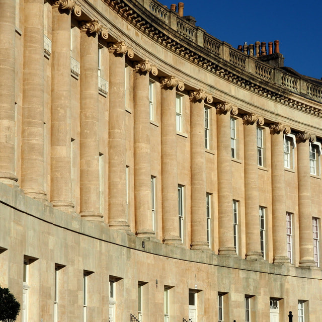
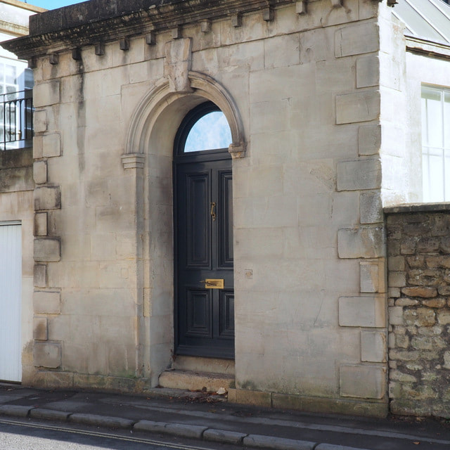
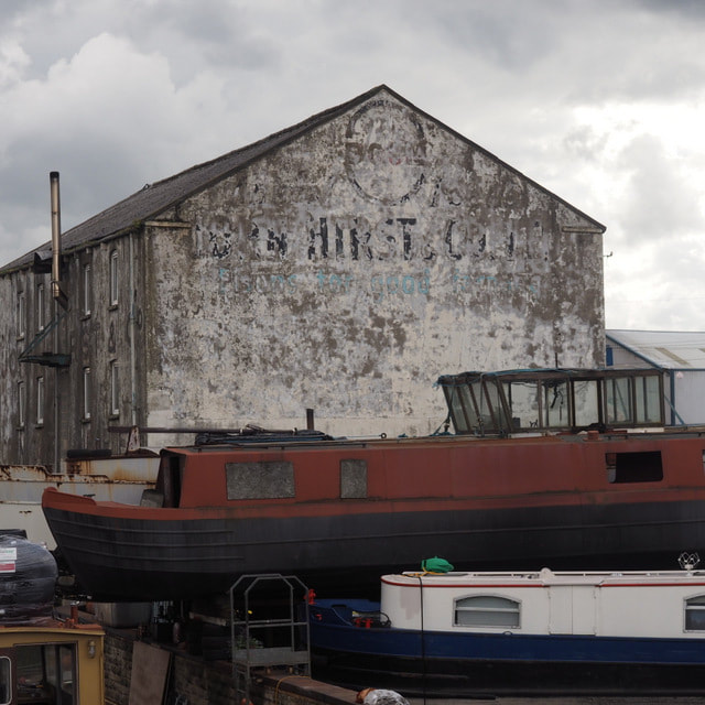
From Wakefield to Bath via the Mekong Delta.
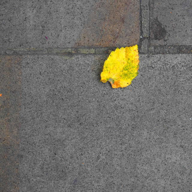
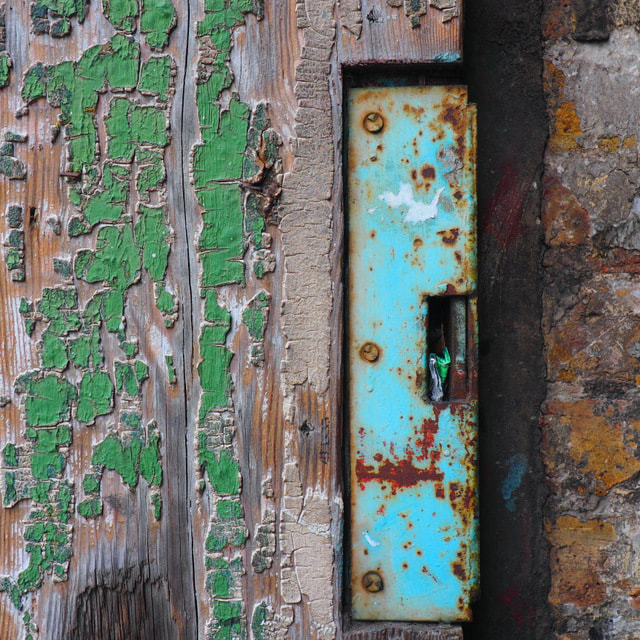
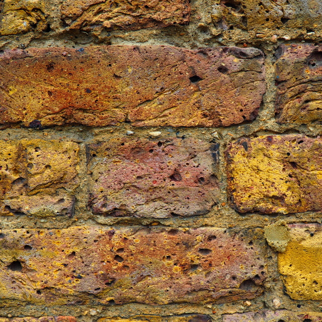

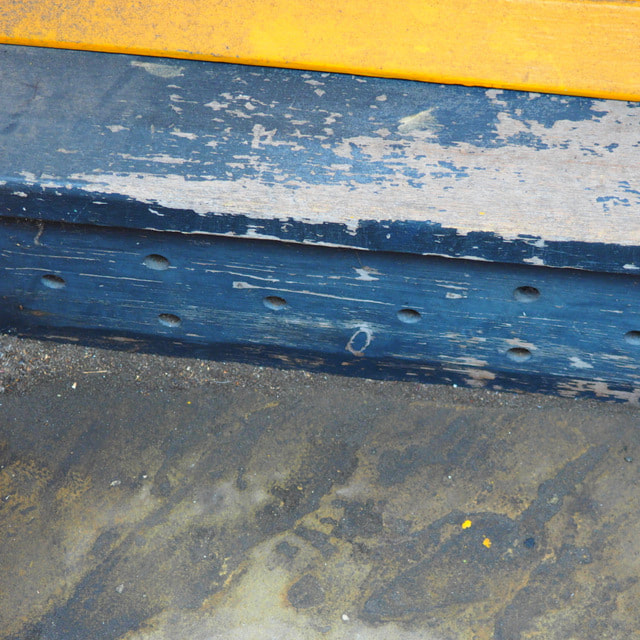
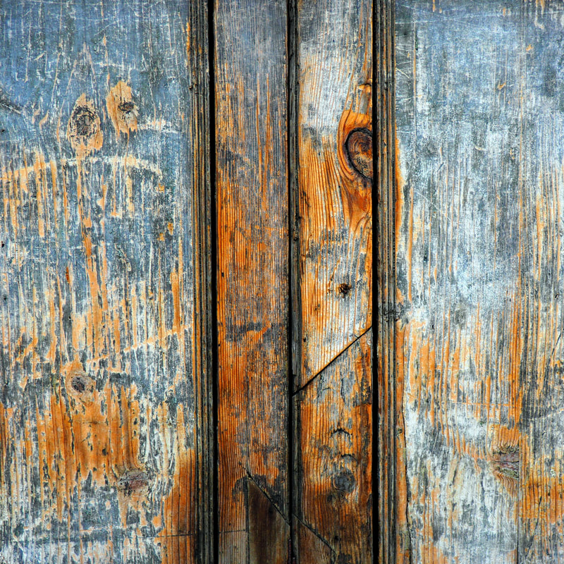
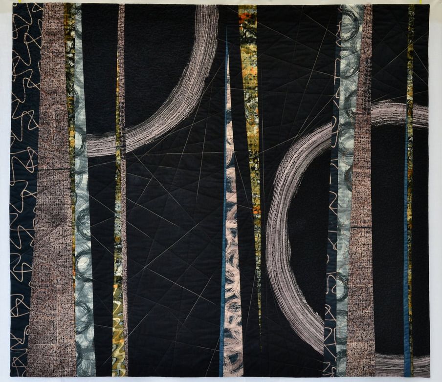
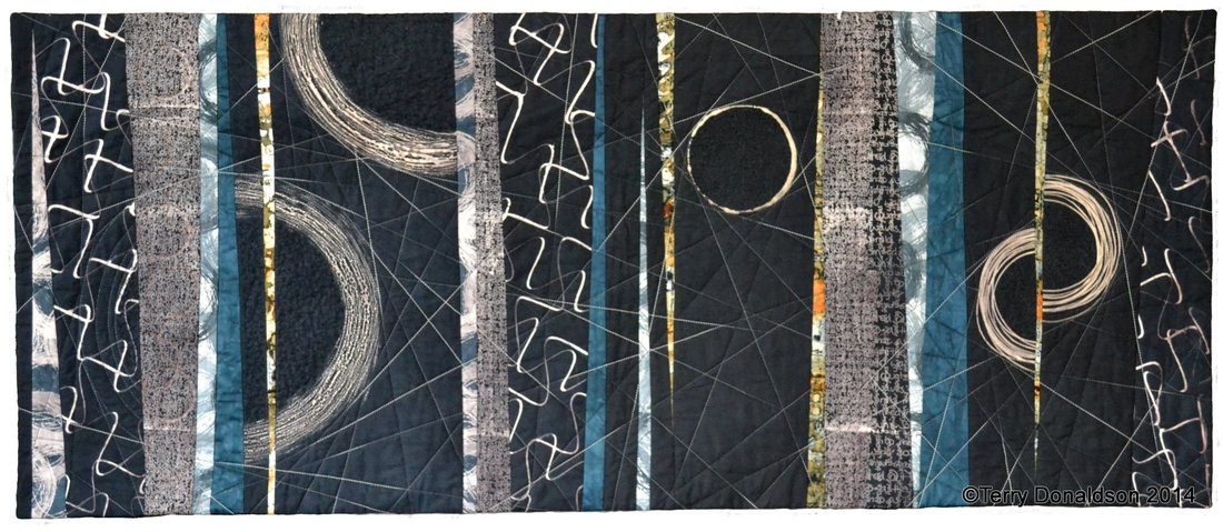
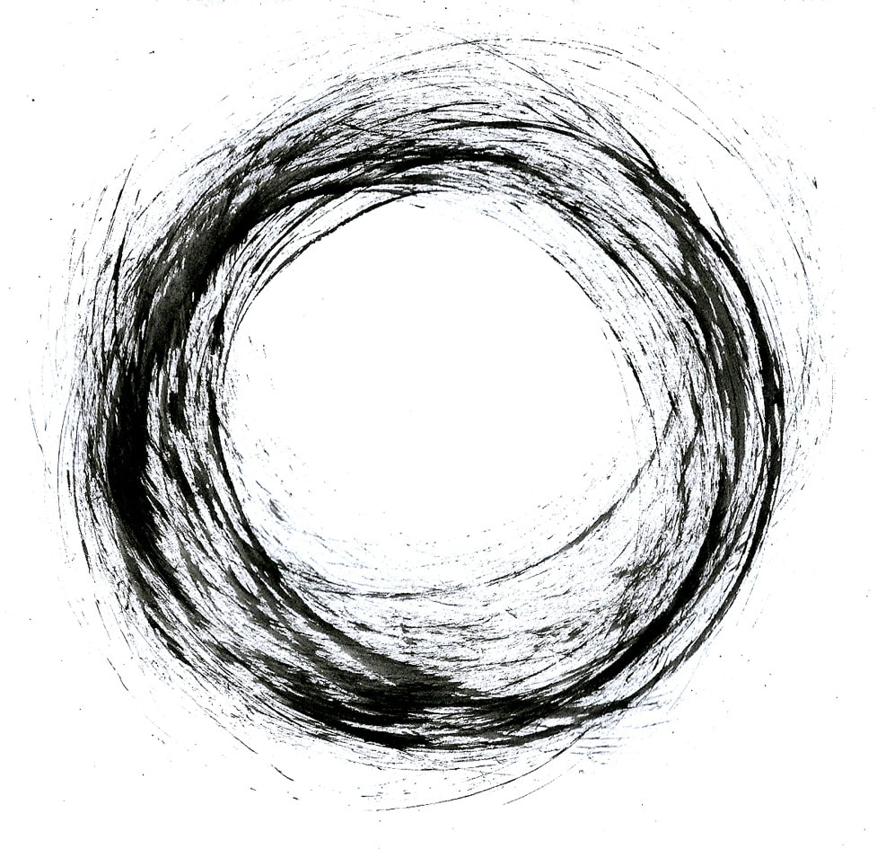
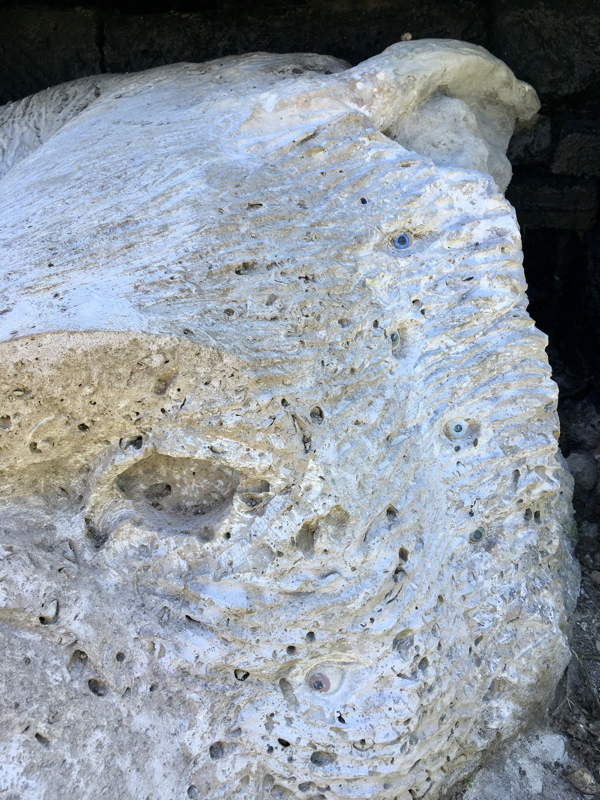
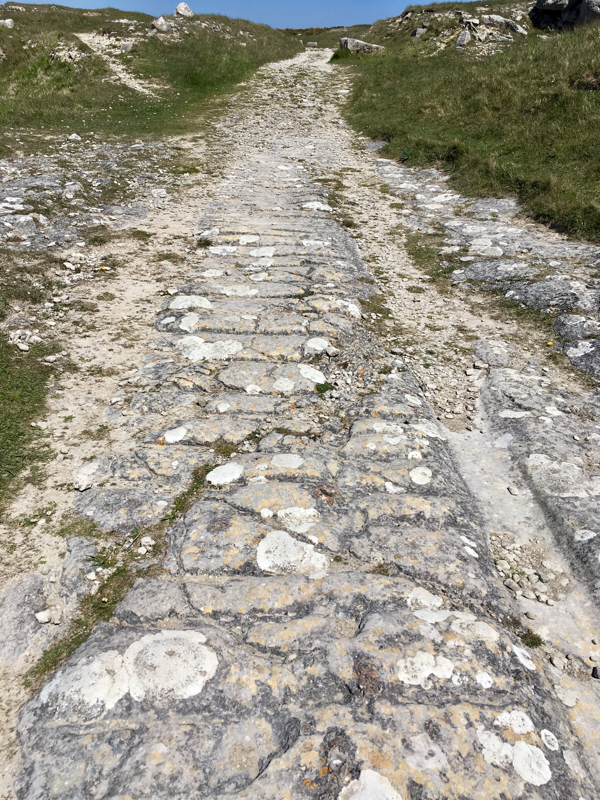
The peeling, the rough and the weathered

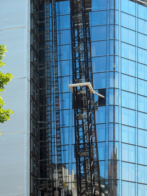
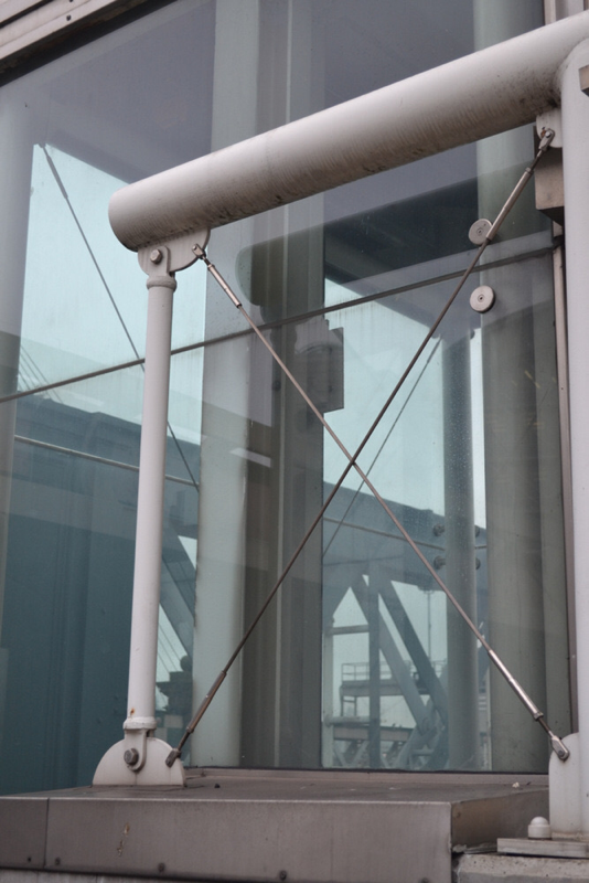
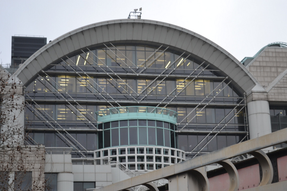

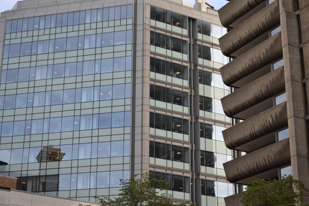
or the modern, the reflective and the graffic?

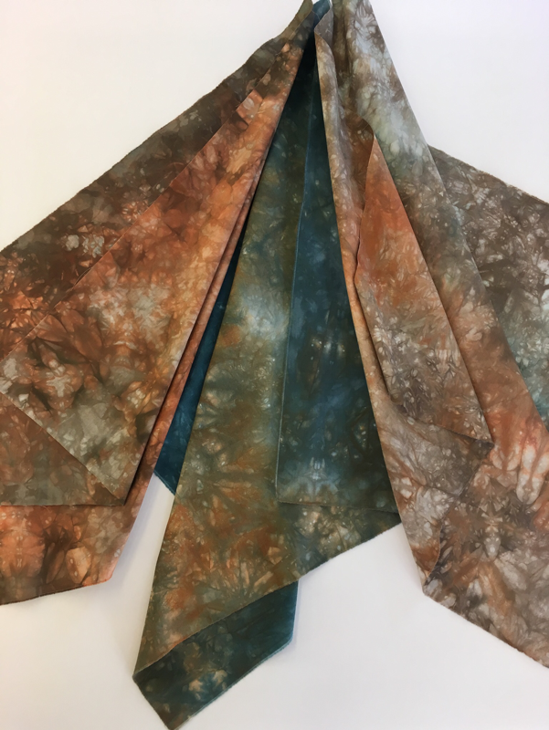


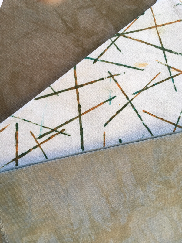
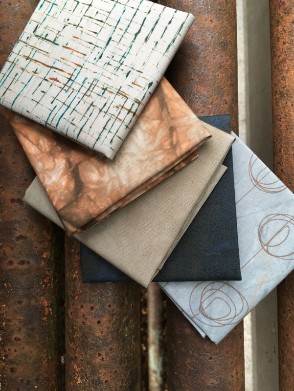
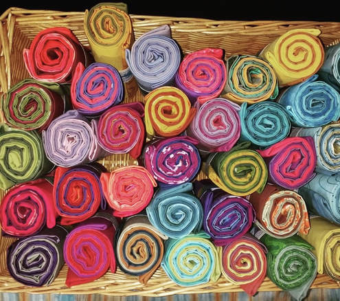
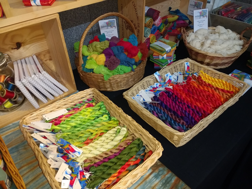
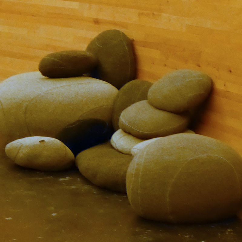
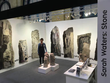
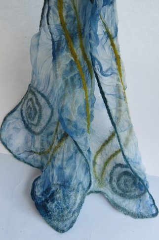
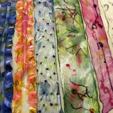
You can see how we've been inspired in our new range of fabrics - Sticks & Stones, which will be available to buy on our stand at this summer's shows.
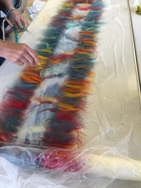
Until next week it's back to the print bench, there's still plenty to do!
Hazel & Terry
Until next week it's back to the print bench, there's still plenty to do!
Hazel & Terry


 RSS Feed