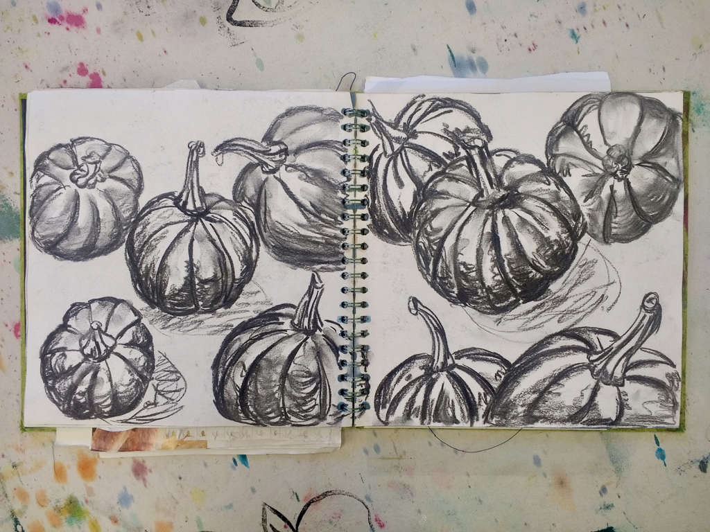
It’s a useful skill to be able to draw on all different scales and this exercise will help you expand your drawing to fill the page – whatever the size!
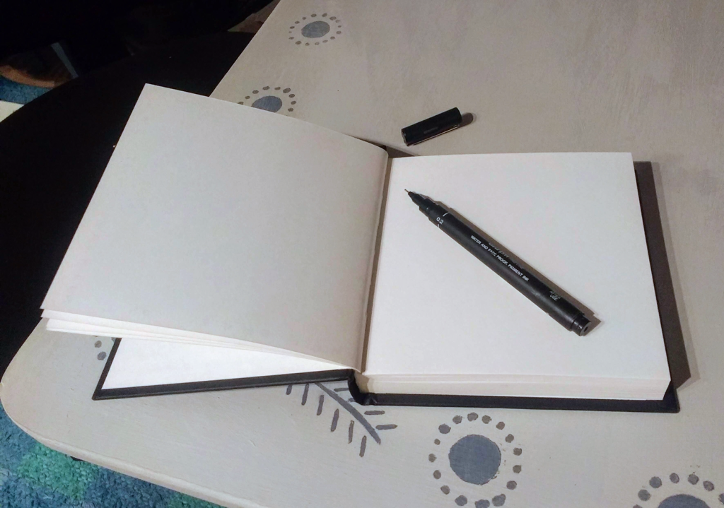
You will need:
- paper - if you always use A4 then try A3
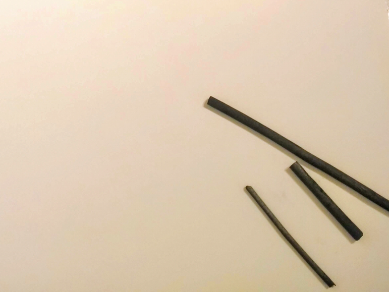
- charcoal sticks - they come in different sizes - you can't do small detailed pictures with a piece of charred wood!
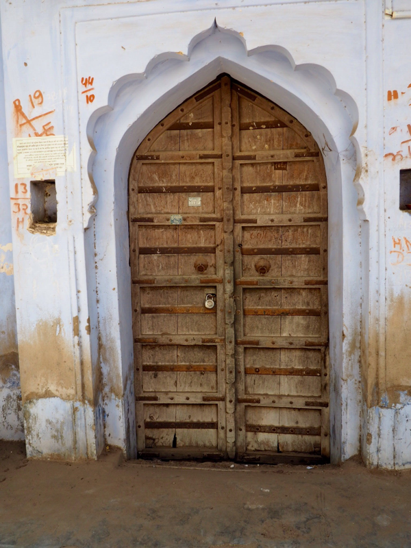
- something to draw; preferably (but not essential) something bigger than the paper you are going to drawn on.
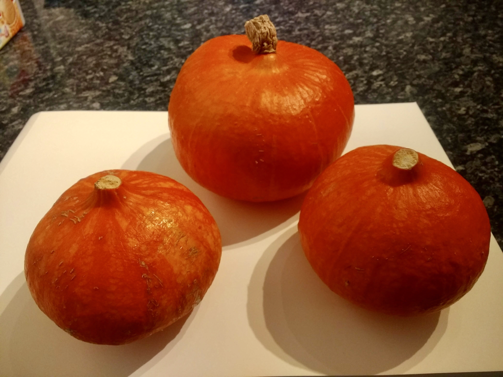
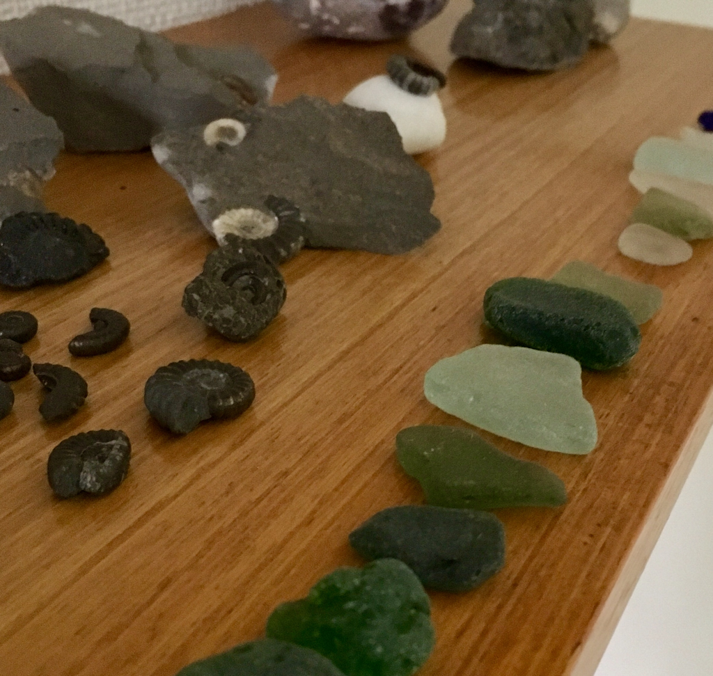
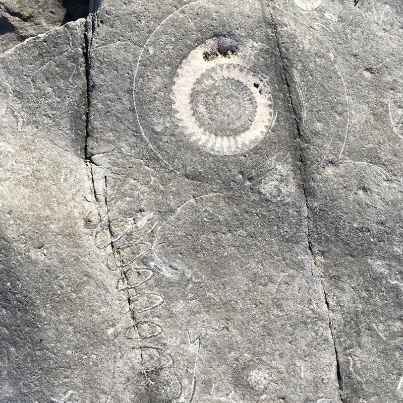
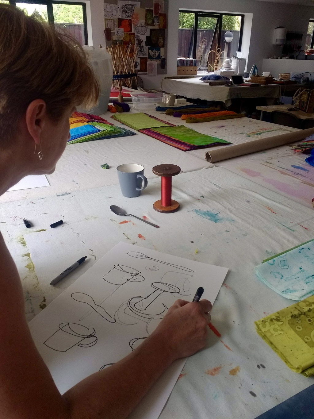
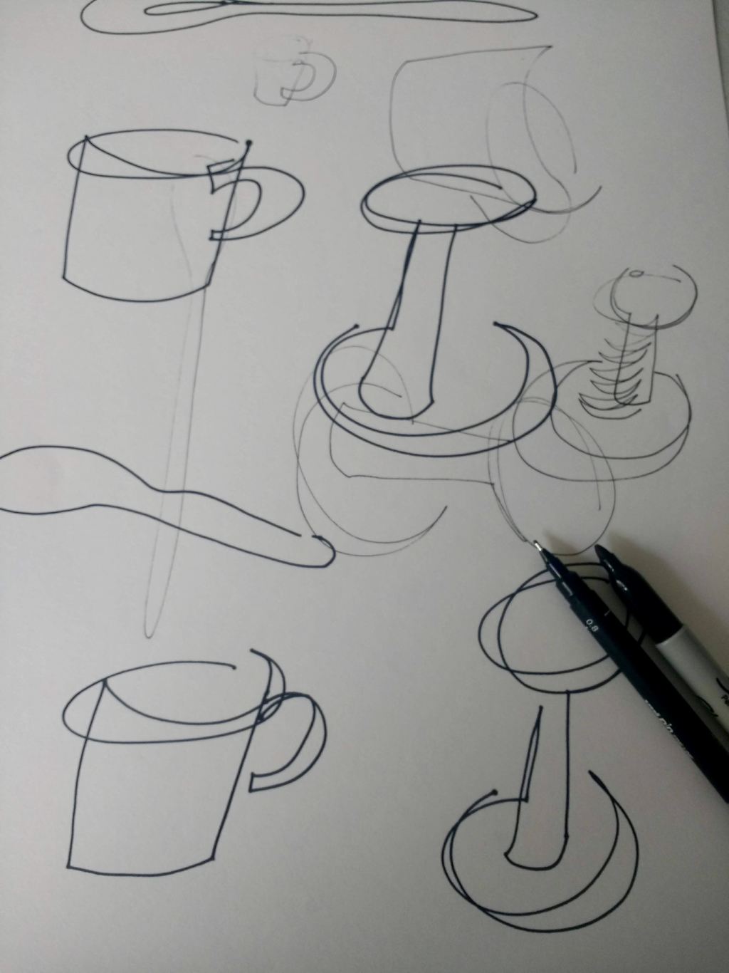
Before you start, spend a few minutes looking at the item you have chosen to draw – look at its overall shape, its relationship to other items on the table and/or the back ground etc


 RSS Feed